Guide for Creating the perfect B2B Website Design
There are many design aspects to be considered when creating your B2B website design. That’s why we made a how to guide about building the perfect B2B Website.

Designing a website for a business can be a difficult task. You need to make sure that it's not only visually appealing, but also easy to navigate and user-friendly. In this Saikai guide, we'll walk you through the steps of designing a great B2B website for your company from scratch.
We'll start by discussing the basics of web design, such as choosing the right colors and fonts. Then, we'll move on to more advanced topics. By the end of this guide, you'll have all the tools you need to create a website that's sure to impress your visitors.
So, let's get started!
What Is A B2B Website?
A B2B website is simply a website that is designed for businesses to market their products or services to other businesses. These types of websites are usually very different from traditional consumer-focused websites, as they often have different goals and target audiences.
For example, a manufacturing company's B2B website might focus on showcasing their products and capabilities, rather than selling directly to consumers. Similarly, a business consulting firm might use their website to generate leads by providing helpful resources and contact information.
If you own or operate a B2B business, you're likely aware of that fact. Still, in the interest of comprehensiveness, here's a partial list of industries and niches that fall under the B2B umbrella:
- Consultants (e.g., business, marketing, financial)
- Agencies (e.g., advertising, web design, public relations)
- Software and Technology Companies (e.g., enterprise software, SaaS, mobile apps)
- Manufacturers and Distributors (e.g., industrial equipment, medical devices, office supplies)
- Service Providers (e.g., janitorial, IT support, event planning)
No matter what your business's goals are, there are a few key elements that all great B2B websites share. In the next section, we'll discuss some of the most important features of a successful B2B website.
Important Features Of A B2B Website
When you're designing a B2B website, there are certain features that are essential in order to be successful. Here are a few of the most important features to keep in mind:
- A clear value proposition: Your website's value proposition is the main reason why someone should do business with you. It should be prominently displayed on your homepage, and it should be clear and concise.
- An easy-to-use navigation system: Navigation is one of the most important aspects of web design, and it's even more important for B2B websites. Your website's navigation should be easy to understand and use, so that visitors can quickly find the information they're looking for.
- High-quality content: Content is still king when it comes to B2B marketing. Your website's content should be well-written, informative, and relevant to your target audience.
- A professional design: First impressions are everything, so you need to make sure that your website looks professional. This means using high-quality images, choosing the right colors and fonts, and avoiding any cheap or tacky designs.
These are just a few of the most important features of a successful B2B website. Now that we've covered the basics, it's time to get more specific and discuss the steps involved in designing a great B2B website.
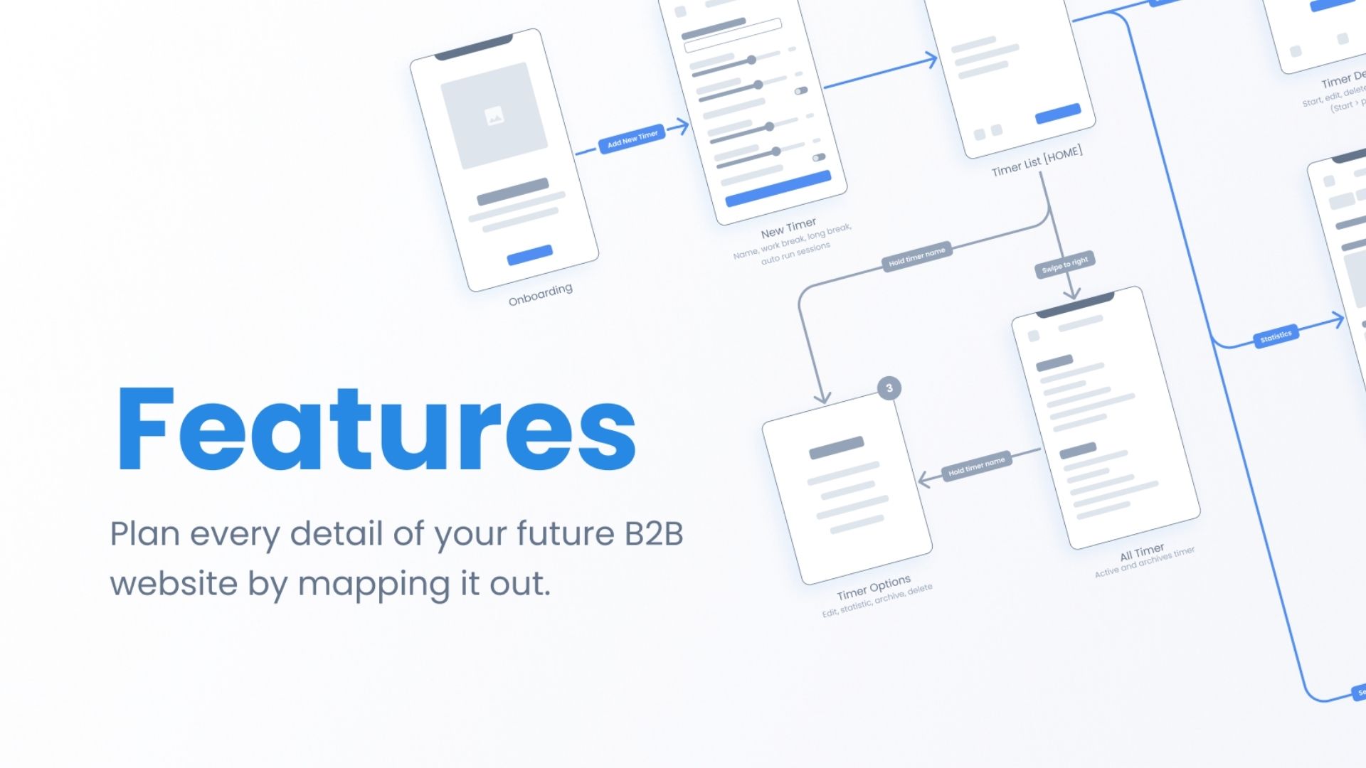
The Steps Of Designing A Great B2B Website
Designing a great B2B website doesn't have to be complicated. Just follow these simple steps, and you'll be on your way to creating a website that's sure to impress your visitors.
1. Choose A Method.
When you begin creating a website—whether it's B2B, B2C, or B2 anything—you need to decide how you'll go about it. When you get down to it, there are two kinds of websites you can create:
- Template-Based Websites: You can use a pre-made website template and make some simple changes to it to suit your needs. This is the quickest and easiest way to create a website, but it's also the least flexible.
- Custom-Designed Websites: You can hire a web designer or development agency to create a completely custom website for you. This is more expensive and time-consuming than using a template, but it allows you to have a completely unique website. Each of these methods has its own set of pros and cons, so it's important to choose the one that's right for you and your business.
2. Choose A CMS Or Website Builder.
A content management system (CMS) is a platform that allows you to create, edit, and publish content on your website. There are many different CMS (website builder) platforms to choose from, including:
- Shopify
- WordPress
- Webflow
- Wix
- Squarespace
They allow you to create a website without having to code it yourself. Website builders are usually less expensive and easier to use than then going full custom, but they're also less flexible and slower.
If you're just starting your business, you might want to consider using a website builder. But if you are scaling up and in need of a more complex website, you might consider hiring a professional designer and developer.
3. Create A Sitemap
One of the first steps in any web design project is to create a sitemap. This is essentially a map of your website that outlines all the main pages and sections.
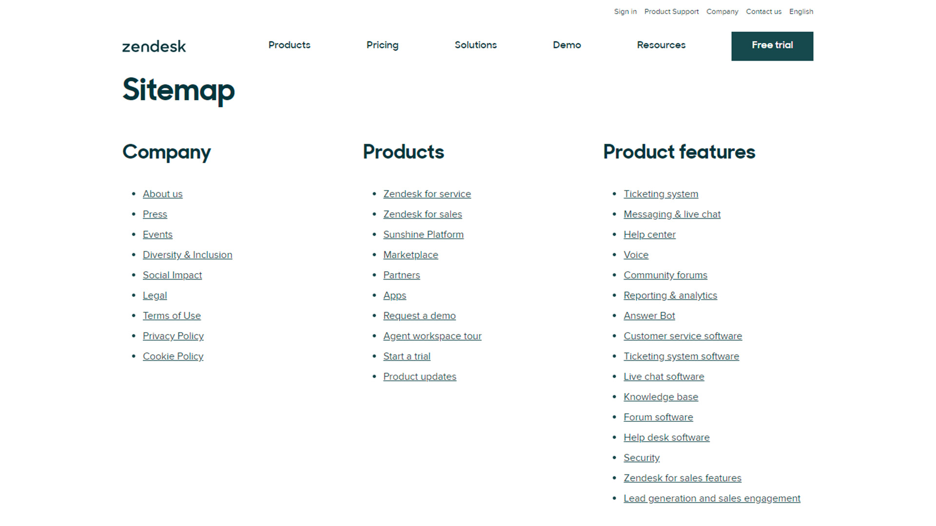 Zendesk sitemap page
Creating a sitemap will help you determine the structure of your website and make sure that all the important information is included.
4. Choose The Right Colors And Fonts
One of the most important aspects of web design is choosing the right colors and fonts. This is especially true for B2B websites, as first impressions are everything.
When choosing colors for your website, it's important to consider both your brand identity and your target audience. For example, if you're targeting a corporate audience, you might want to use subdued colors like blue or gray. If you're targeting small businesses, you might want to use brighter colors like orange or yellow.
As for fonts, you'll want to choose a professional-looking font that's easy to read, like: Arial, Montserrat, or Verdana.
5. Use High-Quality Images
Another important aspect of web design is using high-quality images. Especially for the homepage of your website, as it's one of the first things that visitors will see.
When choosing images for your website, it's important to use professional photos that are relevant to your business, commercially liscensable, and high resolution.
You can find high-quality, commercially liscensable photos on stock photography websites like:
But original content will always be preferred, since stock images can be quite generic if not edited.
6. Add A Video Background
Adding a video to your website is a great way to make it more visually appealing. It's also a great way to show off your products or services in action.
If you decide to add a video background, it's important to use a high-quality video that's relevant to your business. For example, if you're a software company, you might want to use a demo video of your product. If you're a law firm, you might want to use a video of one of your lawyers giving a presentation or include video testimonials of your clients.
7. Include A Blog
Including a blog on your website is a great way to show off your expertise and generate leads. When writing blog posts, it's important to focus on topics that are relevant to your target audience.
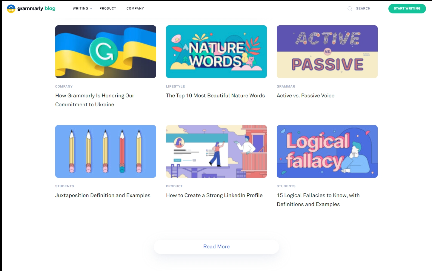 Grammarly blog page
For example, if you're a software company, you might want to write about the latest industry trends or the benefits of using your product. If you're a law firm, you might want to write about recent legal changes or court cases that your firm has handled.
Overall, your blog and any additional resources should focus on providing real value to the people who find it. Doing so helps demonstrate your value to potential customers.
8. Optimize Your Website For SEO
If you want your website to be successful, you need to make sure it's optimized for search engines. This means choosing the right keywords and using them throughout your website in a readable and logical way of course.
When optimizing your website for SEO, it's important to focus on both on-page and off-page optimization. On-page optimization includes things like adding keyword-rich titles and descriptions to your web pages. Off-page optimization includes things like building backlinks to your website.
9. Add A Live Chat Feature
Adding a live chat feature to your website is a great way to provide customer support and generate leads. When choosing a live chat software, it's important to find one that's easy to use and has all the features you need.
Most CMS platforms and website builders have their own app store, where you can easily find a compatible live chat.
10. Make Sure Your Website Is Mobile-Friendly
In today's world, it's important to make sure your website is mobile-friendly. This means that your website should be designed to look great on all devices, from smartphones to tablets to laptops.
When designing a mobile-friendly website, it's important to keep things simple. This means using large fonts and buttons and avoiding excessive amounts of text which makes it hard to read.
11. Use A Call-To-Action On Every Page
A call-to-action (CTA) is a piece of text or an image that encourages visitors to take a specific action, such as signing up for a free trial or downloading a white paper.
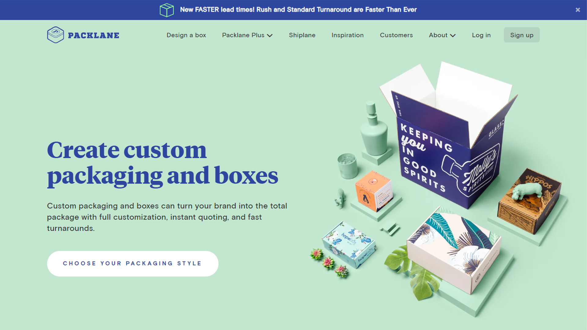 Packlane Homepage CTA
When adding CTAs to your website, it's important to use persuasive language and design them to stand out. For example, you might want to use a large font or a contrasting color.
12. Include A Live Demo
If you're selling a product, it's always a good idea to include a live demo on your website. This allows potential customers to see your product in action and get a feel for how it works.
This usually works best with SaaS products, as it's fairly easy to set a demo account for visitors to play around with. However, there are ways to get creative about demos in other areas as well.
13. Add Testimonials And Reviews
Adding testimonials and reviews from satisfied customers is a great way to build trust and credibility. As you're designing the website, reach out to a few of your most loyal customers, passionate users, or biggest clients to see if they'd be interested in contributing with a quote or video as we mentioned earlier.
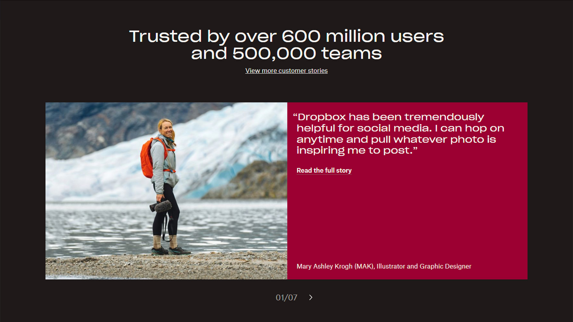 Dropbox Customer Stories
Make sure your testimonials and reviews get a place of honor on the website—social proof plays a huge role in sales.
14. Make It Easy To Contact You
It's important to make it easy for visitors to contact you. The best way to do this is to include a contact form on your website.
When designing a contact form, it's important to keep things simple. You don't want to ask for too much information or make the form too long with many steps.
15. Prioritize Clear Messaging
Messaging is huge when it comes to effective B2B website design. You want to make sure potential clients are instantly aware of what the problem is that your business solves and how you go about solving it.
Example Of An Effective B2B Website
Now that we've covered the process of designing an effective B2B website, let's look at an example of a great one: Asana. For those that don't know, Asana is a project management software that helps teams optimize their workflow.
Asana's website is a great example of effective B2B design for a few reasons:
1. It's has a clean and simple design.
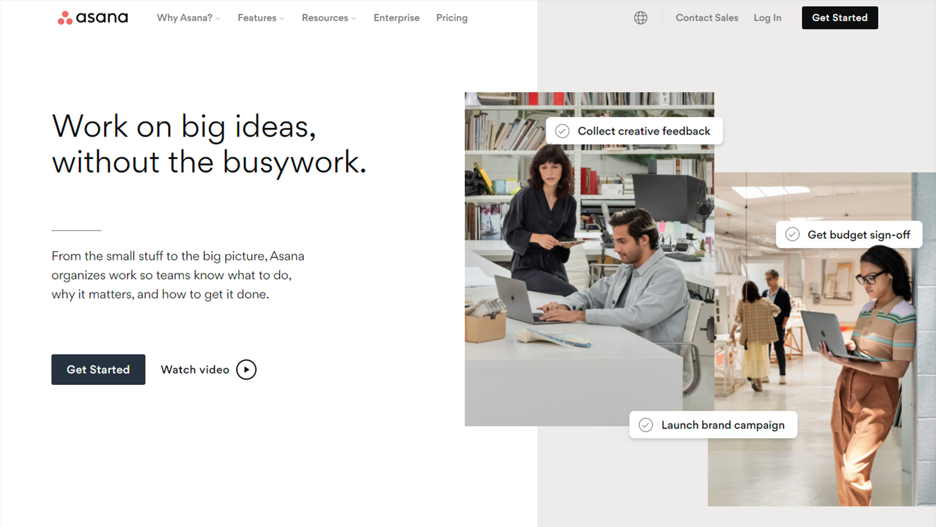
The homepage features a hero image with a clear CTA, as well as a brief value proposition to get buyers interested. The navigation is also simple and easy to use. There are only a few main links, and they're all clearly labelled.
2. It features tons of social proof.
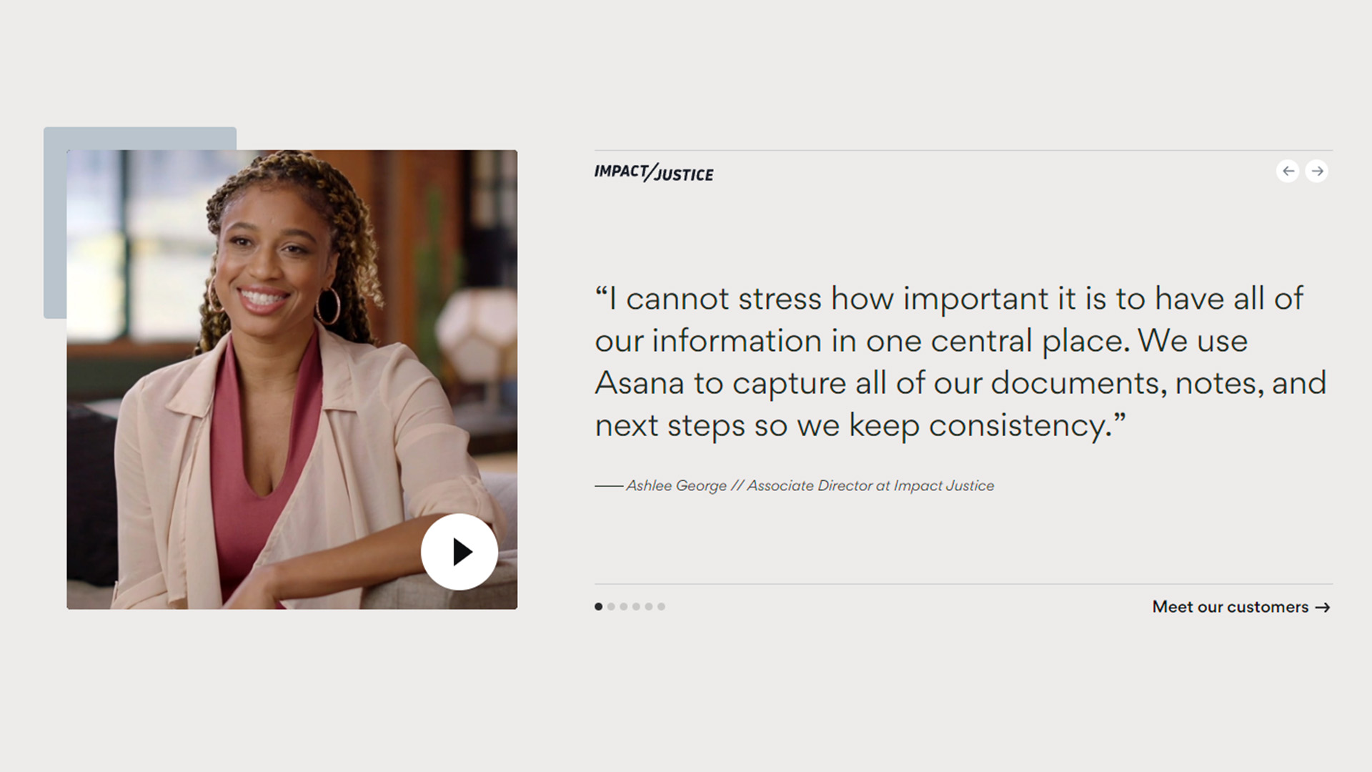
Asana's website includes plenty of social proof in the form of testimonials and reviews. These help to build trust and credibility with potential customers. Plus, the fact that the testimonials come with videos is a great touch.
3. The live demo is prominently featured.
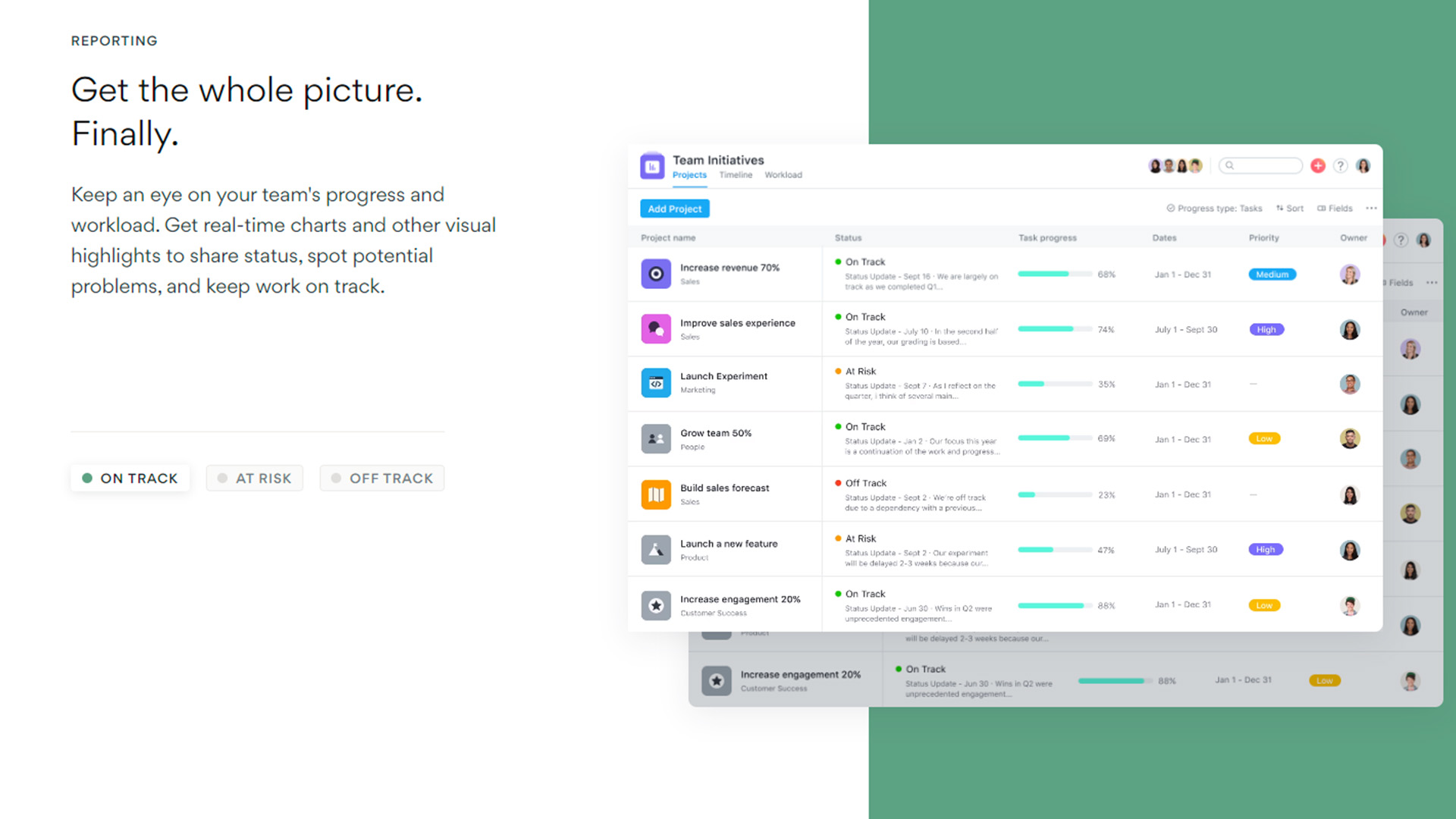
Asana knows that potential customers want to see the product in action before they're ready to buy, so they make it easy to find the live demo on their website.
4. The messaging is clear and concise.
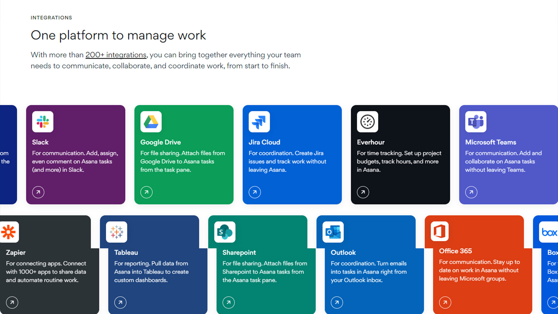
As the visitor scrolls down the homepage, they're greeted with a clear and concise explanation of what Asana is and how it can help them.
Overall, this example shows that you don't need a complicated or flashy website to be successful. Sometimes, less is more.
Final Thoughts
Designing a great B2B website can be a daunting task, but if you follow these tips, you're sure to create a website that's both effective and impressive. Keep in mind that it's always important to test your website on different devices and browsers to make sure it looks good everywhere.
And most importantly, don't be afraid to ask for help! If you need assistance with designing or optimizing your website, Saikai’s team of experts is always available. Feel free to reach out!