Have website traffic but no conversions – what should brands do
Every business wants web traffic, but here’s what you should do if it doesn’t convert into sales.

The purpose of a website is not only to attract your audience but also to make them complete a desired action. Whether it be purchasing a product, signing up for a newsletter, making an account or even a subscription. There is a certain structure behind every successful website that guides the traffic to do exactly what we intend it to do, convert. For this purpose, top brands are particularly designing websites that skip the endless amounts of text and are focusing heavily on the brand’s message and the outcome of their product, packed nicely with the help of user experience (UX) and user interface (UI) designers that help with turning traffic into loyal customers.
The structure –Design, Development and Messaging

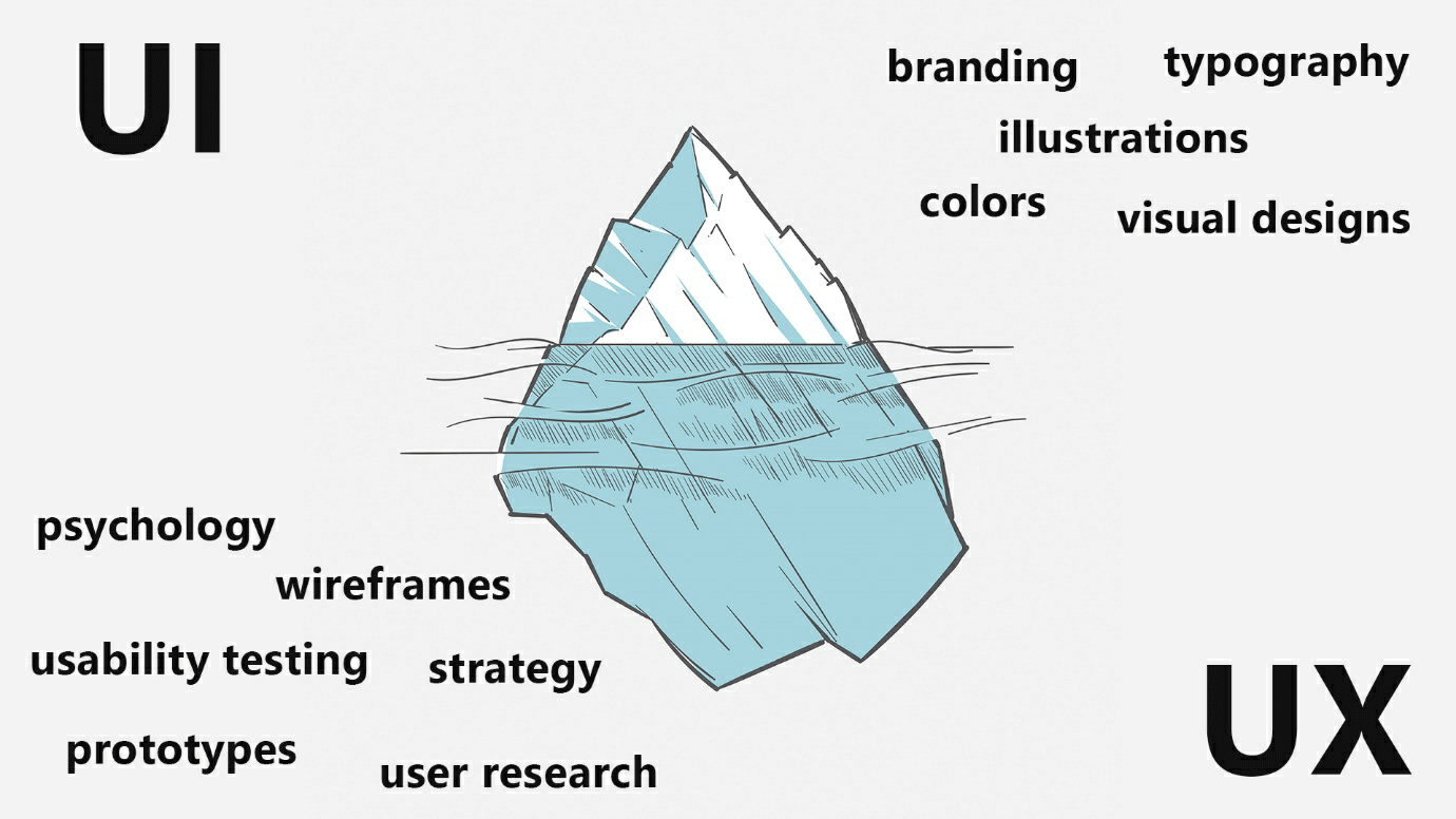
A well-structured web design is about functionality AND form, it doesn’t go one way or another. If you have a well-developed and functional website but missing the design appeal to catch the eye of your audience, it’s just not going to work. That’s why dedicating time in both design and development is so important. Displaying your brand message in style without any obstacles to the user to convert. It all starts from the UX side from which the more technical part is prepared, such as the users and prototyping of the website. All of this is providing information of how it should be visualized in the UI, where branding and layouts are implemented. Perfect example for this is if the users are found to be more senior, then of course the fonts will be made more readable and bigger. Behind every design there is large amount of testing and psychology that’s all connected for the overall performance of the site.
Why is it important to have a well-optimized website?
 UX vs UI - differences
Everything within the structure of a website must serve a purpose and if it doesn’t, remove it. In other words, brands should be focused on communicating their message through CTA buttons, testimonials and solution-based imagery of the product rather than overloading it with endless amount of text. By presenting value in a more minimal clean way, there are less distractions for the viewer and that brings them straight to the point. That is providing less but useful information is more effective than providing too much information.
Although, conversion is dependent upon many factors such as type of industry, product and services offered, yet there is still a pattern on how well-optimized websites should look like.
Here are two examples from different niches - “Tentree” and “Gleamin” , which have familiar well-structured websites:
- Quick product navigation
- This is what we make
- This is who we help
- CTA Purchase/Subscribe
It’s a common build and it works.
Regular occurrence like making a website too salesy, might ruin a brands reputation in the long term. Instead, focus on the audience, and optimizing a website majorly towards fulfilling their needs and problems can do wonders. Every visitor on your site has an expectation, and two of those expectations will be that the website loads fast and is functional on old and new devices. Not every visitor has a fast internet connection or the latest iPhone. Sounds crazy in this era, but this is the reality, and we must make every single detail count.
Platforms that let you create beautiful online stores

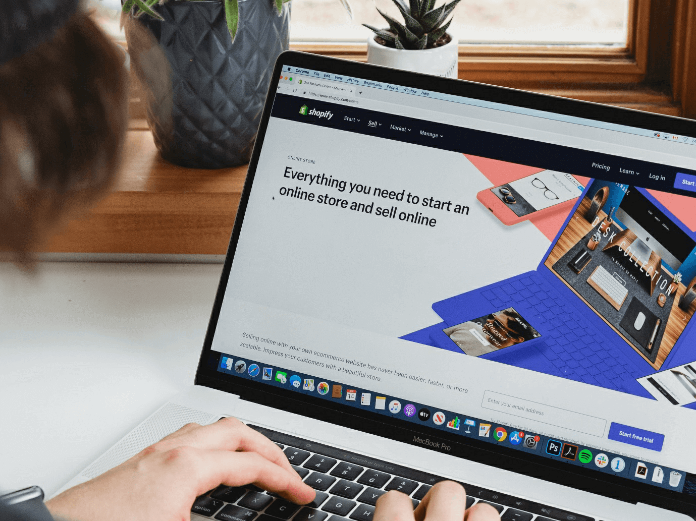
Online store builders like ‘Shopify’ and ‘WordPress’, will let you tailor your website according to your audience’s needs. As a start-up you can always take advantage of the premium themes of the platforms since they already provide the speed and are optimized for almost any device, for more advanced customizations you’ll need a developer to help out. Remember, your focus is to increase the conversions instead of generating website traffic. Thus, think of creating an online store that is clean and offers minimal distraction and focuses on the solution of your product/services with a proper call to action.