The 11 Best Supplement Website Designs in 2025
A showcase of the top supplement websites in 2025 with standout branding, sleek UX, and high-converting Shopify design.
The 11 Best Supplement Website Designs in 2025
With the new interest in treating our bodies like the temples they are, there has been a recent surge in new supplement companies in the market. Not only do you need sleek branding and a website to boot, but also offer a seamless user experience that solidifies your business in the minds of shoppers.
But, with all the new competition, how are you certain that your site is going to stand out from the rest?
Shopify offers a wide range of themes and templates to suit all sorts of businesses, plus a comprehensive suite of tools to create visually stunning and user-friendly online stores. Let's take a look at some of the best supplement stores built in Shopify this year.
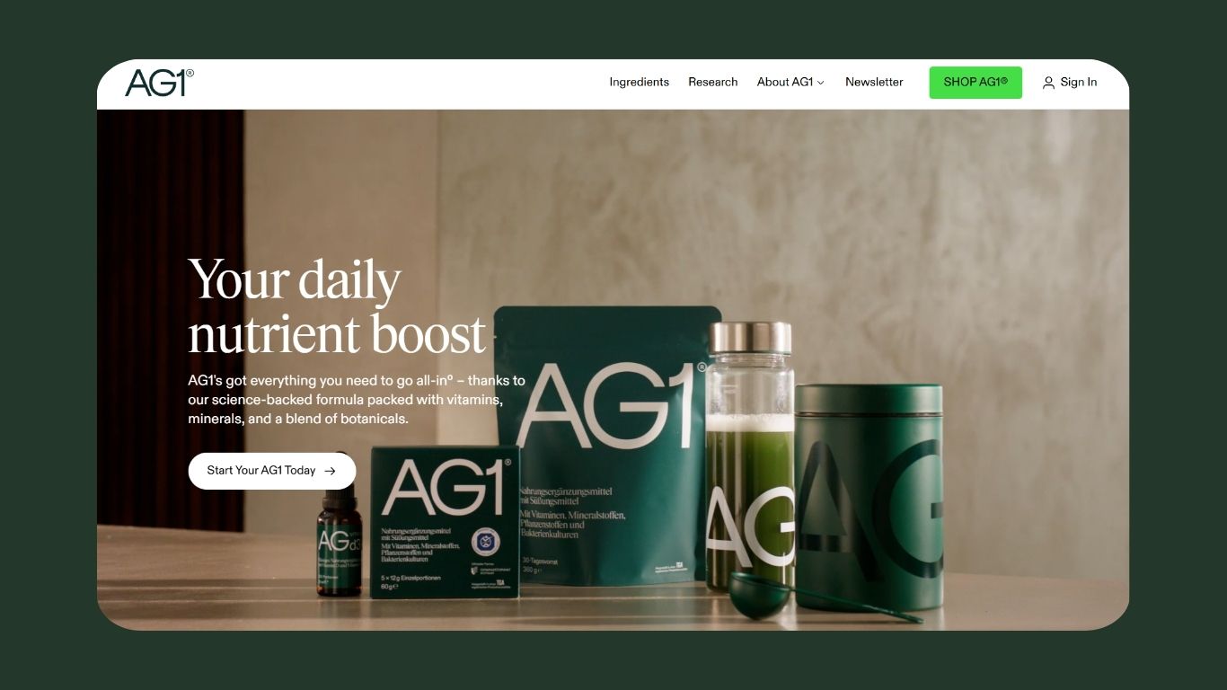
AG1 by Athletic Greens
AG1's website accurately reflects their mission of simplicity and health optimization. The overall design is clean and minimalist, using whitespace to their advantage with a small palette of neutral colours for contrast. AG1's clean aesthetic ensures that product details and benefits stand out.
Visuals are prominent throughout AG1's site accompanied by large bold text for headings. The simple font and no-frills design makes it easier for site visitors to clearly identify the product's key features. Taking this one step further, AG1 has incorporated animations and scroll effects to engage users within their content on the site.
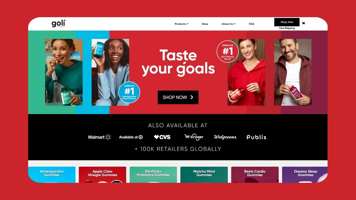
Goli Nutrition
Known for their iconic gummies, Goli Nutrition embraces a vibrant and playful aesthetic with their branding and website design. As soon as you hit the homepage, you're greeted by bold and cheerful colors that represent the different flavors of gummies they offer.
Product pages are informative, with the details presented in a way that's easy for the reader to digest. Bonus point, dietary information (such as gluten free or vegan) is positioned high up on the page so site visitors can quickly work out if the product is suitable for them.
Oh, and, customer reviews and testimonials are weaved in throughout the site to build trust with prospects. Great work, Goli! 👏
Moon Juice
Another clean website design, Moon Juice uses minimalist photography, on-brand image filters, and a muted color palette to create a sense of calm and wellness as you progress through the site. There's a strong sense of storytelling throughout the site - Moon Juice doesn't just sell supplements, they sell a lifestyle.
The website is packed with blogs, recipes, and curated collections to encourage rapport and buy-in from site visitors.
Moon Juice's site is easy to navigate (creating an enjoyable user experience) with detailed product information that's easy to find and read.
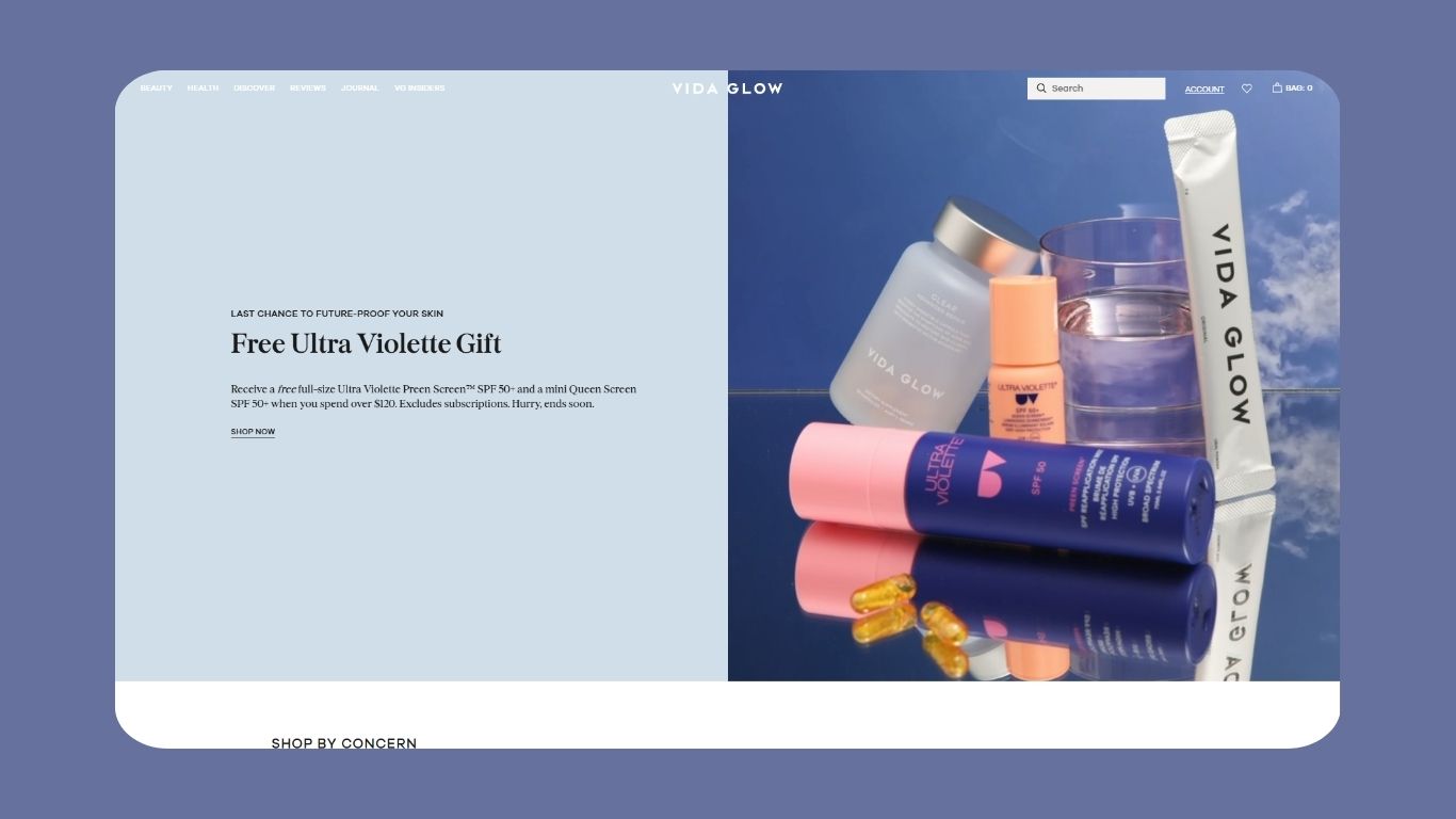
Vida Glow
Immediately after hitting Vida Glow's homepage, you're invited to sign up to their newsletter for 10% off their products - a quick way of capturing leads. Behind the call to action, is a site that focuses heavily on beauty and wellness, rather than simply supplements.
Vida Glow creates a strong sense of luxury with their premium design, high quality visuals, and elegant color accents.
Their value proposition is easy to see and understand, emphasized by bold headlines and minimal clutter on the page - quickly communicating their focus on skin and their product benefits. This, paired with interactive site elements (such as image sliders) to communicate product benefits, makes Vida Glow's website an absolute joy to use.
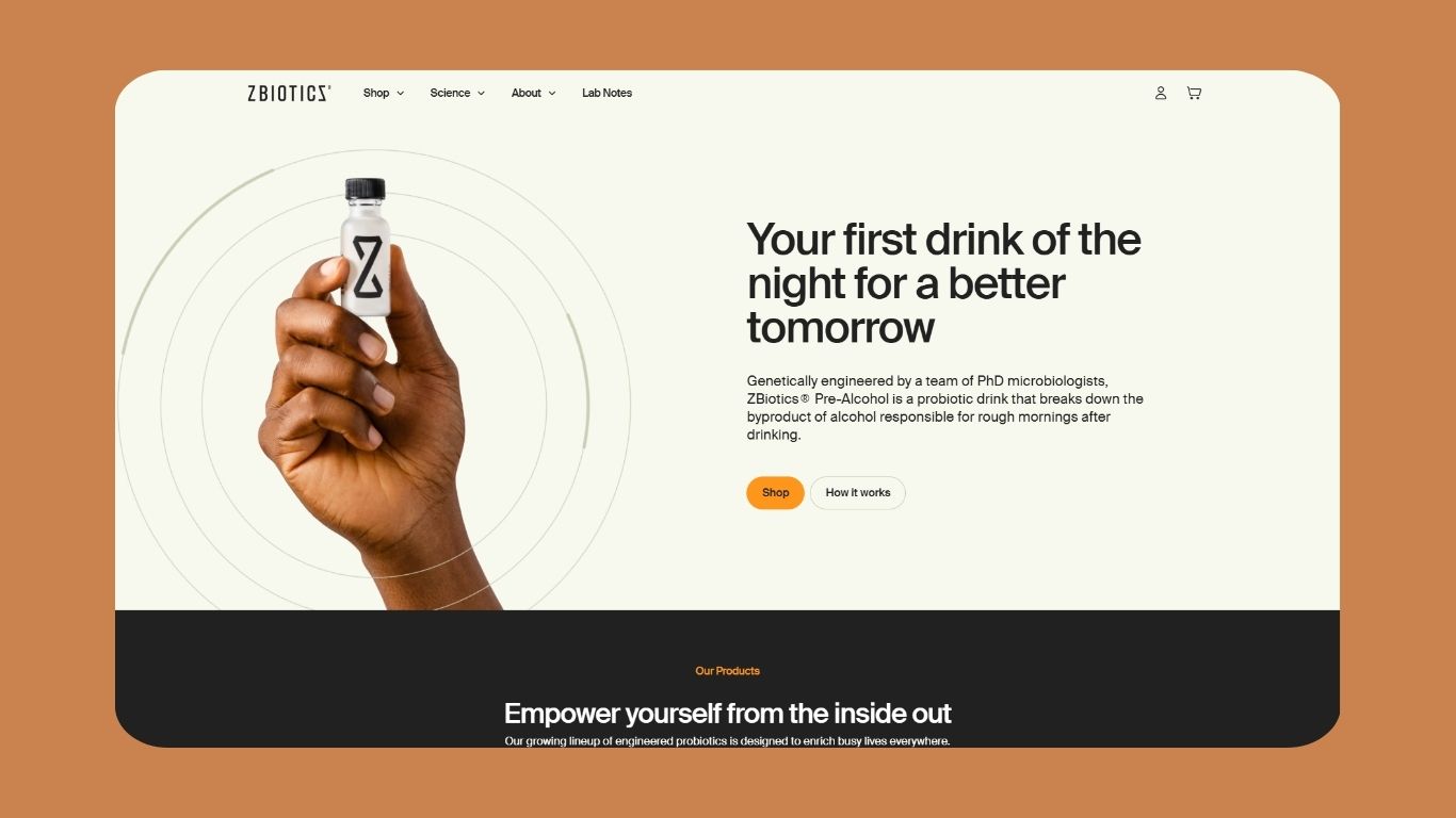
ZBiotics
ZBiotics has taken a different approach with their marketing messaging, instead leveraging science-backed credibility combined with a modern, tech-forward website design. Compared to some of the other sites in this list, ZBiotics has more of an informative and sports-centered approach to their supplements - which is reflected in their branding.
ZBiotics have simplified their storytelling into layman's terms, making it accessible to a wider market. Throughout the site there are certifications, testimonials, and media mentions to establish trust and credibility - plus clear graphs and diagrams to educate their audience.
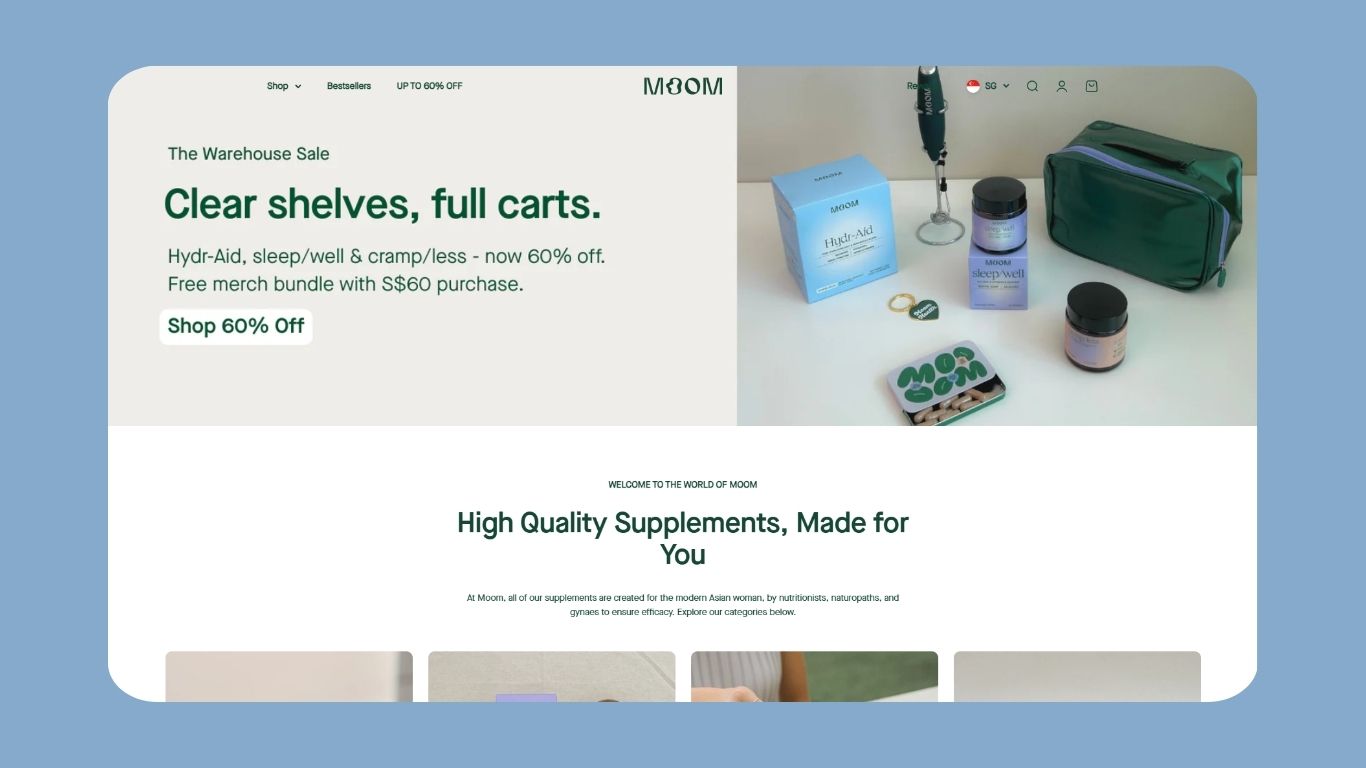
Moom Health
Moom Health offers a personalized experience to shoppers with their recommendation tool, creating opportunities for engagement and to build trust. The general feel of the website is elegance, using delicate fonts and soft and contrasting colours to appeal to their target demographic.
There's a strong community focus within Moom's site thanks to their inclusion of stories by real product users and informative blogs. Moom have also added a feed for social media videos made by their customers so you can see the products in use! Product images are sleek, with the products and packaging clearly taking center stage.
Thesis
Another science-backed supplement, Thesis takes a personalized approach to their nootropic supplements. The homepage clearly displays the product benefits, making it simple for you to navigate the site and their offering. The use of bold and vibrant colours creates a modern feel for the brand.
Products have names that match their desired outcome, so it's easier for users to remark the differences - also putting the science focus into the background for those who might get intimidated by the data. However, for those who want to know more, product descriptions are rich with detail about ingredient sourcing and the scientific research their supplements is based on.

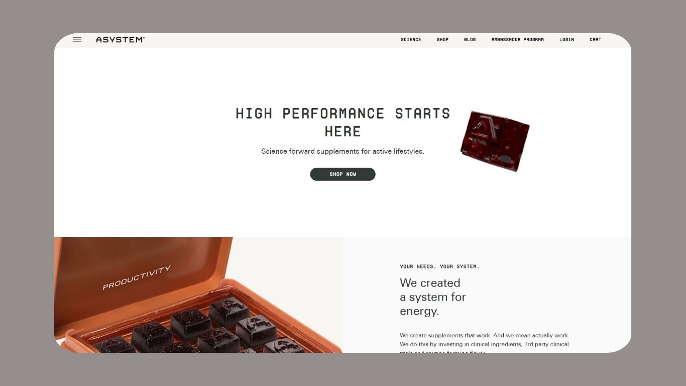
ASYSTEM
Simple in its design, ASYSTEM leads with people-focused and product photography. They've used a small selection of colours that contrast with each other coupled with clean layouts and bold fonts for impact. ASYSTEM also follows a research-based approach to their messaging rather than a sense of luxury.
Product benefits and general information are easy to find, presented in shorter sections which makes the content easier and more enjoyable to consume. The site also offers clear navigation of their products, contributing to a positive user experience.
Absolute Collagen
Absolute Collagen's distinct yellow branding really packs a punch. Instantly recognizable with a modern feel, there's no mistaking whether you've landed in the right place here. Their site is a shining example of how to communicate both beauty and health benefits effectively.
The site is easy to navigate and understand, with clear calls to action and product information throughout their pages. Categories are displayed across the top of the site and simplify the overall shopping experience.
Images, videos, and testimonials have been used to their maximum potential, visibly demonstrating the benefits of using their product to strengthen their credibility.
Absolute Collagen also offers a range of interactive elements within the site to keep users engaged, including a collagen quiz and image sliders. Leaving no stone unturned, they've also got extensive research and blogs around the benefits of taking collagen supplements to build both trust and a bond with potential customers.

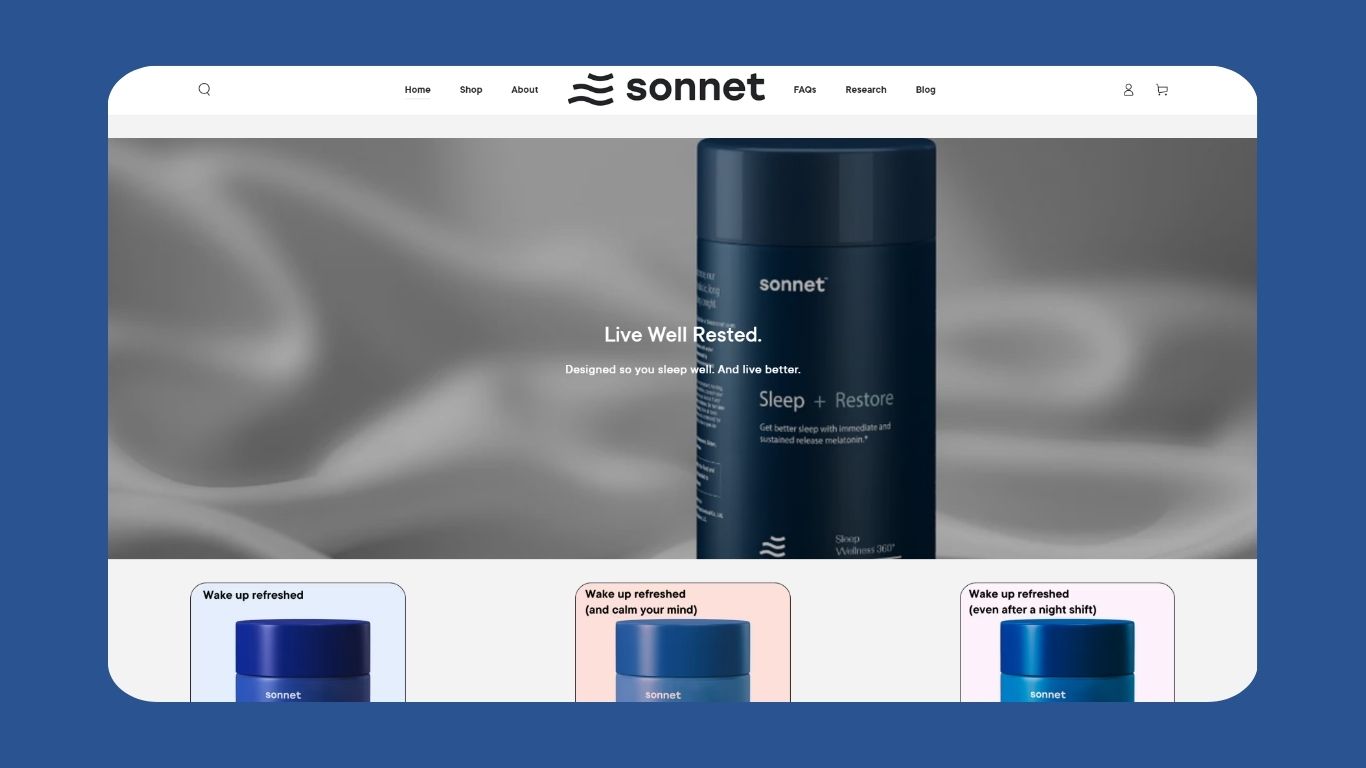
Sonnet
Another site with a discount offer as soon as you arrive! Sonnet's website design conveys luxury through its minimalist design, premium product presentation, and sleek user experience. Its strengths lie in its bold typography, striking visuals, and seamless navigation. Sonnet blends both style and functionality in a way that feels effortless.
Hero imagery and editorial-style product photography allows the products to speak for themselves. As they don't have a wide selection of products, Sonnet has compensated by including easy to understand product benefits, FAQs, and testimonials.
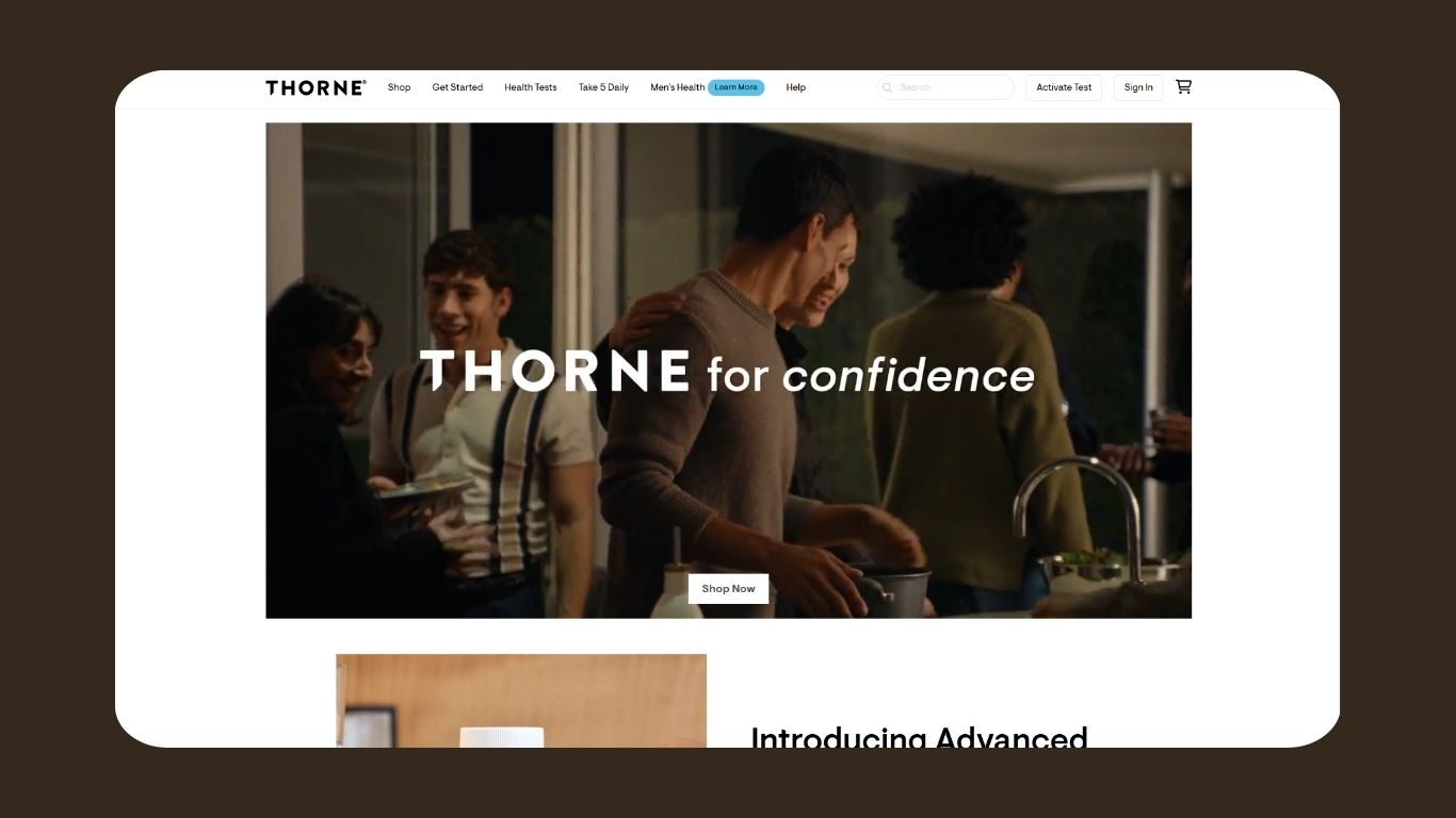
Thorne
Despite not being built in Shopify, how could we resist reviewing Thorne?! Thorne, like many others in this article, has prioritized a minimalist design that puts health at the forefront. Its clean, scientific aesthetic, well-structured product pages, and personalization features (like the health quiz and subscription model) make it highly user-friendly and exciting to navigate.