8 Signs That Tell Your Web Design Isn't Working [2025]
Creating a website is just the start of a long journey. There are many factors that tell if your website design and user experience is working as it should.

When someone clicks onto your website, they form a first impression in roughly 50 milliseconds. That's not a lot of time—certainly not enough time to read your website's copy or perform a comprehensive feature review.
So, what is this impression based on? Web design.
Web design is an incredibly important aspect of your website. It's what makes your site look professional, trustworthy, and credible. And it's also what makes your site user-friendly and easy to navigate.
In other words, web design is what makes people want to stay on your site—or click the “back” button and find someone else to do business with.
But how can you tell if your web design is working? Keep reading to find out.
What Is Web Design?
Web design is the process of creating a website. There are tons of different facets under the umbrella of web design, including:
- layout
- color scheme
- typography
- images and videos
- and many aspects connected to psychology
It also involves user experience (UX) design, which is the process of making sure that people can actually use your site. This includes things like navigation, search functionality, and overall usability.
Why Is Web Design Important?
Your website is often the first interaction that potential customers have with your business. This makes web design incredibly important in terms of making a good first impression.
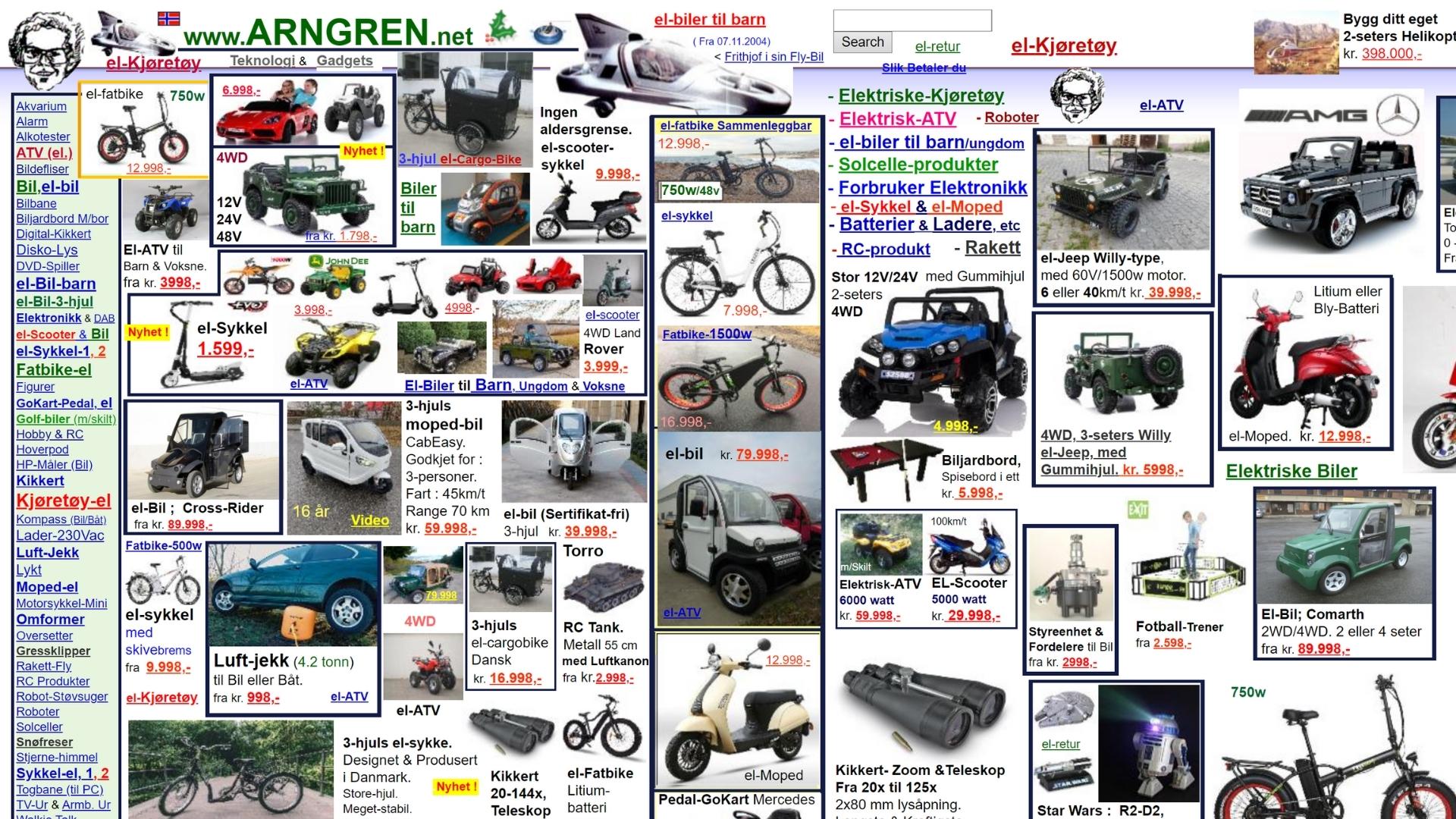
Think about it—when was the last time you clicked on a website and were immediately put off by its appearance? If a website looks unprofessional, or outdated like the example below, chances are you're not going to want to do business with that company.

On the other hand, if a website looks well-designed and easy to use, you're much more likely to stick around and see what that company has to offer in terms of features, products, and services.
In other words, web design is important because it can make or break your chances of converting a website visitor into a paying customer.
8 Signs That Your Website Isn't Working
So, how can you tell if your web design is working? Here are 8 signs to look for:
1) Your CTAs aren't visible.
Your website's call-to-actions (CTAs) are the buttons or links that tell people what to do next. They should be visible, and it should be clear what they do.
If your CTAs are hidden, or if it's not immediately clear what they do, then chances are good that people aren't going to click on them. This means that they're not going to take the next step in your sales funnel, which is a big problem.
2) Your images and videos are low-quality.
The images and videos on your website should be high-quality. This means that they should be clear, and they shouldn't take forever to load.
If your images and videos are low-quality, it's going to reflect poorly on your business. People will think that you're not professional, and they won't take you seriously.
Additionally, if you’re able to produce original images rather than stock content, do it. While a professional designer could pull of a professional look with stock, some people can often make them look fake and cheesy, which is the last thing you want. Creating your own visual content offers a great ROI, so don't be afraid to make an investment.
3) Your navigation system is confusing.
Your website's navigation should be easy to use and enable people to find what they're looking for without any trouble.
If your navigation system is confusing, people are going to get frustrated, and they're going to leave your site. While we can't recommend a specific navigation system, there are a few things most sites will want to include:
- Menu Bar: This is typically at the top of the page, and it includes links to the most important pages and categories on your site that would help you achieve your goals. It should be visible at all times.
- Pop-up Shopping Cart: If you have an eCommerce store, then you'll want to include a pop-up shopping cart so that people can keep track of the items they want to purchase and checkout quickly. It should be dynamic and visible at all times.
- Search Bar: This allows people to search for specific keywords or terms on your site.
- Breadcrumbs: These are links that show people where they are on your site, and they can be helpful in terms of navigation.
4) Your website is hard to read.
Your website should be easy to read. This means that the text should be the right size, the colors should contrast well, and important information (like CTAs) should be differentiated using font size, bolding, or contrast.
If your website is hard to read, people are going to have a hard time digesting your content and may lead them to leaving your website.
5) Your website is slow.
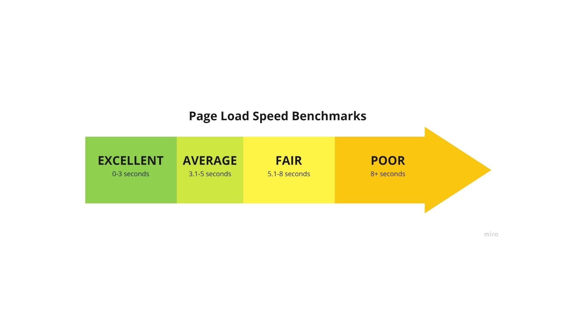
Your website should load quickly. If it doesn't, people are going to get impatient, and they're going to leave. In fact, studies estimate that a 1-second decrease in page load speed leads to a 50% increase in bounce rate and a 7% decrease in conversions.

There are a few things you can do to speed up your website. First, you'll want to make sure that your images are optimized for the web. This means that they shouldn't be too big or too small.
Second, you'll want to make sure that you're using a good web hosting provider. A good web host will make sure that your website is always up and running, and they'll also offer support if you have any issues.
6) Your bounce rate is through the roof.
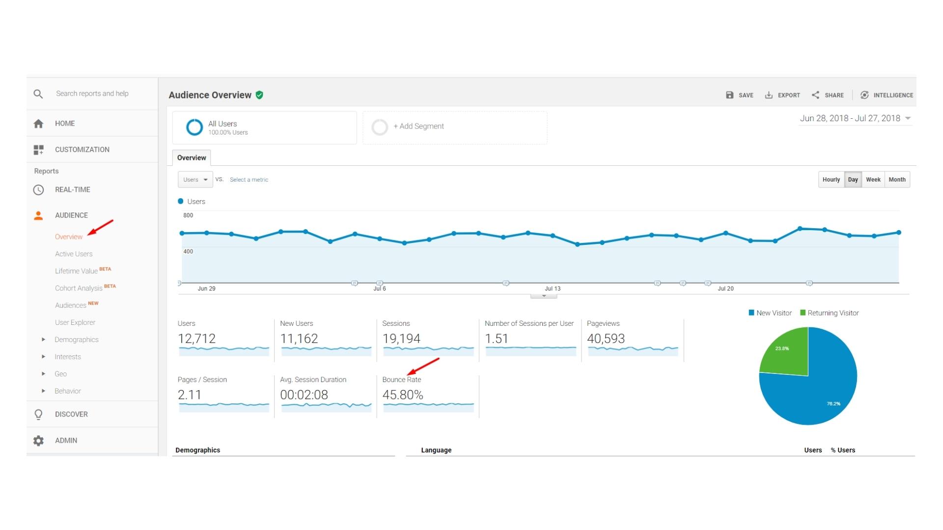
Your website's bounce rate is the percentage of people who leave after only viewing one page. A high bounce rate is typically a sign that something is wrong with your site or ad targeting.

There are a few things that can cause a high bounce rate. First, it could be that your website is slow. As we mentioned before, people are going to get impatient if your site takes too long to load.
It could also be that your website is hard to navigate, or that the content isn't relevant to what people are looking for.
Whatever the reason, it's important to try to lower your bounce rate. The best way to do this is to figure out why people are leaving and then make the necessary changes using techniques like A/B testing for both design and marketing.
7) Your branding isn't consistent.
Your branding should be consistent across all of your marketing channels. This means that your website, social media accounts, and even your email newsletters should all have a similar look and feel.
If your branding isn't consistent, people may not find it appealing enough, and they're not going to know what to expect from you. This can lead to them losing interest in your brand.
8) You aren't generating sales or leads.
If your website isn't generating sales or leads, then it's not doing its job. Kind of. This is often the most important metric for businesses, so it's something you should keep an eye on.
There are a few things you can do to increase sales and leads. First, you'll want to make sure that your site is optimized for conversions. This means that it should be easy to use and that the purchase process should be smooth.
You'll also want to make sure that you're marketing your site effectively. This means driving traffic to your site through SEO, social media, and email marketing and you’re targeting the correct audiences.
The Bottom Line
If you're not seeing the results you want from your website, it's time to make some changes. The eight signs we've listed are a good starting point, but they're by no means exhaustive. There are many other things you can do to improve your website and increase sales and leads, but the aim is to read the data and find the root of your problems.