10 ways to reduce bounce rate and increase conversions on your eCommerce store
Why it’s crucial to keep your website’s visitors attention right away, and tips on how it can help to increase your sells by reducing your bounce rate.
Is your website getting traffic, but the visitors tend to bounce off almost right away? In this article, we are going to explain what bounce rate is, why it is important and how to improve it, which can help you with generating more sales.
Bounce rate is a term used in the digital world context which describes the case when visitors of a website leave too soon after the initial click. To make it more objective - Google classifies bounce rate as a session during which only a single page has been visited.
There could be many reasons why they choose to go elsewhere. Why this is important for businesses, is the fact that a high bounce rate indicates to search engines that people tend to like staying on some websites over others.
However, lowering your bounce rate will not only result in pleasing Google but as you would notice from the tips in this article - it would hopefully make the experience for your potential customers more relevant and better overall.
Custom over stock images
Whenever possible, businesses should use their own images over generic stock ones. This is a chance to stand out from the competition, especially in an eCommerce world in which multiple stores would offer the same product. Budget wise, it could be a bit more expensive and time consuming to make high-end visual content. But with a quick crash course and how-to videos, you’ll be able to produce better quality images than the generic custom ones offered by retailers.
Implement social proof
Showing some authentic customer feedback could be the little extra that some buyers are looking for in their decision making. If your website still hasn’t generated sales, you could use some of the testimonials left in the listing of the retailer. You could notice some big brands use this technique on their homepages.
Once you begin generating more sells, you can always place some incentive in your packaging, so customers could tag you on socials for a discount or other privileges. As the term UGC (user generated content), this will help you get an evergreen stream of photos that can be placed on your homepage. Instagram feed plugin or before and after slider are some of the most within web design.
Make the checkout process effortless
Try to simplify the checkout experience by removing any distractions during the last stage. The last thing that you would want is someone leaving after they added a product to their cart and going elsewhere. Making it obvious and easy to buy is key and you shouldn’t sleep on this one. Try to reduce the clicks, with clear call to actions and don’t go too aggressive on upsells. Payment security and price transparency are also important, so don’t hide anything.
Crystal clear product navigation
When designing your website, don’t just focus on a cool-looking landing page. Make sure your product navigation is welcoming new traffic as well as serving your already loyal customers who decided to pay you another visit.
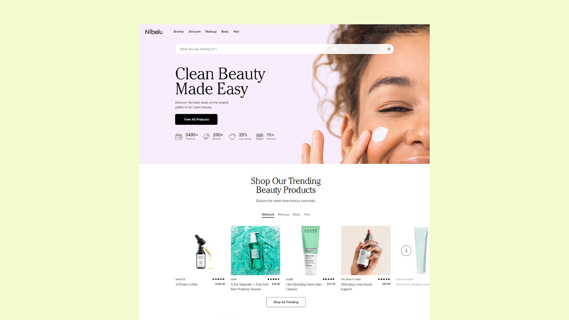 Navigation Example by Nibelu – Beauty & Wellness Brands
As the example from Nibelu, your selection of products should be well organized and easy to navigate. Keep the bestselling products visible to retain existing clients and don’t forget to highlight offers to attract new ones.
To be sure everything is well done navigation wise, you’ll need to place “Heatmaps” such as Yandex Metrica and analytics from Google. They’ll show you where users click and bounce the most, that way you can A/B test different navigation designs and improve.
Always use call to action
Having an easily distinguished call to action on each page is a must. For example, the page with your products needs a ‘’Buy’’ button and your ‘’Contacts’’ page should highlight your email and social media so people do reach out if they need more information. This can sound basic, but it’s very common to miss navigate traffic, especially on landing and homepages.
To tackle bounce rate, give people access to what content might interest them the most. Consider hyperlinks to your delivery information, pricing or testimonials.
Thinking about FAQs upfront would save you time responding to messages and could be the difference whether people decide to buy your products.
No matter what the CTA is, make it obvious and make it stand out.
Follow the trace – Don’t mislead.
Sometimes to give the best customer experience you should put yourself in their shoes. See whether your landing page is fulfilling the expectations that someone had when they decided to visit your website. It might have been a Facebook ad, a Google organic search or another medium, the message on the landing page should mirror the message that they clicked on. If they clicked on an ad with a special offer but they lent on your homepage, trying to find that product and offer - the trace is gone. They will bounce.
Visitors would also think something is off if they clicked on an ad with one particular style and the visuals on the landing page are different. This goes for colors, images, fonts and writing style.
Make changes both to the ad and the landing page accordingly. The more there is a match between those, the more your potential customers would feel like they are in the right place.
Battle on all fronts – Optimize on as many devices as possible
More than 5 years ago, mobile surpassed desktop as the main medium to surf the web.The share of users that use their mobile devices to browse is expected to always grow and you should optimize your website mobile version to suit it to their choice. To convince users that your website is where they want to spend their money at, try to also make it fully responsive across different browsers.
Act as a professional – Build you brand strategy
When it comes to shopping online - customers want to buy from well established brands from which they connect and identify with.
To build trust businesses focus on building a strong identity and branding. Try to think about who you are, who your customers are, what value are you offering and how you are different from your competitors. It’s alright if you don’t know the answers to these questions yet. Plan a mind map that would shape your branding strategy, think of your core values internally and externally and then implement them into your design layout. People relate to authentic and genuine brands, so take your time and build your visual authority.
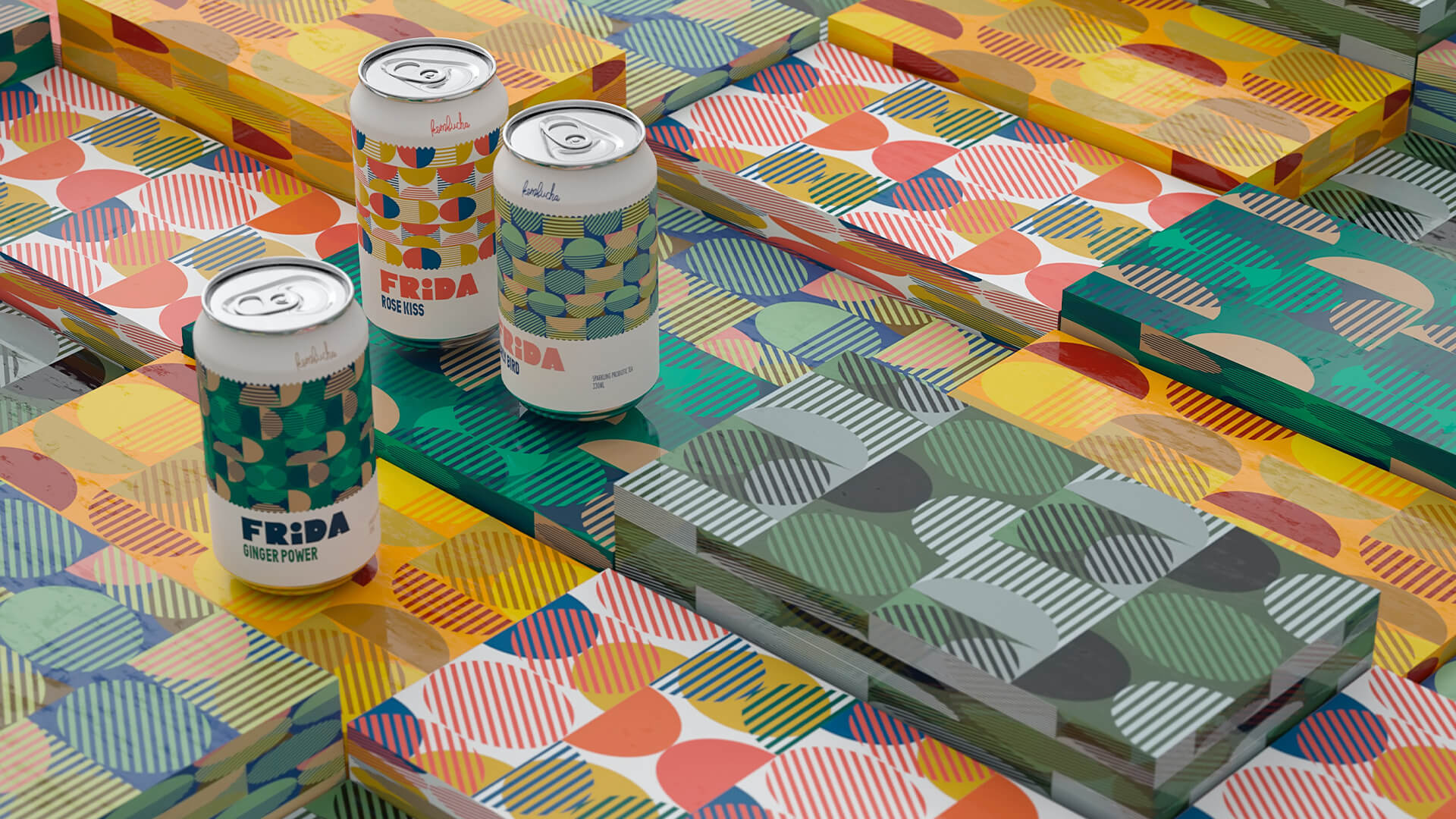 Kombucha Bevarage Brand Identity
Branding is a serious tool and there is a reason why already established brands spend millions on the process as it is a factor that could generate a massive following and therefore sales. Once you have a strategy developed, designers usually provide you with “Guidelines”, which are used to direct designing decisions for marketing and content. You can see a brief of what is usually included with the “Guidelines” HERE.
Don’t spook the visitors – Be careful with your popups
Popups could be modified in all possible ways, which unfortunately doesn’t change the general opinion about them - that they’re annoying. Popups could lower your bounce rates, however, be careful how you design them.
A good popup design that we’ve noticed is one that is designed to appear after visitors reach for the ‘’Back’’ button on a webpage. This is a trigger that would mean they almost certainly were about to leave the page, so the chances to lose them because of the popup is almost zero.
Something that needs mentioning is that there should be a visible button for a popup to be closed, Google doesn’t like when users are not given any options.
The fast and the bounce rate – Website speed optimization
We don’t want to bother you with statistics about the correlation between the website loading speed and the bounce rate. To keep it simple, a slow loading website is playing with visitors patience and is punished by search engines.
There are websites that would let you check the health of your website loading speed such as Google’s page speed insights. You can use it to check what needs to be fixed, things that we usually leave up to our developers.
Keeping it simple
When you are designing your website, you might come across some cool looking scrolling animations and slideshow experiences on Behance or Dribble. We agree that some of them might result in a better visual experience but this is rarely the case. Truth is, taking a step back to the previous point, some of these animations would also slow down your website. Stick to simple and proven stuff, making it easy for your customers to browse through your content and products. Here is an example from a well-established skincare brand which has executed the animations on their eCommerce website to the edge of acceptable level:
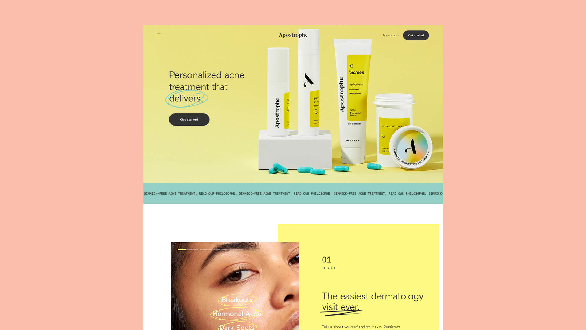 Skincare Treatments – Web Design by Apostrophe Dermatology
If you have an art gallery, portfolio website or anything similar that visuals can be used to impress, go for it. But for an eCommerce store it only makes it difficult to navigate and purchase, keep it simple.
Conclusion
Bounce rate is a useful metric, which would vary depending on the website and its purpose. If your eCommerce store is based around a single product, some of the tips won’t relate, so don’t stress too much about it. For those who have it otherwise, the tips written above could help you significantly drop the bounce rate, which would result in a better experience for the visitors and search engine rates.