Make Your Clothing Brand Stand Out With Web Design
How To Make your clothing brand stand out with Web Design - Upgrade your fashion website UI design with these easy tips.
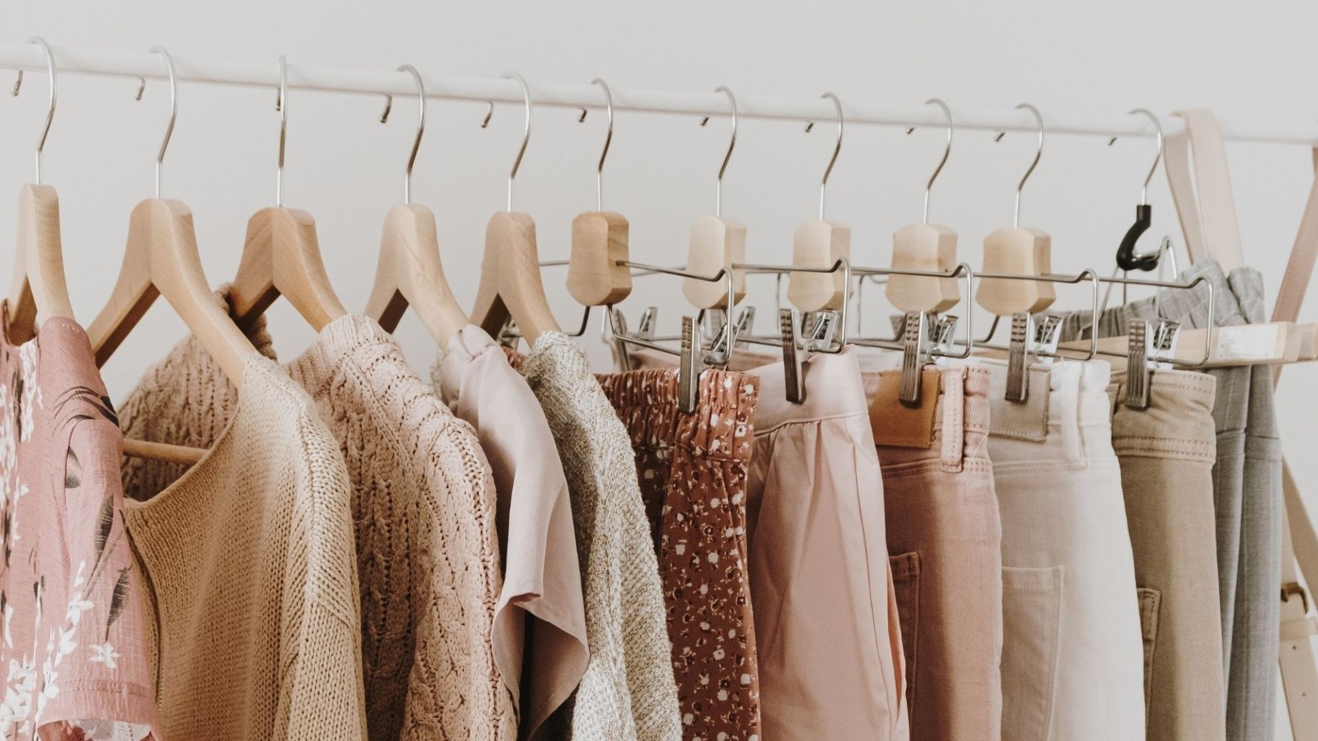
If you were looking for a sign to upgrade or completely re-do your clothing brand website design, consider this: the e-commerce fashion market is predicted to grow by over 50% in 2022. What does that mean for aspiring and established entrepreneurs? Having a fully functional and aesthetically pleasing fashion website UI design has just turned from “just a choice” to a downright necessity.
But is it really worth it?
If you’ve already got some signals that indicate the need of redesigning your website, the answer is yes. With a brand new fashion brand website design, you’ll be able to tackle your specific marketing goals, generate more leads, increase traffic and drastically improve your site’s functionality and user experience. Luckily, there are many web design services that will help you elevate your fashion website UI design according to your budget and needs. Here are some tips to make your clothing brand stand out with web design in 2022 and beyond.
How to make your brand stand out with strategic clothing brand website design
Custom or Theme? Which fashion brand website design is the best?
Business owners are always debating whether or not they should opt for a template or custom website when they start creating their branded online store. While it’s obvious that custom clothing store website designs come with significantly more perks, we have to take into consideration some important factors to determine the right fashion website design for a business’s digital presence.
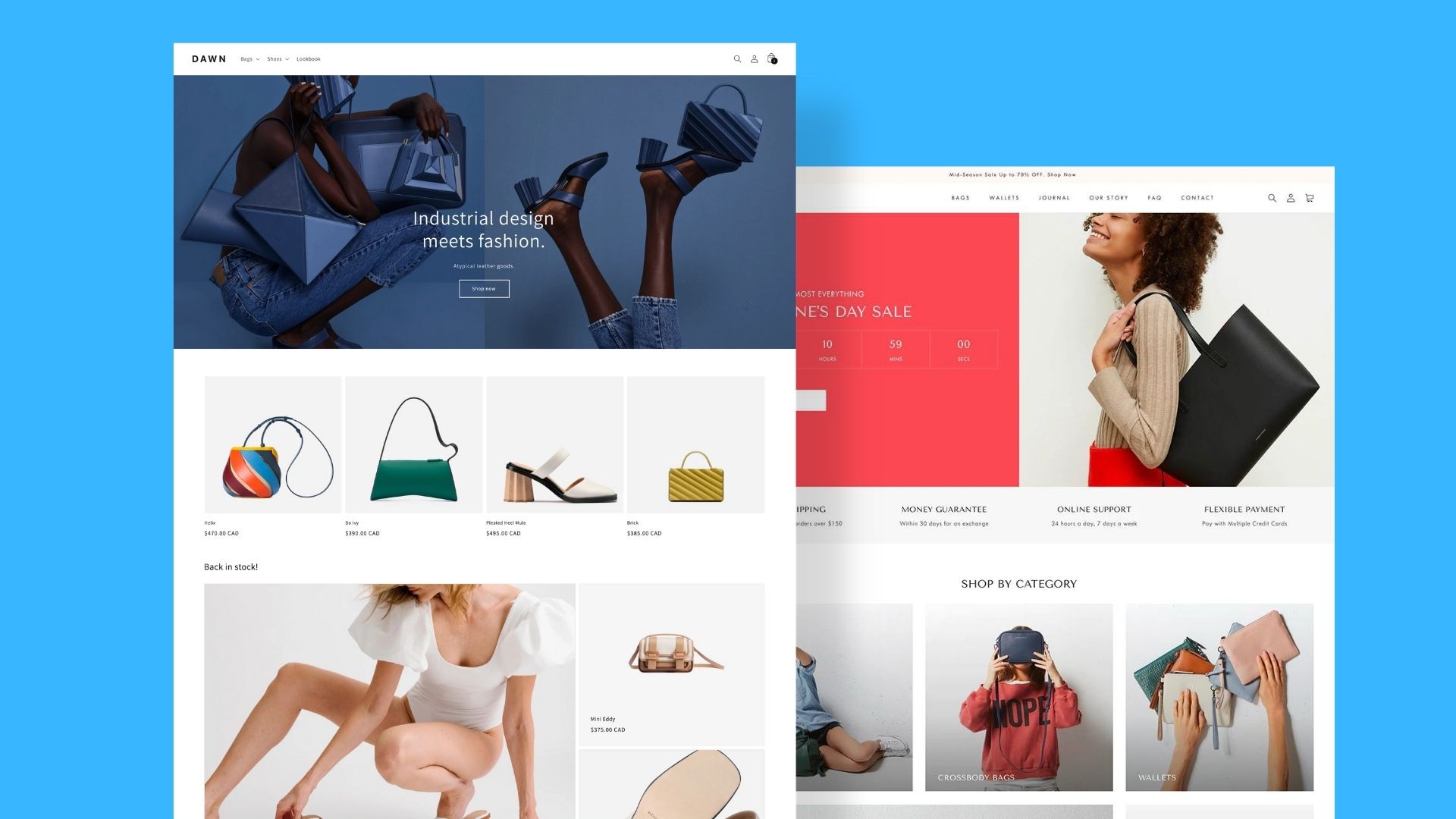 Shopify Clothing Brand Themes
For up-and-coming entrepreneurs, website templates are an affordable, easy way to kick start their business. However, when it comes to big retail owners, having a fully custom store will provide more flexibility and sale oriented optimization. Apart from creating a better first impression for your company, custom website design for clothing brands minimizes any limitations while separating you from the competition.
Clothing Brand Website Ideas
1. Make your homepage stand out
What’s the one thing that every fashion brand website design has in common? A homepage that pops! Upon landing on the page, you only have a few seconds to captivate their attention, inspire trust and spike their interest. From a visitor’s point of view, a website should have a unique aesthetic that’s true to the brand’s identity, easy-to-navigate sections, and the ability to showcase the most important elements without overbearing potential clients. That’s exactly where fashion website UI design really shines with a layout that’s strategic, aesthetically enjoyable, and easy to navigate.
2. Don’t overload your clothing brand website design with pop-ups
Let’s face it - no one really enjoys the excessive use of pop-ups. While they can certainly serve as a great marketing tool, pop us simply interrupt the user experience. So much so that even their inventor, Ethan Zuckerman, has apologized publicly for creating them. Does that mean that you have to remove all pop-ups? Of course not. They can actually be very effective in your quest to collect emails if you manage to find the right way to provide value and ease frustration.
3. Focus on your photography
We previously discussed the importance of product photography and how it can enhance your clothing brand website design immensely. Lookbooks and product photos alike are a core part of any business. In fact, 75% of online shoppers rely on product photos when deciding on a potential purchase.
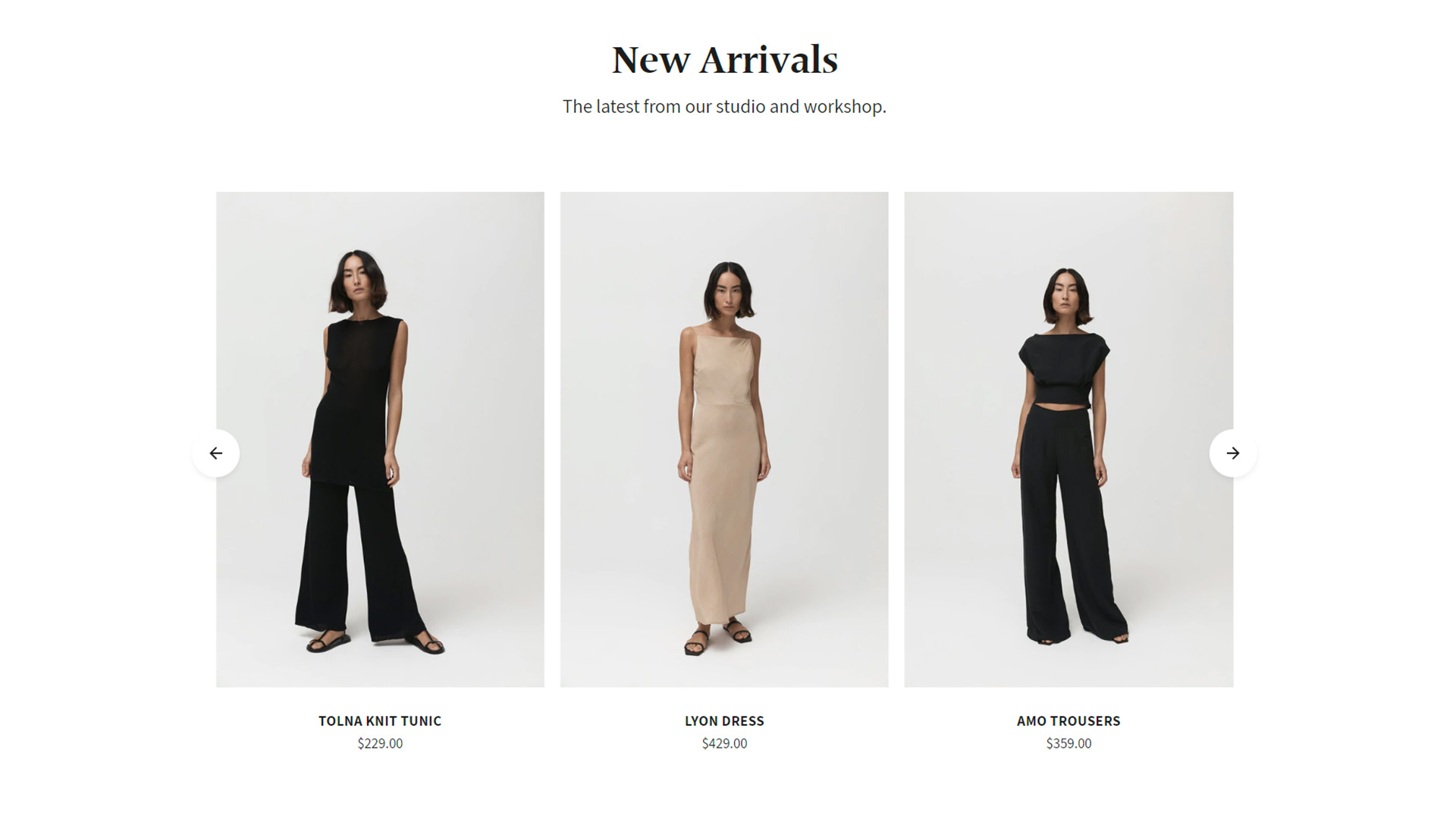
Certainly, each brand has its own aesthetic, however, certain unwritten rules can take your product images to new heights and improve the overall look of your fashion brand website design. Clean, high-resolution photos of products displayed against a white background and/or with a model will always be the go-to and make your brand look more “professional” and high-quality.
4. Split products into collections and categories
One of the most important mistakes startups do is to not filter their products correctly. By splitting products into collections and categories, visitors will be able to find exactly what they are looking for in record time which will also improve your fashion website UI design. When a potential client lands on your website they should know what you’re selling and how to find it right away.
5. Use promo videos for new collections
All markets agree that 85% of customers feel more comfortable about buying after watching a product video. Surely, copywriting is what makes your brand come to life. However, promo videos advertise a product more engagingly. Clients can have a better idea of how a piece of clothing looks from different angles in a more natural, candid way. In fact, studies show that 54% of consumers want to see more video content from a brand or business they support and 72% of customers said they would rather learn about a product or service by way of video.
6. Add character to your clothing brand website design with branded fonts and colors
When it comes to a stellar clothing brand website design, fonts and colors play a huge role in your overall image. Remember, color has a big impact on psychology by evoking certain emotions. Of course, readability is extremely important and so are contrasting colors.
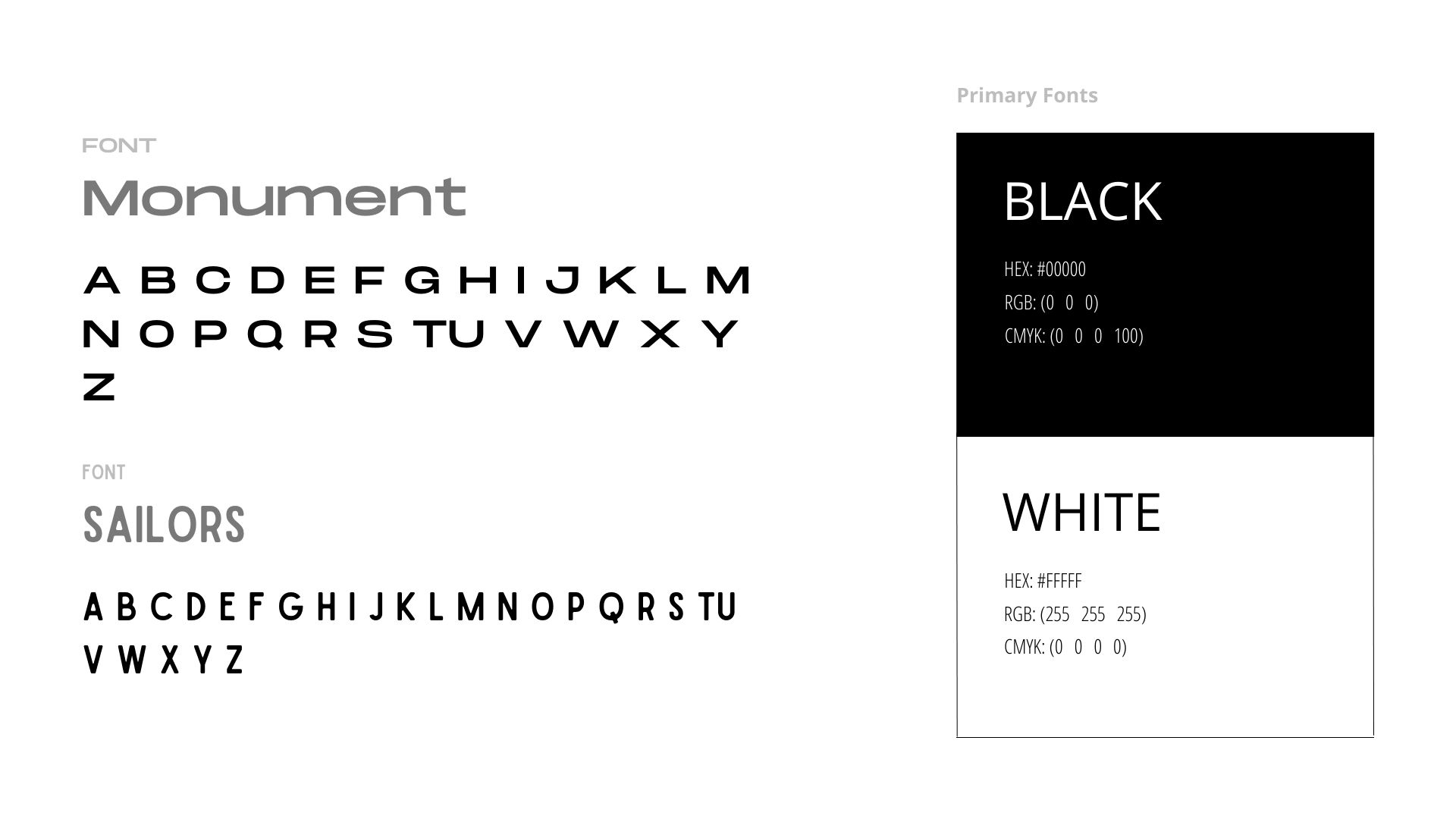
But did you know that certain fonts also influence the image of your brand? In the psychology of typography, Serif fonts are associated with authority, tradition, respect, and grandeur. Modern fonts are associated with exclusivity, fashionable, style, sharpness, and intelligence. The list goes on and on. When building a website design for a clothing brand, you should consider your target audience (traits, aesthetics, habits) and tailor your branded fonts and colors accordingly.
7. Keep your text minimal
You already have a pretty good idea of how your clothing brand website design should be in terms of categories, homepage structure, and visual presentation. But how about the info pages?
While you might be tempted to add as much text as possible to paint a clear picture of your vision, story, mission, and goals, keep in mind that the least text content you have, the better. Your About Us page, for example, should include a mix of creative storytelling, and lots of visually-intriguing content (images and videos) to capture the attention of your customers and inspire them to keep reading.
Top Fashion Website Designs & Ideas To Inspire You
Luckily, there is no shortage of clothing brand website ideas and inspiration to help you get a glimpse of all the aforementioned tips in action. The labels below are using stellar fashion website UI design strategies to make their homepages pop, inspire trust and attract thousands of new leads.
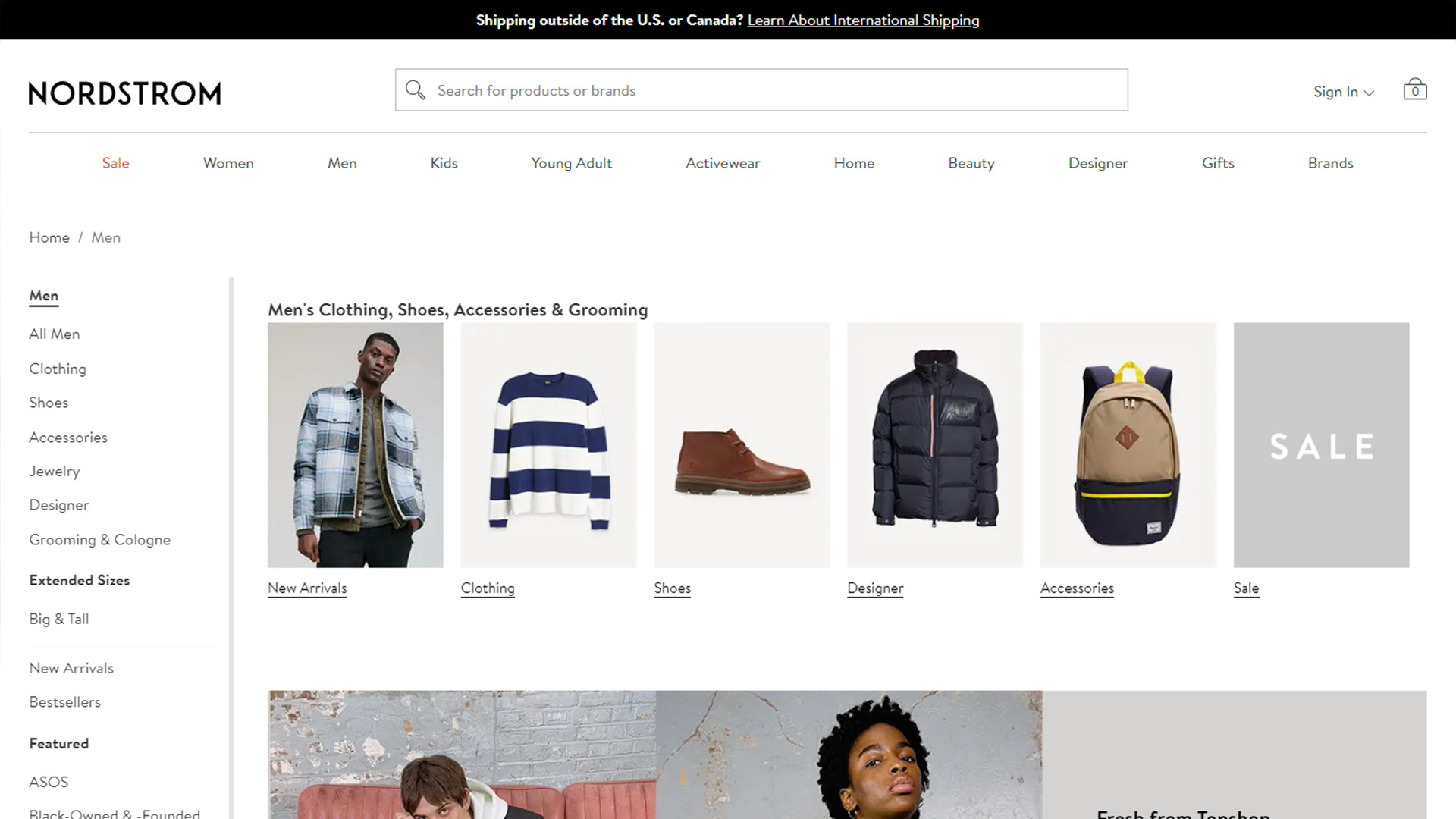
On average, Nordstrom generated sales of about 41.01 million dollars per store in 2019 making it the top luxury apparel retailer in the United States in terms of sales. The company has a large retail section that includes Great deals on popular items, the most popular styles of the month as well as many separate categories that allow visitors to shop by trend, opt for their new releases and get a glimpse of what the most-viewed items by shoppers in your area. It goes without saying that Nordstrom knows how to use filters, categories and smart recommendations that make their fashion brand website design extremely easy to navigate.
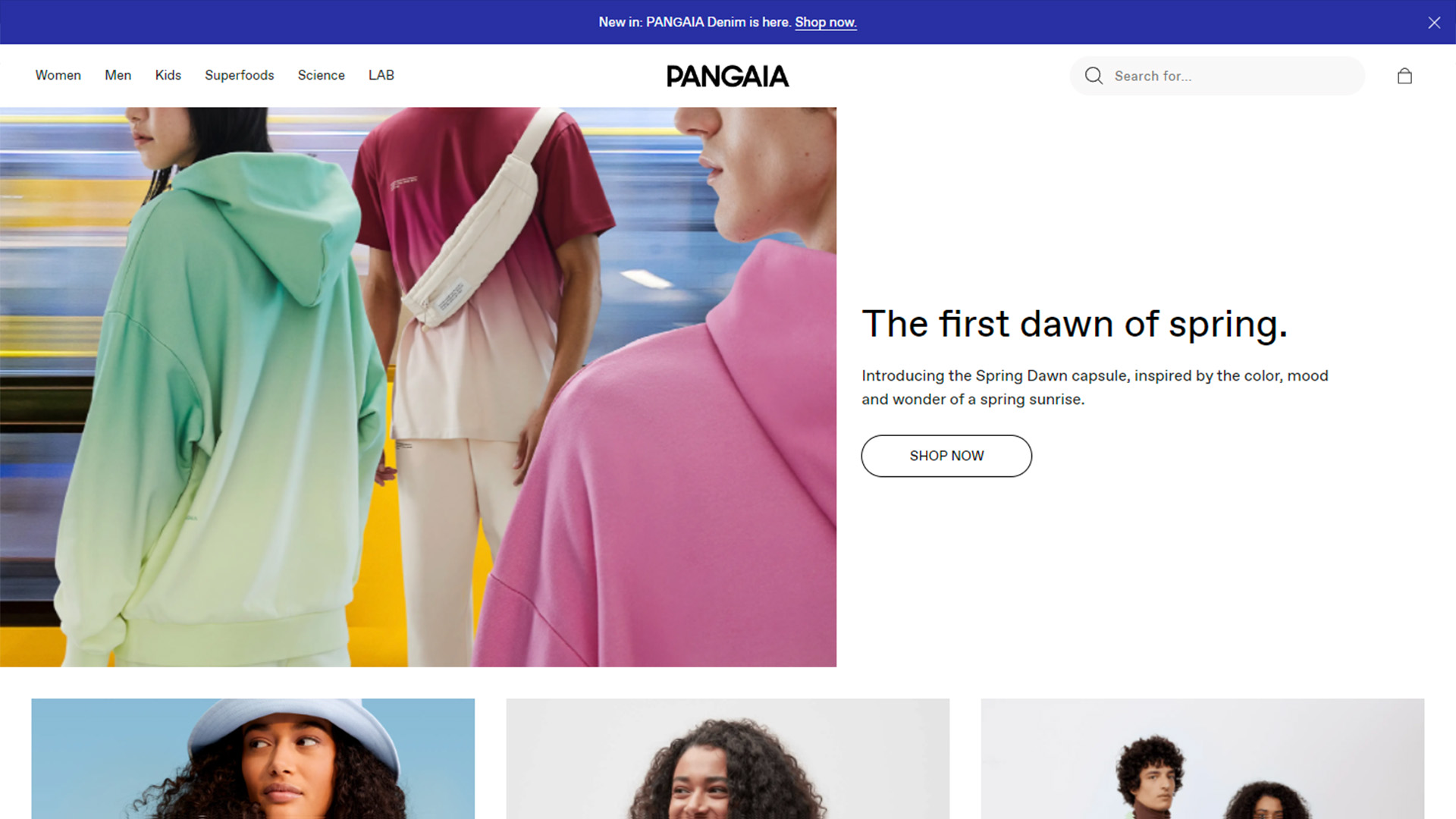
Forbes described Pangaia as a Startup that is “Reshaping What It Means To Be A Sustainable Fashion Brand” and for a pretty good reason. Apart from their amazing collection of ethically-made pieces, their clothing brand website design also reigns supreme above the competition. The branded store has a minimal yet informative homepage that consists of the mission statement and direct links to every collection. They use high-resolution images with monochromatic backgrounds and a neutral color palette with easy-to-read fonts that pop!
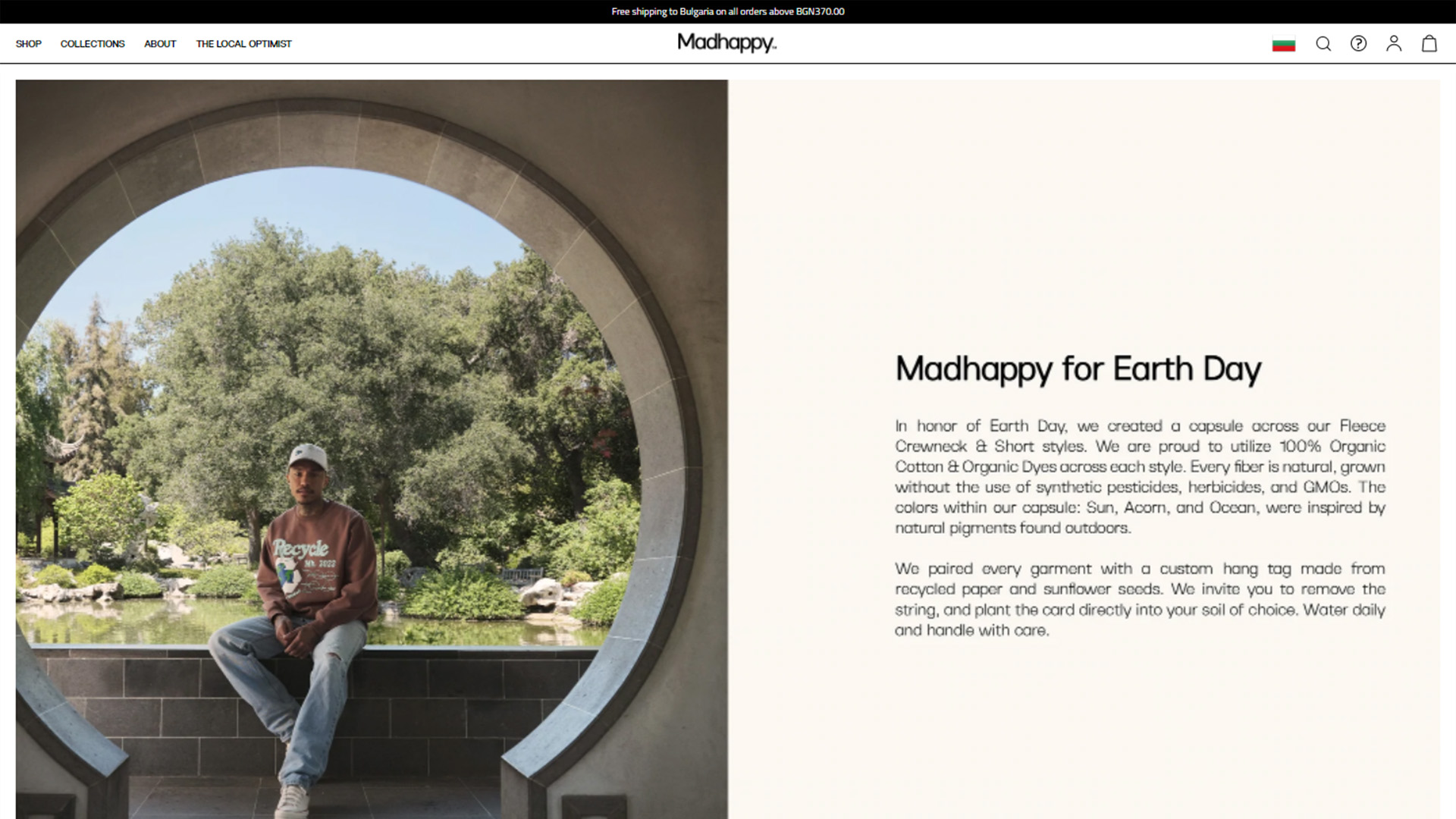
MadHappy is a lifestyle label that lets striking product images do all the talking. Their simply fashion website UI design features direct links to the most popular categories along with a full-width banner at the top of the homepage to inform visitors of their newest releases. Their about page has minimal texts, enhanced with bright, high-res images to make it more reader-friendly.
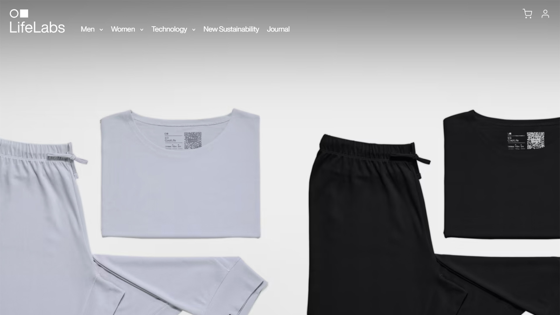
LifeLabs uses a very modern fashion brand website design that highlights the most important aspects of the clothing company and inspires action. They divided their homepage into multiple different sections to educate potential customers on their ground breaking material science, and newest releases, while also offering a breakdown of their Technology. At the bottom of the page, visitors can access the brand’s blog to learn more about their story and impact. The font is really simple and stands out against the dark-colored backgrounds.
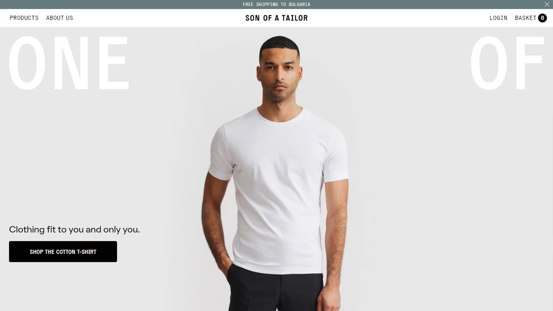
Son Of A Tailor’s clothing brand website design is packed with striking product images, animations, and videos to grab the attention of new and returning clients. The brand offers made-to-order staples with a huge emphasis on sustainability and ethical manufacturing practices. They have a direct link to their about us page where they share all the information about how they turn landfill waste into custom clothing. Additionally, they filter all products by categories and highlight the “THE MOST ORDERED” pieces on their homepage.
Upgrade Your Clothing Brand Website Design & Make Your Ecommerce Store Stand Out
Whether you decide to opt for a template or have a completely custom clothing brand website design, the ideas above will help you avoid some of the most common mistakes. It only takes a moment to browse through the top fashion website UI design examples to understand that there is a recipe for success.
With an engaging homepage layout, multiple, easy-to-navigate categories, strategically placed pop-ups, and the right use of color and font phycology, you will certainly be able to upgrade your fashion brand website design and score more leads.