eCommerce Website Structure - Blueprint For Business Owners
Website Layout Design for Online Store - Top guide for business owners on how to structure and design a eCommerce website for optimal results.

Most people know that in order to be successful in eCommerce, you need a well-structured website. But what does that mean exactly? And how can brand owners create a website that will help them achieve their business goals?
In this article, we'll provide a blueprint for structuring your eCommerce website and explain the benefits of each element.
Let's get started!
What is an eCommerce website?
An eCommerce website is a website where you can buy and sell products or services online. They can be used by businesses of all sizes, from small to large corporations.
There are many different ways to structure an eCommerce website. With that being said, there are certain features, pages, and content that the vast majority of eCommerce website owners will want to include.
Stick around to find out what those are!
The elements of an eCommerce website
Before we get into some of the more specific details of structuring an eCommerce website, let's take a quick look at the basics.
Every eCommerce website needs the following elements:
- eCommerce platform
- Pages
- Content
- Features
Don't worry if you're new to eCommerce or web development, we'll be going over each of these elements in much more detail!
What is the best platform site for eCommerce?
The first element of an eCommerce website is the eCommerce platform—or at least a web development platform with eCommerce feature. What we're talking about here is the software that runs the website and allows you to sell products or services online.
There are many different platforms available for building online stores, including:
- Shopify
- Wordpress
- Magento
- WooCommerce
There isn’t necessarily a best one to choose, but all the platforms mentioned above have pros and cons, so it's important to do your research before making any final decisions. For more guidance on choosing the perfect eCommerce platform for your business, check out this Wordpress vs Shopify guide.
What pages should your eCommerce website include?

The second element of an eCommerce website are pages. These are the individual pages that make up your website. Each page should have a specific purpose, and should be designed to help you achieve your goals.
Some common pages that all eCommerce websites should include:
Home Page
This is the main page of your website. It's the first thing that your visitors see when they visit your site, and it usually contains information about your business, products, and services. It's also a good place to showcase your brand's personality and style.
About Us
This page is a great opportunity to tell your visitors more about your business and what makes you unique. You can also use this page to list your team members, share your company history, and describe your mission and values.
Product Pages
These are the pages where you'll showcase your products or services. It's important to make it easy for your visitors to find the information they need on these pages, so be sure to include clear titles, descriptions, and images.
Contact
This page should include all the necessary information your visitors need to get in touch with you. It's also a good idea to include a contact form so that visitors can easily send you a message.
Privacy Policy
This page is required by law in most countries, so be sure to include it on your website. It should include information about how you collect and use your visitor's data.
Terms of Use
This page is also required by law in most countries. It should include information about the rules and regulations that apply to using your website.
Shipping and Returns
It’s important to mention all logistic details in this part of your website. Where people will learn the rules of your return policies to your shipping rates.
What content should an eCommerce website contain?
The third element of an eCommerce website are the contents. This is the actual text and images that appear on your website. In order to create a successful eCommerce website, you'll need to include content that's both engaging and informative.
Some of the most important types of content you should include are:
Bestsellers Section
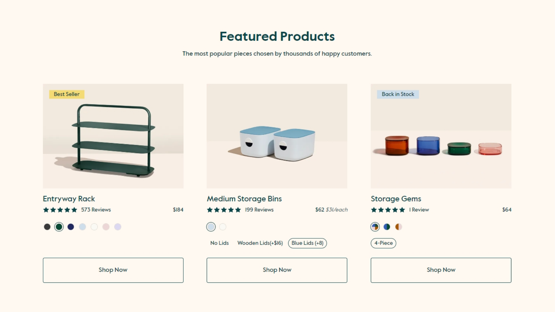 Open Spaces Featured Products
This section can be used to showcase your most popular products or services on your homepage. This is a great way to help visitors quickly find your best selling products and also to make it easy for returning customers to buy the products they're after right away without navigating for a long time.
Product Descriptions
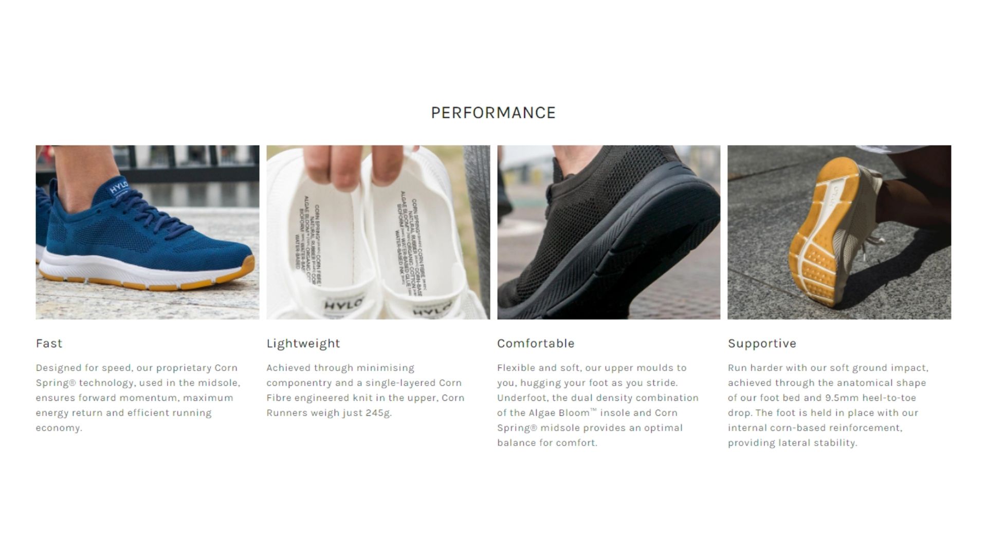 Hylo Athletics Product Highlights
Your product descriptions should be clear and concise, and they should accurately represent your products or services. You should also make sure to use keywords throughout your descriptions, since it help you with ranking on search engines.
Blog Posts
 AireCBD blog section
Your blog posts can be a great way to engage with your visitors, and they can also get you on the first page on Google. Be sure to write blog posts that are relevant to your business by providing solutions and insights. Also experiment with different keywords and publish at least once per week. It takes time to become an authority on search engines and that’s why we wrote an entire Content Strategy post about the topic.
We’ve also talked about some great eCommerce blog examples, so check them out if you looking for inspiration to start ranking.
Images
 Nibelu skincare product photos
Images are the only way to showcase your products or services, that’s why you need to make sure to use high-quality images that accurately represent them. This will not only make you increase sells, but also reduce return rates.
What features does your eCommerce website need?
The fourth element of an eCommerce website are the features. These are the specific functions and tools that your website needs in order to be successful. Some of the most important features you should include are:
- Pop-up Cart: A pop-up shopping cart is the one that shows up on the side of the screen once something is added. It's a nice, subtle reminder that a customer has items in their cart where they can easily edit its contents. This makes checking out easier and can also be used for upsells.
- Secure Checkout Process: Your checkout process should also be secure, so your visitors can feel safe entering their personal information. For that you’ll need an SSL certificate and also to show the payment methods that you accept.
- Customer Account Management System: A customer account management system is a great way to keep track of your customers' orders and preferences. This system can also help you create targeted marketing campaigns. Good example of a CRM system would be HubSpot.
- Product Filtering: If you have a large selection of items on your store, product filtering is a great way to help your visitors find the products they're looking for. Common filters include gender, size, color, fit, and product category
- A Navigation Bar: This is rather basic of course and every website has it, but you have to keep in mind to keep ONLY the most important links and add dropdowns whenever necessary so it’s easy to navigate.
- Customer Reviews: Customer reviews can be a great way to help boost your site's credibility. That’s why you’ll need testimonial section or integrated Instagram feed that will feature influencers and happy customers.
Top eCommerce website examples
The website examples may be in different niches, but they still have the earlier mentioned characteristics. There is no specific order to include them, that’s why you get to experiment, move these crucial sections around and see what works best for your audience.
CBD Oil Drops: Aire CBD

Aire is a CBD eCommerce brand that is focusing on a clean minimalist look. Simple navigation, where pretty much everything can be found on the homepage. They have only three products which they have featured beneath the main banner. Great CTA button locations and social proof from their Instagram feed and featured logos. Product photos and images are original and authentic throughout their entire website.
Skincare: Nibelu

When you have a lot of items on your website, the most difficult part is to make everything easy to find. That’s why Nibelu is a great eCommerce example of a beauty brand with large selection of products. They have great filtering system on the product pages, search bar on the homepage and mega menus in the top navigation. Each of their section has great breakdowns through different collections with well ordered CTA’s.
Running Shoe Brand: Hylo Athletics
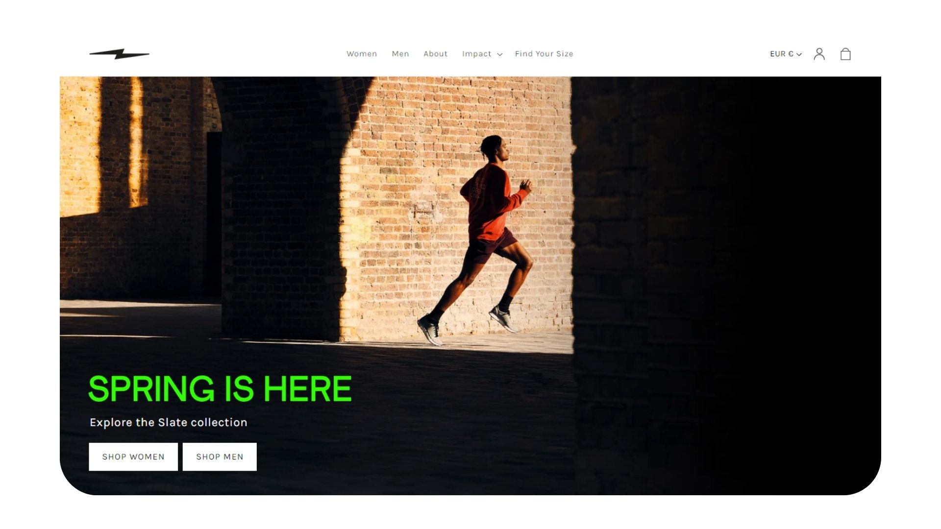
Simply said Hylo sells Men and Women version of its shoe in different color ways. Great CTA on the main banner where you get forwarded to the product page and the only thing left is to choose a color. On the homepage you can also find a review section, about us and a non-disruptive banner animation. Effects and movements have to be limited when it comes to eCommerce, since shopping experiences need to be functional and focused on the products, which Hylo has balanced perfectly.
Clothing Brand: Rains
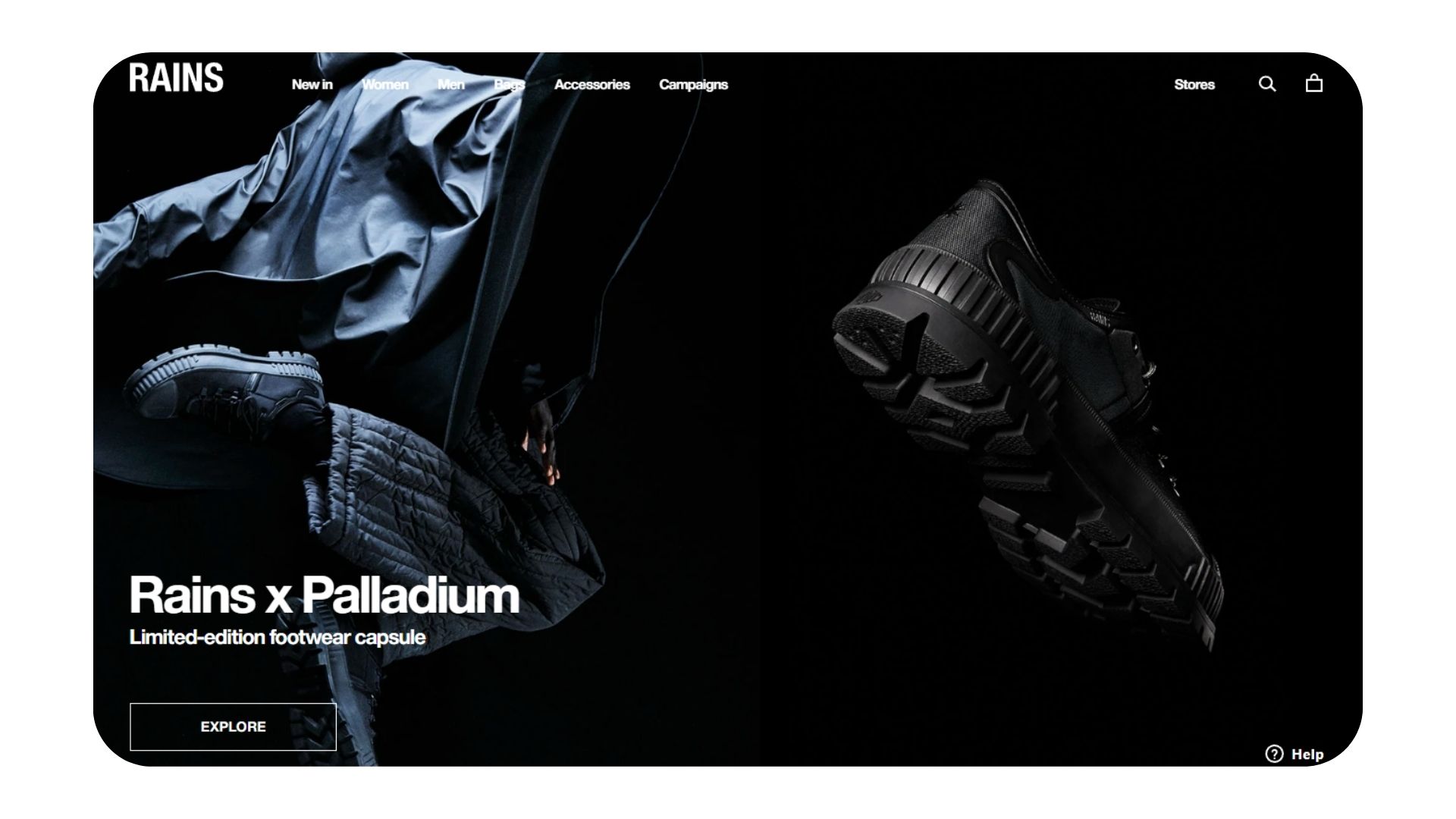
Another online store with large selection of items, that has made filtering easy to navigate. Categories are split in Men and Women clothing, but this time with a “New in” link to promote new collections. While the aesthetic of the design seems to be targeting younger generation of customers, this type of layout can also be observed in many big brands in the industry.
Home Organizer: Open Spaces
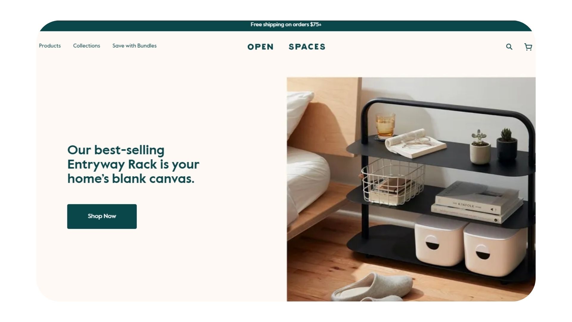
Open Spaces sell home organizer essentials, and the structure of their eCommerce store is one to mention. Each section is a feature of their unique products, followed by CTA’s and offers that make users engage. Reviews, Instagram feed and media mentions cover the social proof side. While their amazing photography skills, show the products at their best. Something worth mentioning is that their discount pop-up is in the bottom left corner, and it only shows when clicked. How less intrusive is that?
Final Thoughts
When creating your eCommerce website, it's important to remember that the most important thing is to design it for your visitors. By following the tips above, you can create a website that's both engaging and informative, and that will help you achieve your business goals.
If you need additional help creating an eCommerce website for your business, feel free to reach out to the Saikai development team —we’re always happy to help!