Supplement Packaging Trends - Get Noticed Through Branding
Get inspired by the top supplement packaging trends & create the best custom vitamin packaging tailored to your business identity.
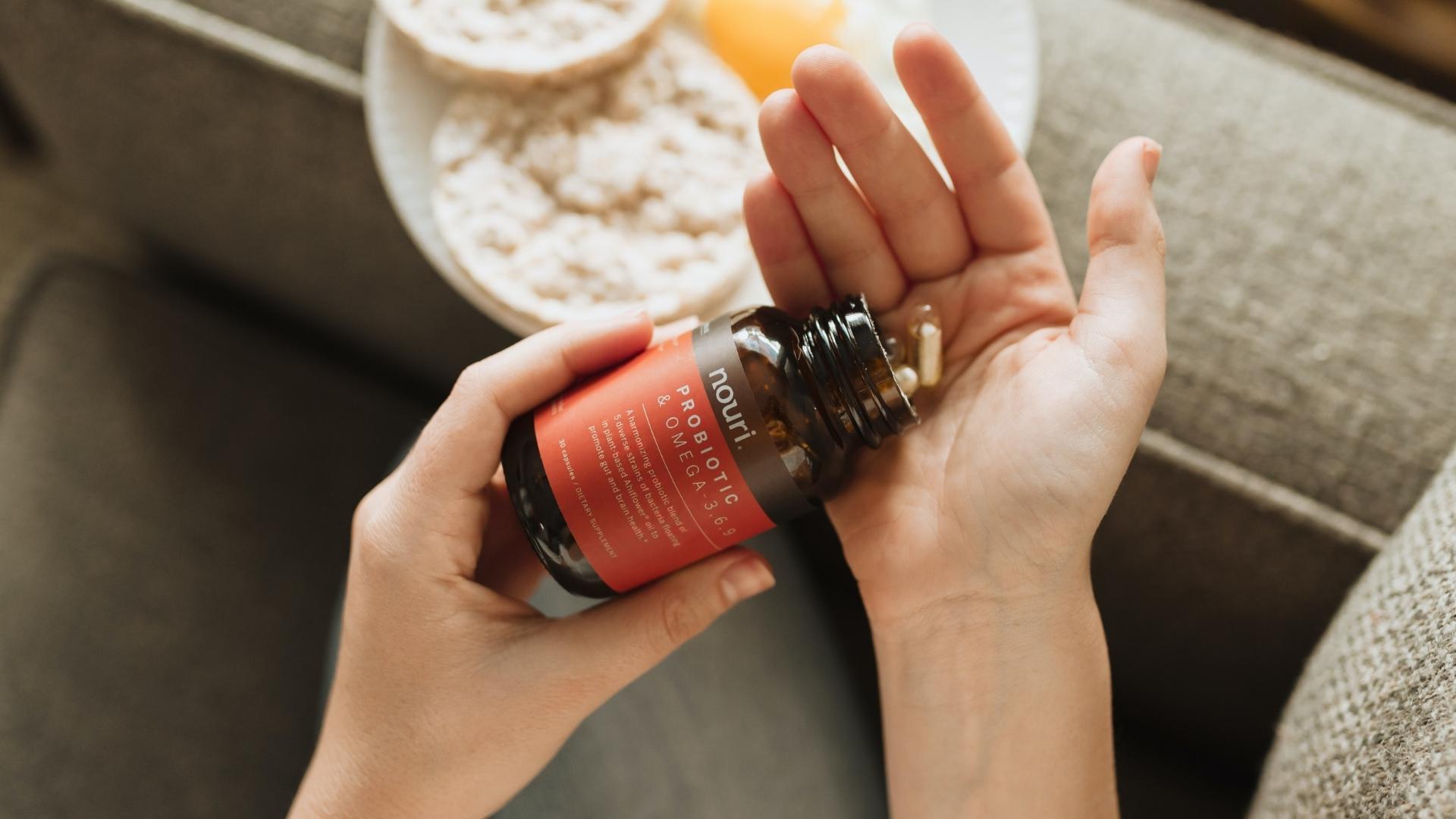
The top supplement packaging trends are here to offer us some much-needed inspiration to nail the branding game despite the high competition. According to Nutrition Business Journal (NBJ) Global Supplement Business Report, the predictions for 2022 are in your favor. They estimated a 3.8% growth in the global supplement market which will most likely reach $173.92 billion.
What does this mean for your supplement packaging design? Now is the best time to capitalize on the ever-growing market with unmissable custom vitamin packaging that perfectly reflects your business.
Let’s not forget that when customers are presented with beautifully-designed packaging that speaks to their aesthetic, it definitely has an impact on the way they perceive your brand. Consider creative supplement packaging design as a way to silently communicate your brand values, built trust, and differentiate your supplement brand in an over-saturated market.
We round up the most noteworthy supplement packaging trends you need to put on your radar in 2022.
5 top supplement packaging trends to inspire your design
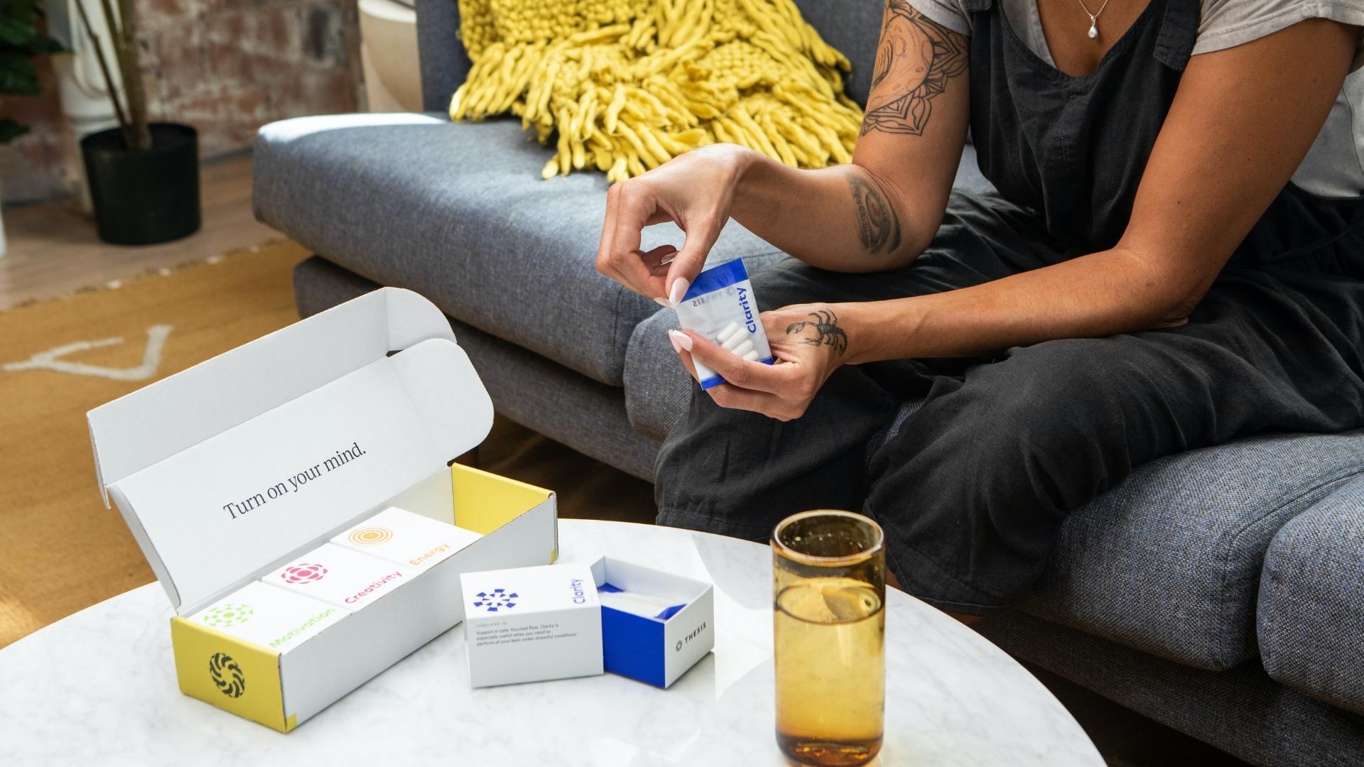
1. Make your supplement packaging design stand out with a great brand strategy
At first glance, you might think that it's impossible to stand out and actually leave a memorable impression with your newly founded supplement business. But that's certainly not the case if you have a stellar brand strategy to help you tackle all your goals. The first thing you need is to have a unique, creative identity that “speaks” the language of your ideal customers while also representing your values and mission. This goes beyond your custom vitamin packaging. It covers everything from your brand personality, voice, and position.
Once you establish your brand strategy, you can tailor your supplement packaging design (including fonts, colors, graphics) accordingly to align perfectly with your brand identity.
2. Embrace minimalism
Over the last few years, you might have noticed that the most popular supplement brands have tapped into minimalism. When you are looking for vitamin packaging design inspiration, simple, clean styles reign supreme. A great idea would be to remove all the fluff from the packaging label and keep the most important legal information along with the necessary branding details. Remember, sometimes, the simplest ideas communicate the message the quickest.
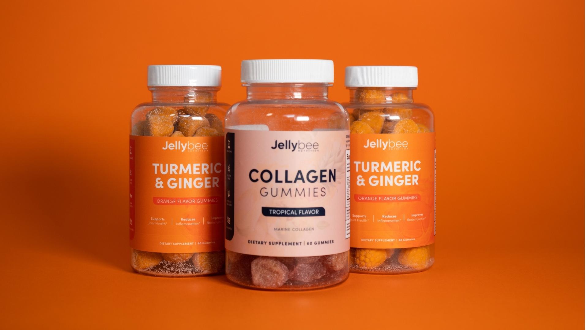
3. Create a more personalized supplement packaging experience
Some brands boast character, so why hide it? With creative supplement packaging design, you can create a personalized packaging experience for your loyal customers who just “get you.” Instead of sticking to the basics, leverage the art of copywriting and visual storytelling to make your brand stand out. Did you know that, according to research by Headstream, if people love a brand story, 55% are more likely to buy the product in the future, 44% will share the story, and 15% will buy the product immediately?
4. Close the circle with sustainable supplement packaging
Here are some things you should really take into consideration during your quest to find the best vitamin packaging design inspiration. 53% of consumers prefer green or sustainable products? On top of that, 75% say they would pay more for environmentally friendly products. Of course, this includes packaging as well. As more and more people are taking the eco-conscious route,2022 is the best time to introduce sustainable supplement packaging to your customer base.
5. Multipurpose supplement packaging designs
Here’s the thing; we are all impacted by striking visuals. Bright colors, big headlines, and beautifully-designed things caught our attention instantly. This is one of the reasons you should consider multipurpose packing.
Sure, your favorite supplement packaging design looks beautiful on your eCommerce’s virtual shelves, but does it steal the attention when displayed in physical stores? Multipurpose, creative supplement packaging design should provide information faster, easier and most importantly, gain and maintain the attention both online and in real life.
Examples of the best supplement packaging designs
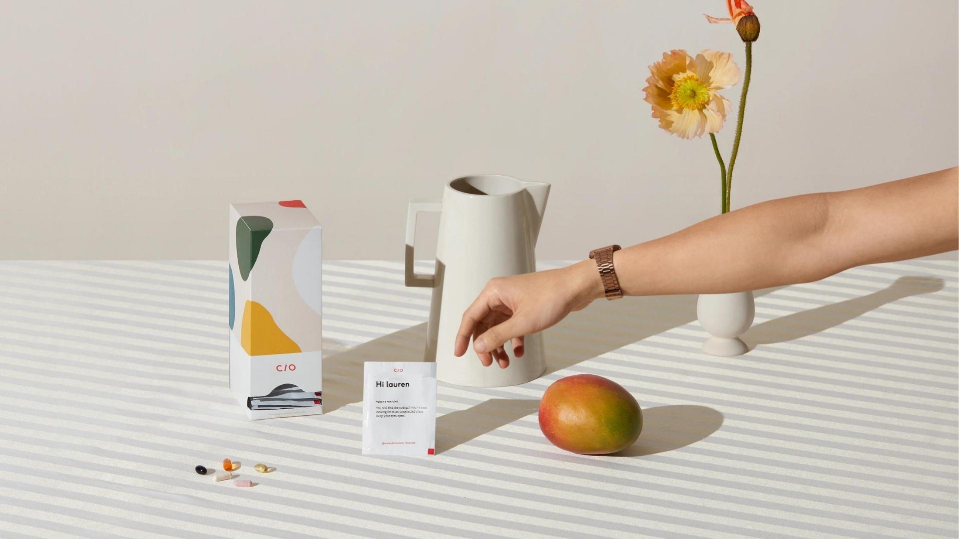
Care Of’s products have gained the title of the most display-worthy due to their amazing creative supplement packaging designs that perfectly represent their brand personality and aesthetic. The packaging is light-colored with beautifully-placed aesthetic. The packaging is light-colored with beautifully-placed green, olive, yellow, red, and orange abstract artwork plastered across it.
Despite their colorful look, the overall design is pretty minimalistic featuring only the most important information and ingredients. Thanks to their multipurpose, creative supplement packaging design, they can now catch the attention of Target shoppers who are looking for the best vitamins and supplements to add to their self-care routines.
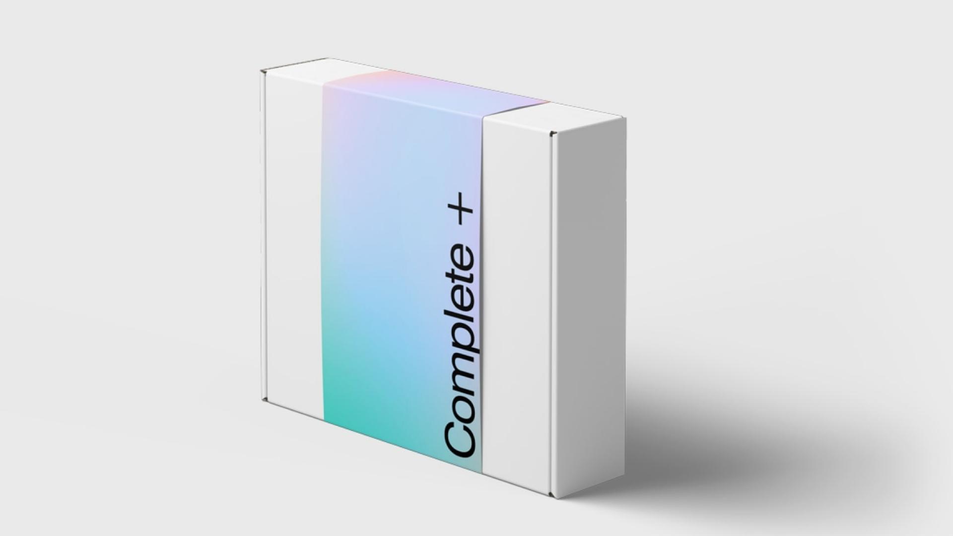
Get Base’s innovative personalized diet and routine suggestions along with their ability to offer a great way to track vitamin and hormone levels is what makes this company so popular. The end goal? To give convenient, accessible, and potentially life-changing solutions. In order to start your at-home testing journey, the company sends over a kit to collect samples, and frankly, we haven’t seen a more impressive packaging design for samples than this one. The plain white box is dressed in a gradient-colored sleeve that perfectly matches the brand’s color palette and identity. The color combinations vary depending on the type of kit.
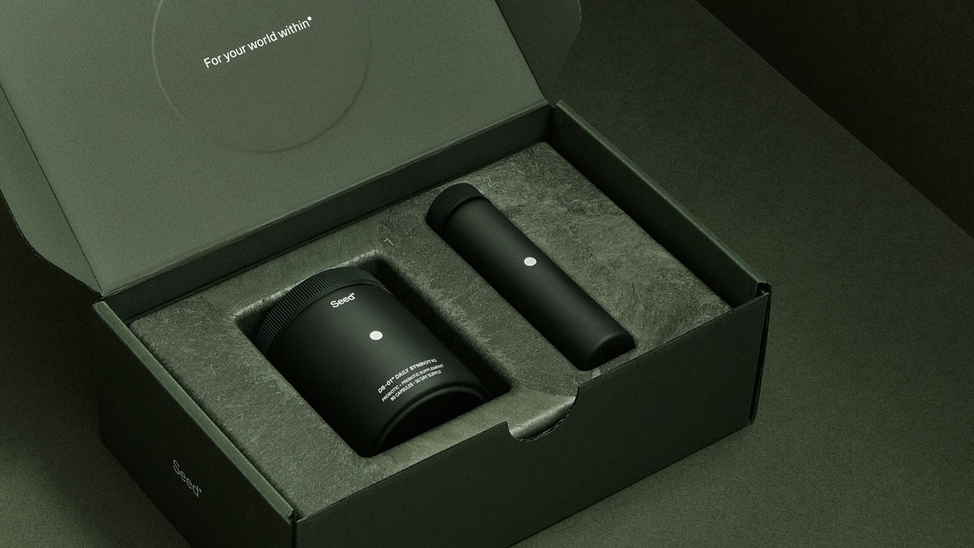
Granted, when we think of Seed, the color green instantly comes to mind. The supplement packaging design is simple, minimalistic yet very informative due to the strategic font and color options. White stands out against the deep green color which makes the branding details instantly visible.
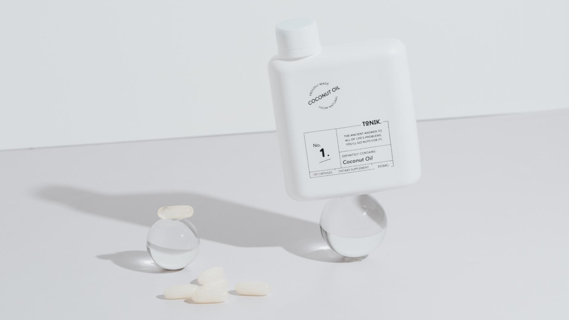
Tonik’s creative supplement packaging design has a very unique shape and a very unique font combination. While other companies keep the lettering pretty minimal, this brand uses calligraphy fonts in combination with easy-to-read information about the products. We can instantly notice catchy phrases that perfectly alight with the company's voice like “the insider scoop is that ACV is known to have even more benefits than ya mum’s apple pie.” Overall, it’s a fantastic supplement packaging design for minimalists who want to rise above the competition.
To Sum Up
It’s time to use the top Supplement Packaging Trends to your advantage!
While every brand has its own, unique creative identity, the best creative supplement packaging design ideas can offer you all the inspiration you need to create something personal to your own style, voice, and values. Minimalism will always be one of the strongest candidates, but for personality-packed brands, bright colors and catchy phrases will always be preferred. Remember, your new, custom vitamin packaging should be created with a multi-purpose use in mind - because let’s face it, it’s all about making a visual statement.