Top 10 Skincare eCommerce Website Designs
Best Skincare Website Designs & ideas - Get inspiration for your new skincare website design layout from top brands and get your eCommerce running right away.
Let’s be honest; when it comes to skincare website designs, functionality is almost as important as aesthetics. While many other niches can get away with simple styles, that's certainly not the case for skincare website layouts.
The best skincare website designs have something in common
It only takes a few seconds to scroll through our best skincare web design ideas below to realize that most of these brands have something in common. Each one of them have aesthetically pleasing colors, beautiful product photography, and striking front-page visuals.
On top of that, custom skincare websites also offer the most user-friendly shopping experience that inspires people to keep browsing for more. However, if you are on the quest to find the best skincare website design inspiration for your new business, chances are that you don’t really know what elements should be present to take your brand to new heights.
So let’s first go through the basics.
What should a skincare website design include?
A great skincare website banner design
One thing is certain - you won’t be able to find a skincare website design layout that doesn't include a striking banner offer with great CTA button somewhere on the page to increase sales. The most prominent brands put much emphasis on skincare website banner design - because it converts. Consider it as a digital billboard that’s consistent with your overall brand identity and also adheres to your current marketing goals.
Easy navigation and many filtering options
What differentiates the best skincare website designs from those that simply miss the mark is the amazing user experience. Most brands have many products to offer which sometimes makes it difficult for the customer to spot what’s right for them. That’s exactly why easy product navigation for new and returning customers should be a core element of your skincare website design layout. Let’s not forget the importance of offering the ability to filter large sections of products with a few simple clicks.
Reviews and testimonials
Sure, most businesses can benefit from flaunting their reviews and testimonials around with pride. But for skincare brands, in particular, it’s the ultimate way to build trust, showcase your success and give your customers that final push they need to opt for your products.
You’ll notice that the best skincare web design layouts above all have customer and influencer reviews/testimonials - because they work!Before and after imagery to showcase the effectiveness of the products
If you’ve browsed through enough website design inspiration for skincare already, you know that before and after imagery is a must. When it comes to skincare, customers look for great solutions to specific concerns. Photos speak a thousand words, so make sure to include some amazing results to showcase your product’s effectiveness. Remember, it’s one of the most important additions to your skincare website design layout, and thus, it should be immediately visible.
Sign-up forms to collect emails and offer discounts & rewards
No matter your niche, email marketing is a fantastic way to build relationships with your customers and get new leads in the process. From attracting new clients to inspiring past customers to come back for more, your skincare website design layout needs to include special forms to collect emails. Whether you decide to offer discounts upon signing up, insider tips, or promise to be the first to know about every new product launch, one thing is certain. It definitely helps with retargeting campaigns on social and email marketing.
Personalized quizzes
If you browse through our list of the best skincare web design ideas below, you’ll quickly notice that most brands use quizzes to attract new customers and offer a personalized experience. We already talked about how to create a skincare routine quiz for your website and why it should be a part of your skincare website design layout. Spoiler alert: ECommerce product recommendation quizzes drive 80% of consumers to actually make a purchase when provided with something completely personalized.
An active blog
Last, but definitely not least, all skincare website designs should also include an active blog. We highlighted all the ways blogging for eCommerce businesses can help get sales in a previous article. In fact, Businesses that blog get 55% more website visitors than businesses that don't. On top of that, you’ll get the chance to Educate readers about your skincare products. The benefits are many!
Best skincare web design examples & ideas
If you are looking for minimalistic website design inspiration for skincare, Ten over Ten is a prime example of how a custom Shopify skincare website can be tailored to your own, personal style and brand identity. The color palette is neutral with an emphasis on creating a calming, clean environment for customers to freely browse.
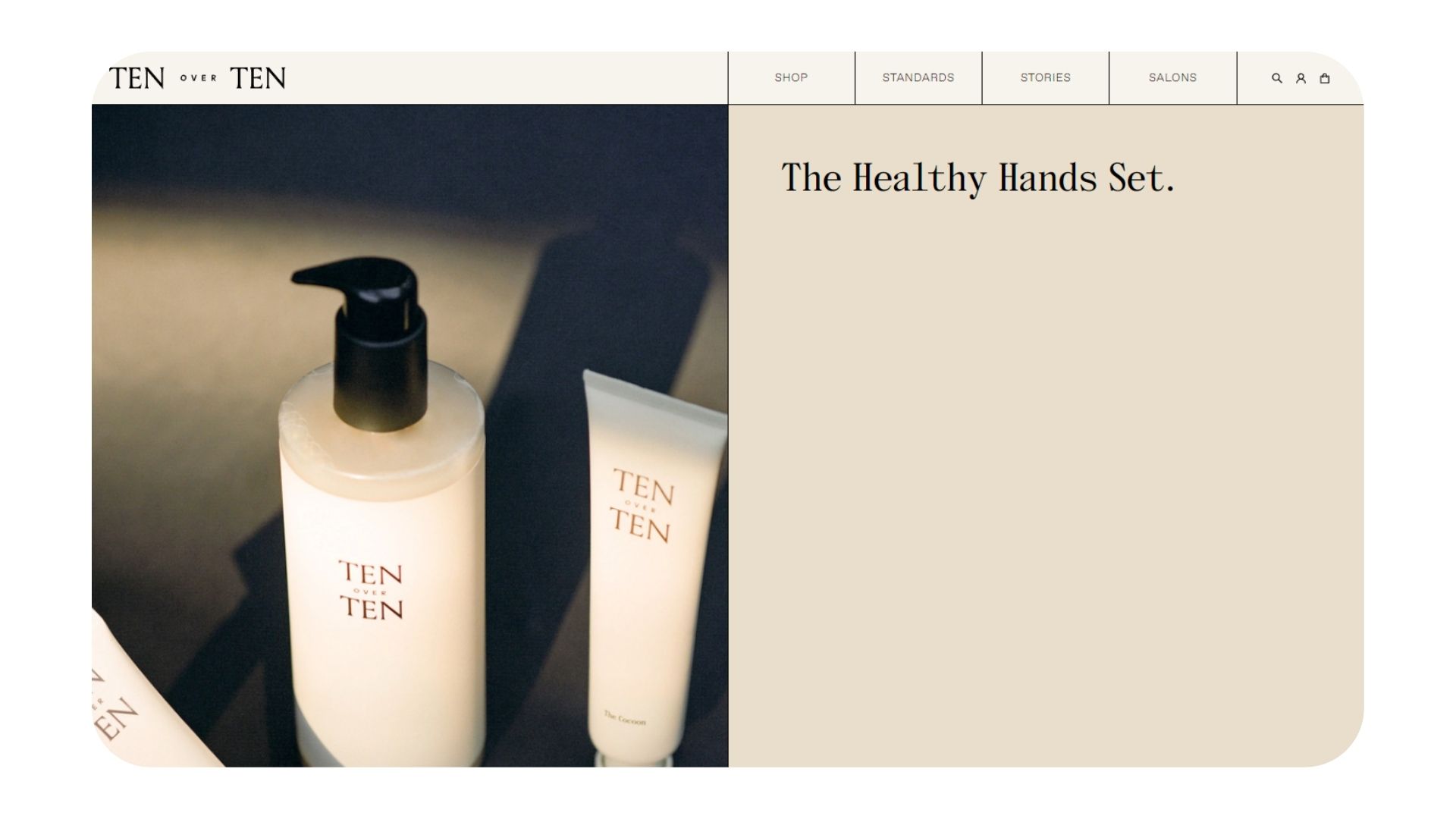
The skincare website banner design offers easy access to their current deals. The highlight of this website design is definitely the “salons” section in which the brand introduces us to their locations as “Salons as unique as their neighborhoods.” where you can book an appointment, event and purchase gift cards.
One Ocean Beauty is the ultimate skincare web design inspiration for those who wish to offer splurge-worthy rewards. Apart from the strikingly beautiful, clean website design that emphasizes on colors that translate to balance and harmony, calmness, or serenity. This way, they further reinforce their sustainability efforts.
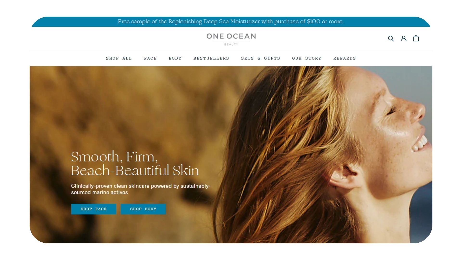
Additionally, the brand has a special page for their rewards system. You can sign up to start earning points and redeem them for exclusive offers. Plus, you refer a friend and earn additional rewards! Now, that’s a fantastic way to bring more leads.
If you are looking for the best skincare web design ideas that are equal parts modern and user-friendly, Uruoi is the brand for you. They use a lot of motion animations to attract attention and engage customers better. This way, the band separates themselves from the crowd with a skincare website design layout that is fresh, aesthetically pleasing, and out of the ordinary.
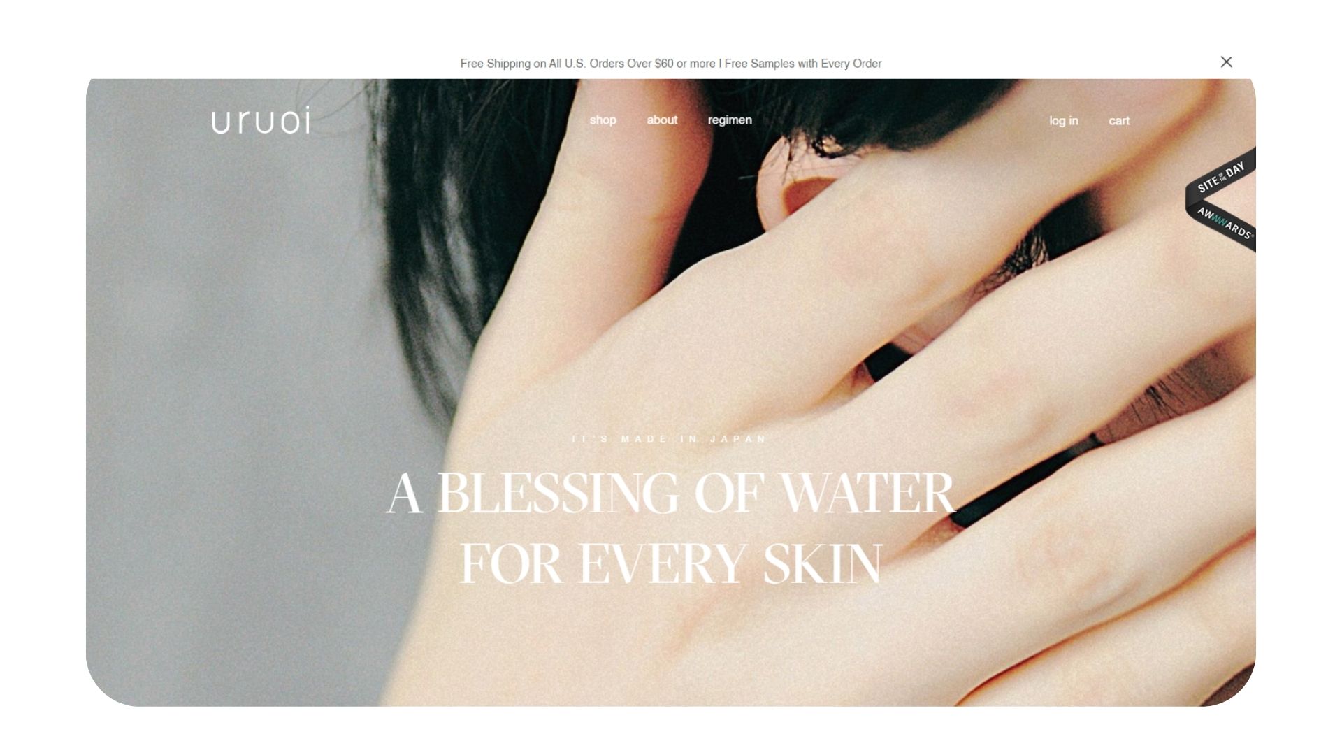
You can also have easy access to the “regimen” section where the brand suggests the top three items they think is the best fit for each skin type based on individual needs of the customer.
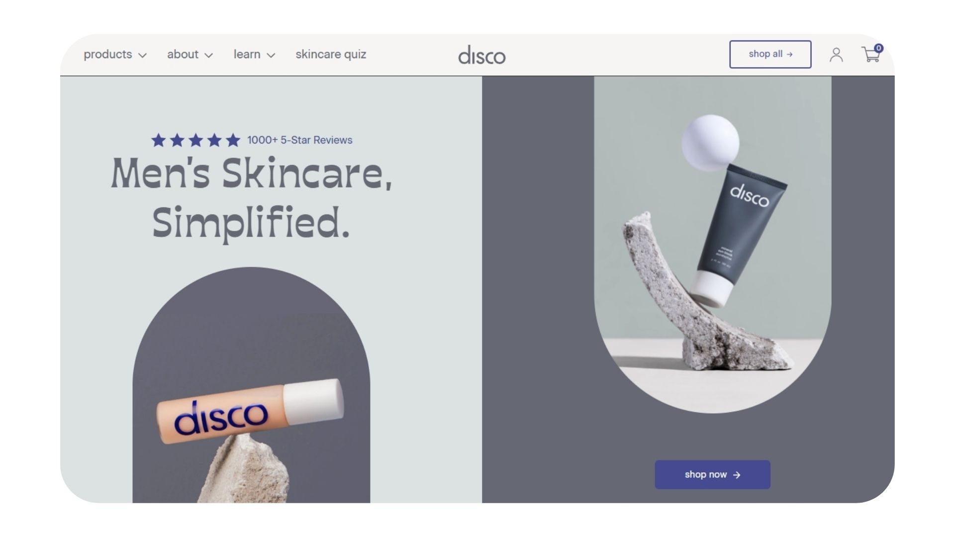
Let’s Disco has one of the best skincare website designs that focus on highlighting their reputation by showcasing many reviews. The brand has Over 1,000+ 5-Star Reviews - and you can access them all! Can you think of a better way to build trust and set yourself as an authority in the skincare field? On top of that, they offer quizzes, as well as a 20% discount to customers who sign up. The overall design is visually-preasing with neatly presented information that inspires you to keep scrolling.
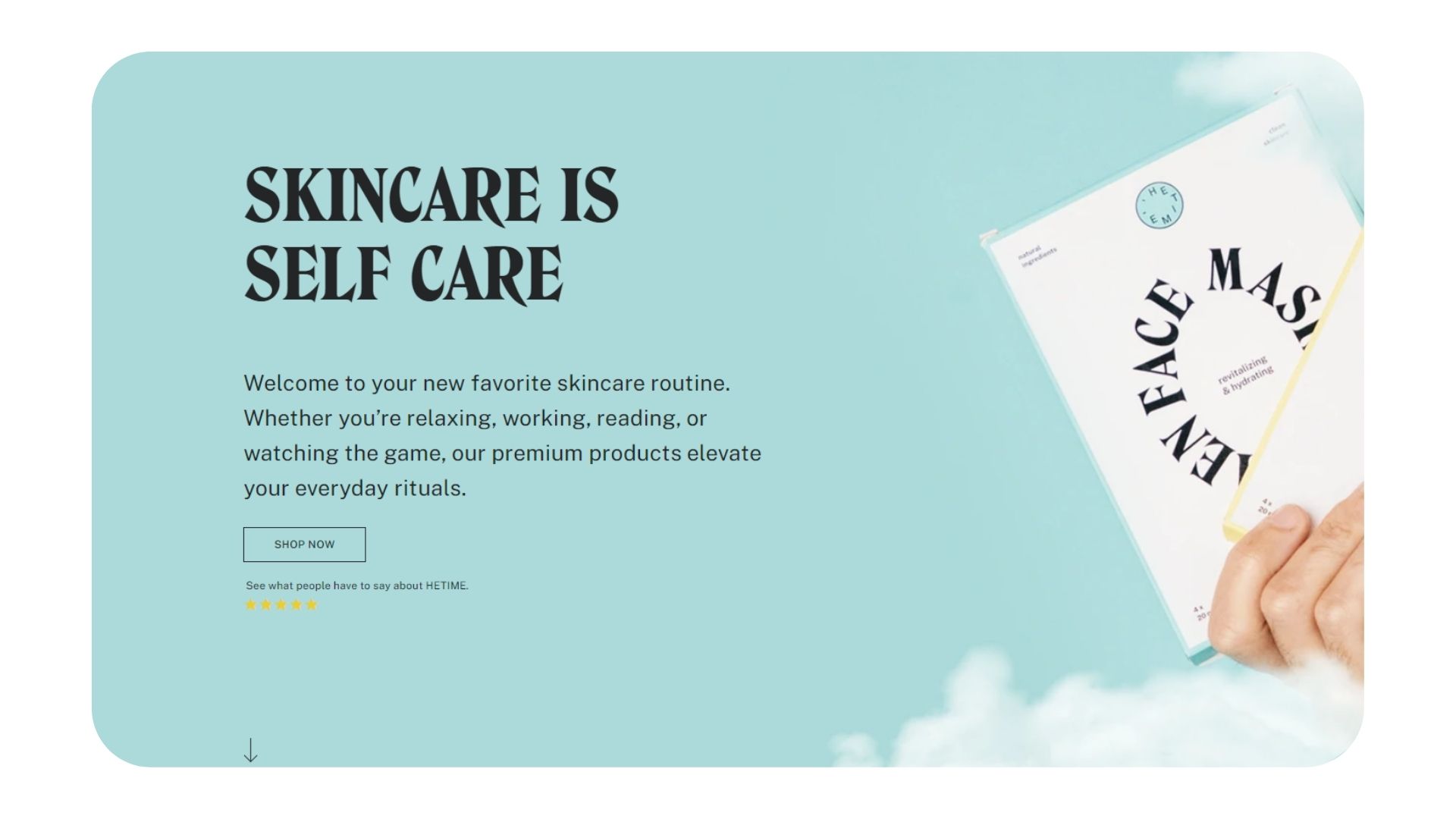
He Time’s skincare website design layout focuses on one, single product. Basically, you can do everything on the homepage. From reading the customer reviews to learning more info about their nourishing face masks and getting a good idea of the brand’s identity, this website design has all customer needs covered. Overall, the site is very well-designed and extremely user-friendly.
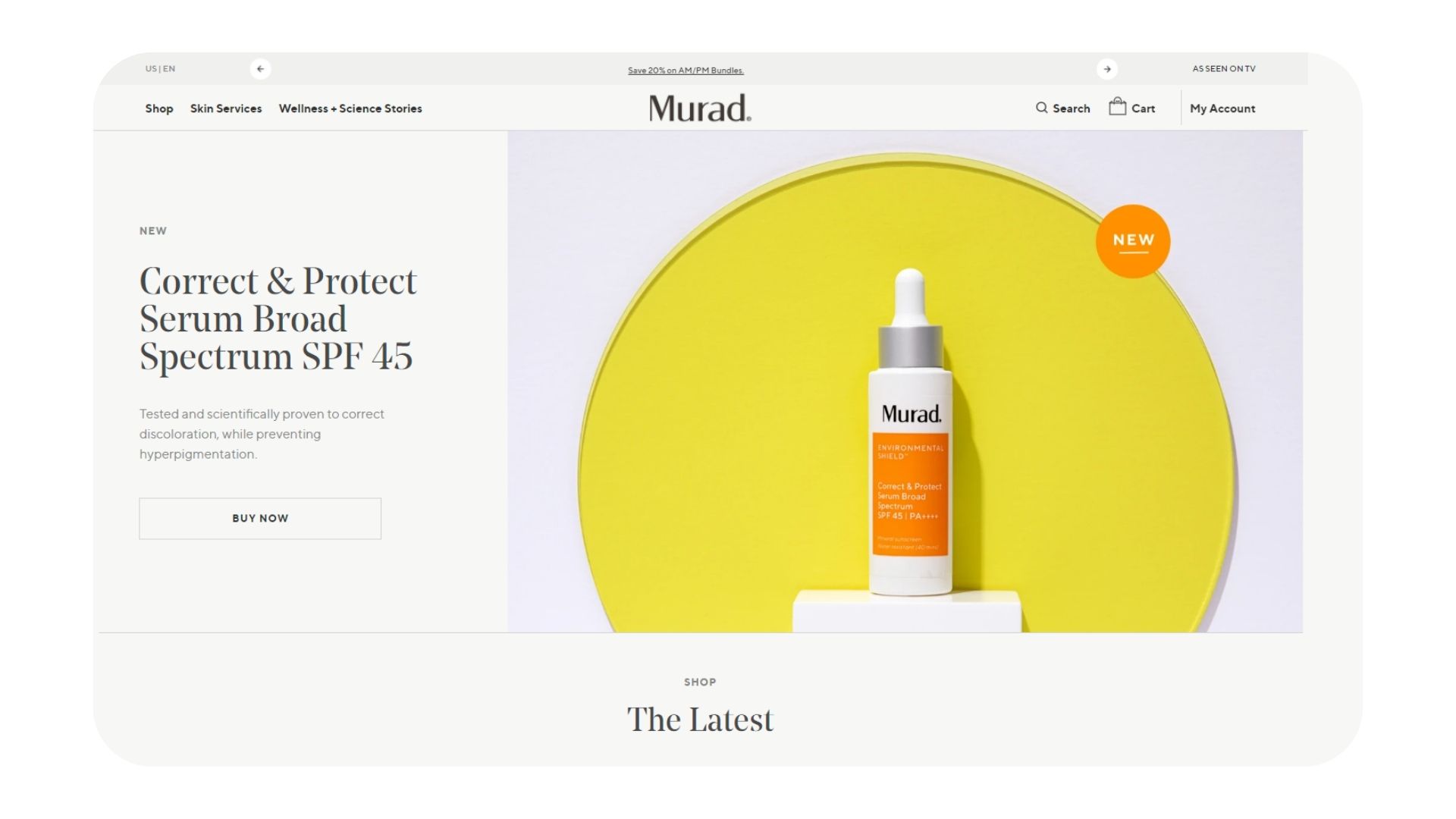
Murad is a great skincare website design inspiration for everyone who wishes to have a large selection of products. The brand uses exceptional filtering to help users navigate the collections with ease and spot desired formulas. On top of the gorgeous minimalistic layout and high-res images, Murad’s navigation bar gives easy access to their skincare services (check-in with an expert, create your own serum or take a skincare quiz). To top it all off, they also have a great reward program.
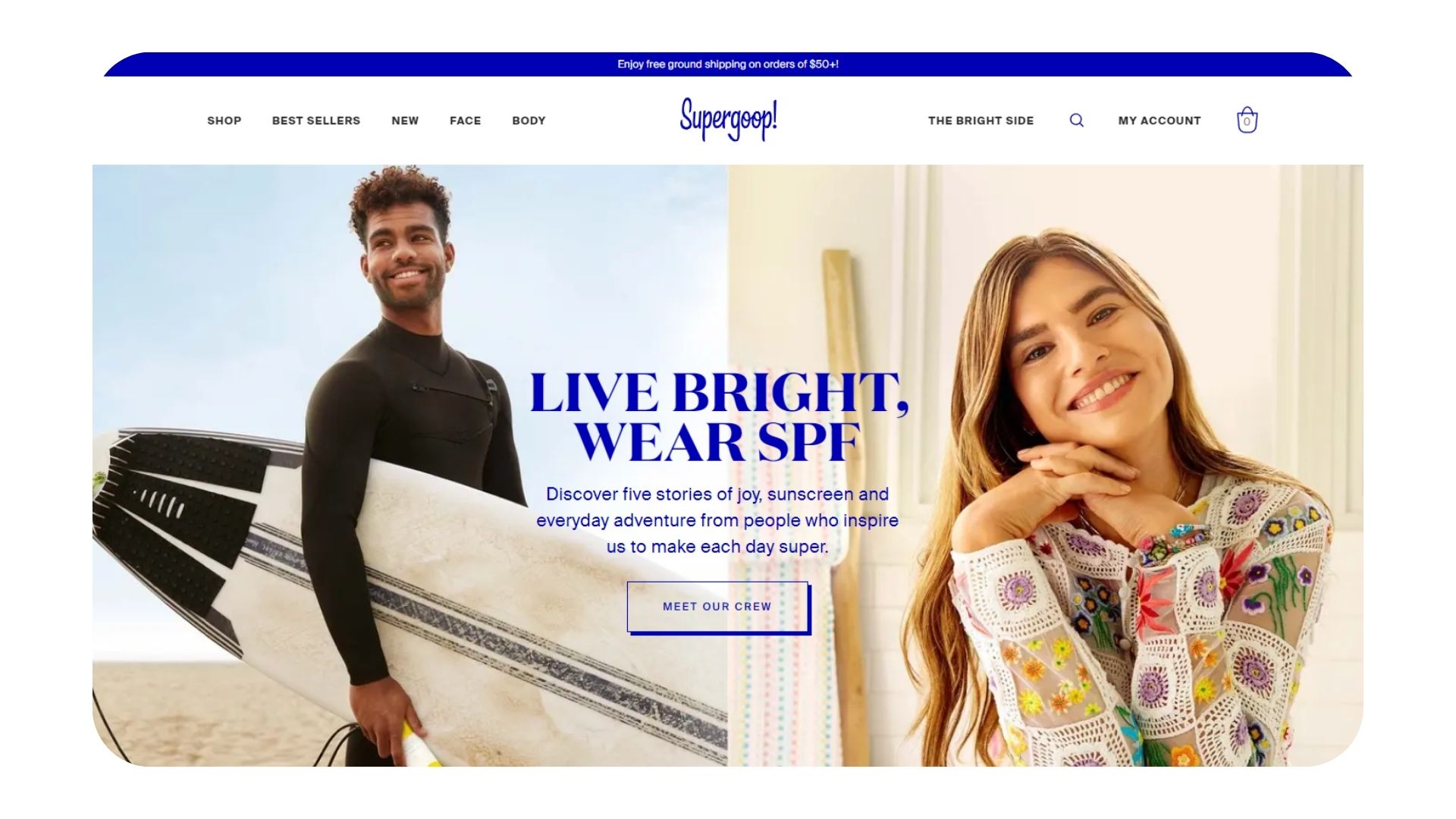
Supergoop is a prime example of how the best skincare web design ideas don’t always need bold colors and a lot of assets to look strikingly beautiful. The brand has a very clean layout enhanced with high-quality images and rephrasing, uplifting hues. From the top menu, you can have access to every important page including a direct link to their top-rated CC Screen SPF 50. Take a look at how statement-making their skincare website banner design is.
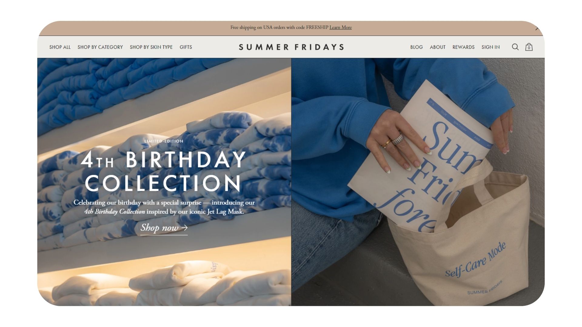
Another brand that knows the rules of how to create fantastic skincare website design is Summer Fridays. As soon as you land on the page, you get presented with a banner that allows you to shop your favorite formulas from their new collection. Their header displays the most important categories, highlighting the “shop by skin type” option. On top of that, the brand has a great reward program for their Self-Care Club members. You can earn points by shopping or by referring a friend.
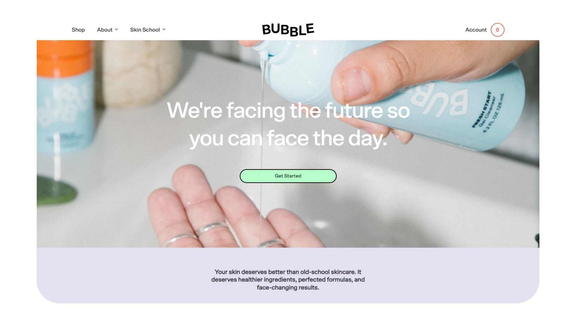
When it comes to the best skincare web design inspiration, Bubble skincare ticks all our boxes. The brand is not only using bright, youthful, vivid images that attract attention but also offers a slew of expert information through their “skin school”. While it’s a fantastic opportunity for SEO, their comprehensive guides, ingredient breakdowns, personalized quiz, and “build a routine” options keep customers coming back for more.
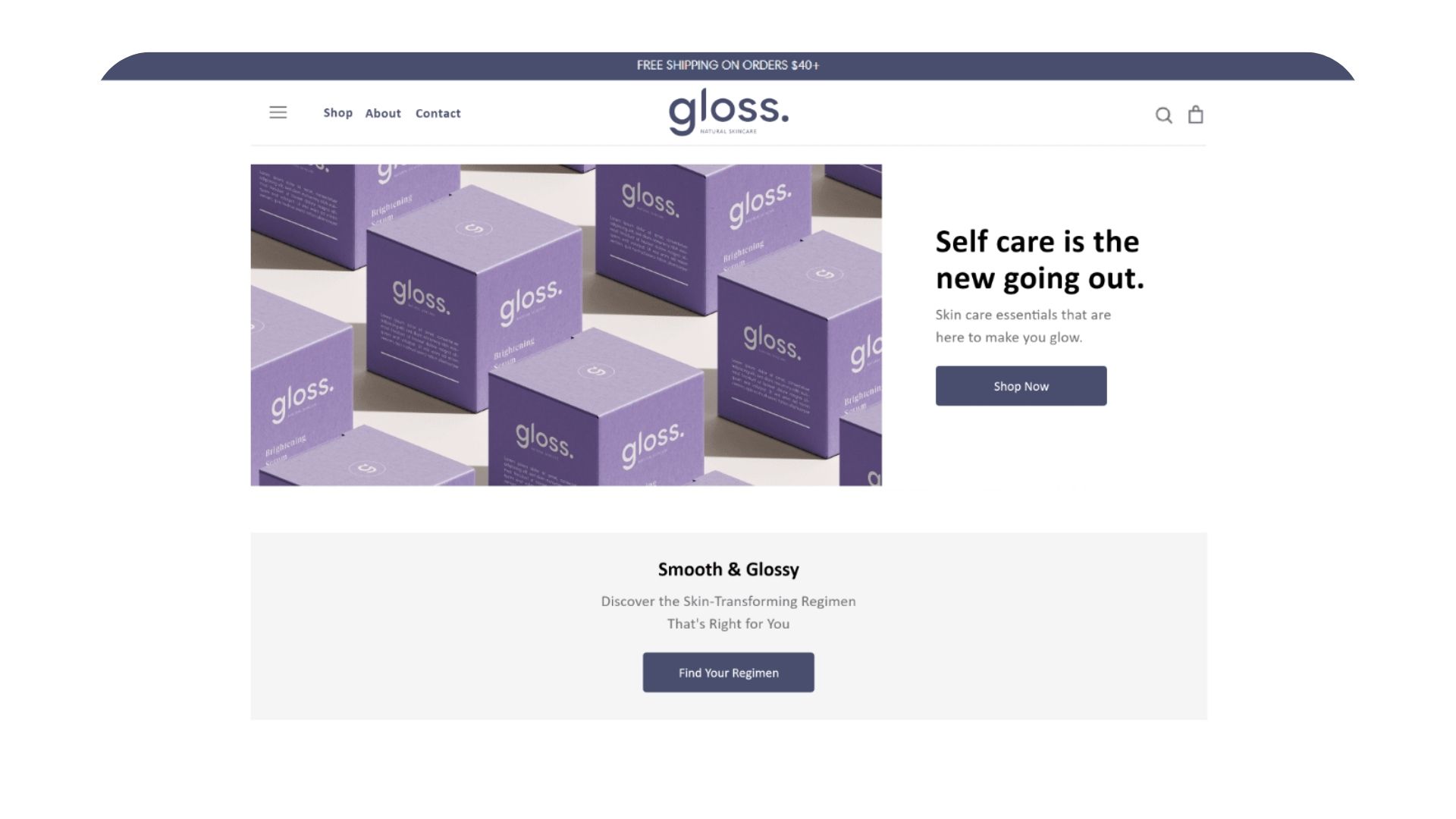
While many brands decide to stick to their simple skincare website designs, Gloss Skincare wanted to take their branding and UI/UX to a whole new level with a custom skincare website that perfectly alights with their identity. To further reinforce their slogan "Good for body & environment" easy-to-find categories were placed in key locations for easier navigation.
Time to take advantage of the best skincare website designs to elevate your brand
The above skincare website designs were only a few examples of what a beautiful skincare website design layout can do for your business. The industry is highly competitive, but luckily there are many ways to stand out from the crowd and give your customers the most amazing shopping experience through a custom skincare website designed to convert. So let’s use the aforementioned skincare website design inspiration to build an amazing home for your products.
If you have an upcoming website project and you are not sure where to get started. You can reach out to our design team and they can point you into the right direction.