Top 8 Tea Brand Identity Ideas
The best tea brand identity ideas for unique tea shop design concepts and modern tea packaging designs that stand out.
The best identity and website designs for tea brands have one thing in common; a strong strategy behind them. While a unique tea shop design concept with striking tea packaging design can score you many new customers, a powerful brand identity is what will drive them to come back for more. The seamless blend of aesthetics and function with memorable messaging that resonates with customers is what separates successful brands from those that simply miss the mark.
But how do you brand tea? What are the core elements that make a tea shop design concept shine? What does a striking tea packaging design look like? We rounded up the 8 best tea brand identity ideas below.
The top tea branding must-haves to keep in mind
So, what is a brand strategy? With stellar identity and website design for tea brands on your side, you can confidently scale your business and attract new customers, score more sales, and build trust. Here’s everything you need to know about developing a brand strategy for your tea business.
Develop a strong tea brand identity
A remarkable brand identity should be personal, unique, and most importantly, memorable. This includes striking visuals, fantastic copywriting, and a consistent way of expressing yourself across your website and all your social media. The end goal is for your message to resonate with your core audience and attract customers who share the same values and speak the same language.
First, you need to determine:
- Your core mission: What makes your brand unique? What inspired you to launch your own products? How will they help people?
- Your values: What do you stand for?
- Your brand personality: Is your business’ personality fun, uplifting, refined, playful?
- Your brand voice: With different personalities come different brand voices. What’s your way of communication?
- Your position: There are many tea companies online, what makes your products stand out?
Your answers to the questions above will heavily impact your tea shop design concept, and tea packaging as well. When it comes to branding, every aspect is interchangeable.
If you want to get inspired, here are the best examples of identity and website design for tea brands that “get it.”
Top 8 Tea Brand Identities To Inspire You
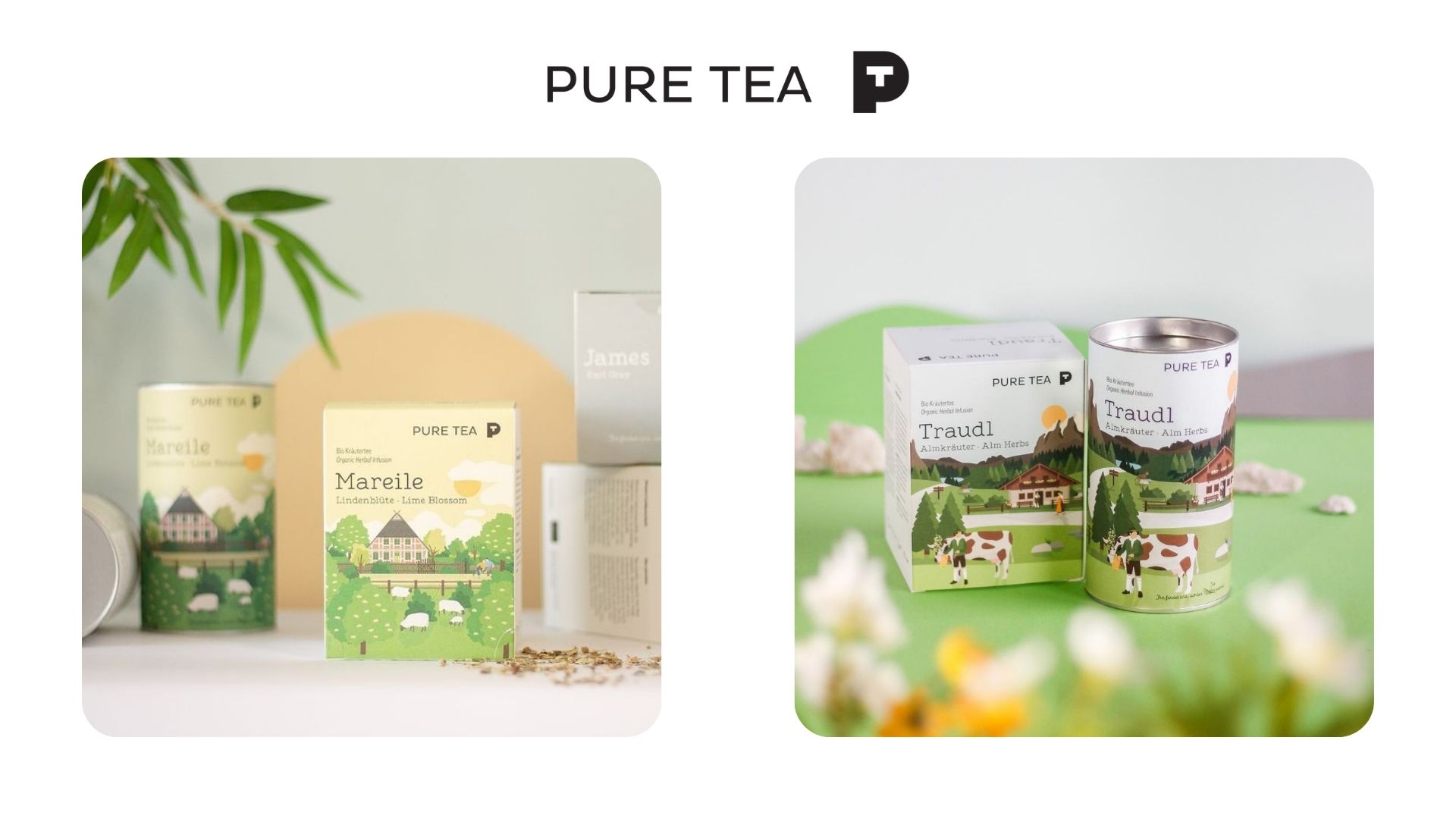 Pure Tea logo and special tea packaging design
Pure Tea’s shop design concept is clean, minimalistic, and classic. The German brand heavily focuses on creating a visual story through their great tea branding and packaging strategies. The packaging illustration consists of elaborate landscapes reminiscent of the countries the teas originate. The strategic uses of color are heavily related to the different tea flavors the brand offers, boasting every regions’ distinctive cultural characteristics.
Unlike other brands that take a modern approach, this tea shop design concept is stripped of bold visuals and animations. Instead, they use a simplistic font and ‘natural’, unedited imagery to emphasize the purity and organic nature of their products.
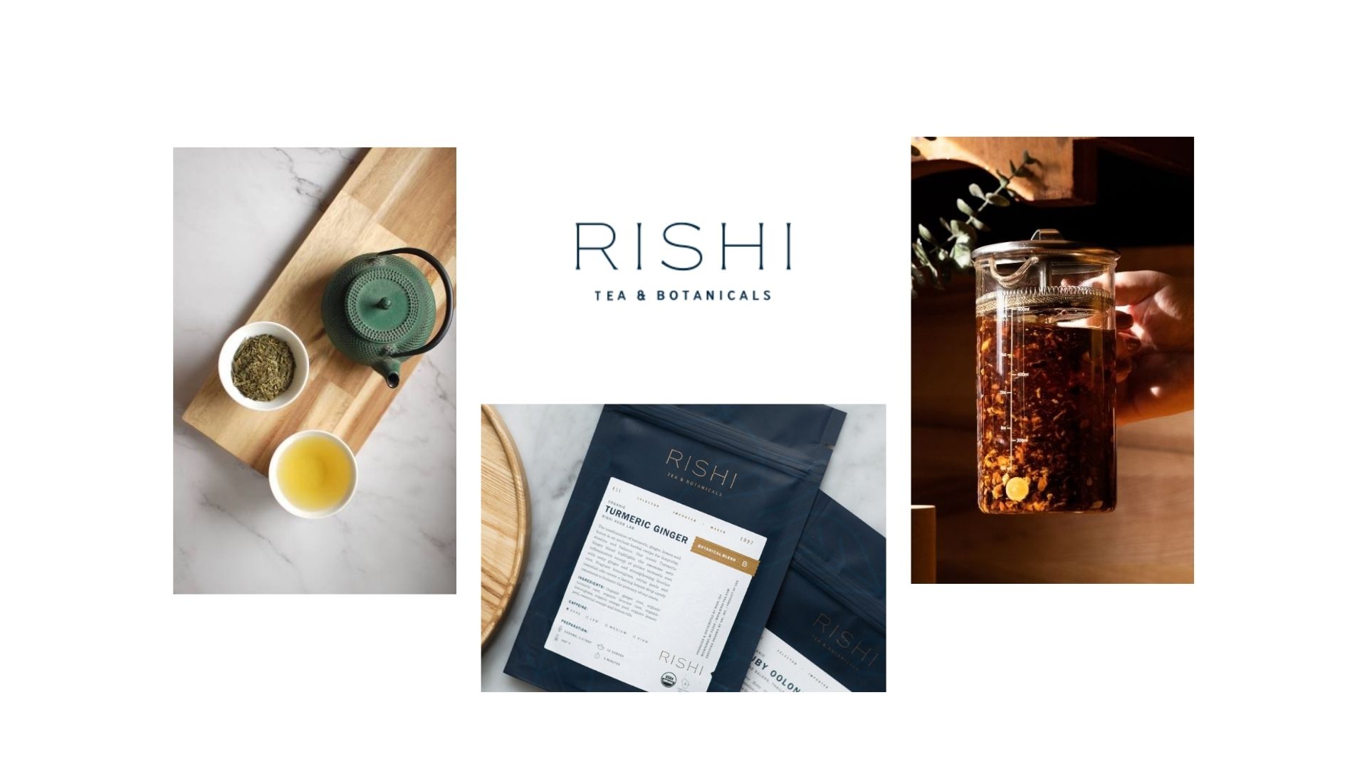 Rishi Tea logo, packaging and mood setting
If you are looking for sleek and simple tea brand identity ideas, Rishi Tea ‘s shop design concept will give you plenty of inspiration. The brand communicates its quality through an array of high-res images, plenty of white space, and tactical use of color throughout the website. Their target audience is health-curious people who understand and appreciate the value and benefits of sustainably sourced blends. They chose a cool-toned color palette with delicate gold lettering to highlight their product’s rich tradition.
Scrolling down, you’ll find simple yet powerful copywriting that pinpoints the most essential values of the brand with neatly presented information. The full-width video that welcomes visitors inspires immediate action while the menu on the top gives you easy access to different pages of the website.
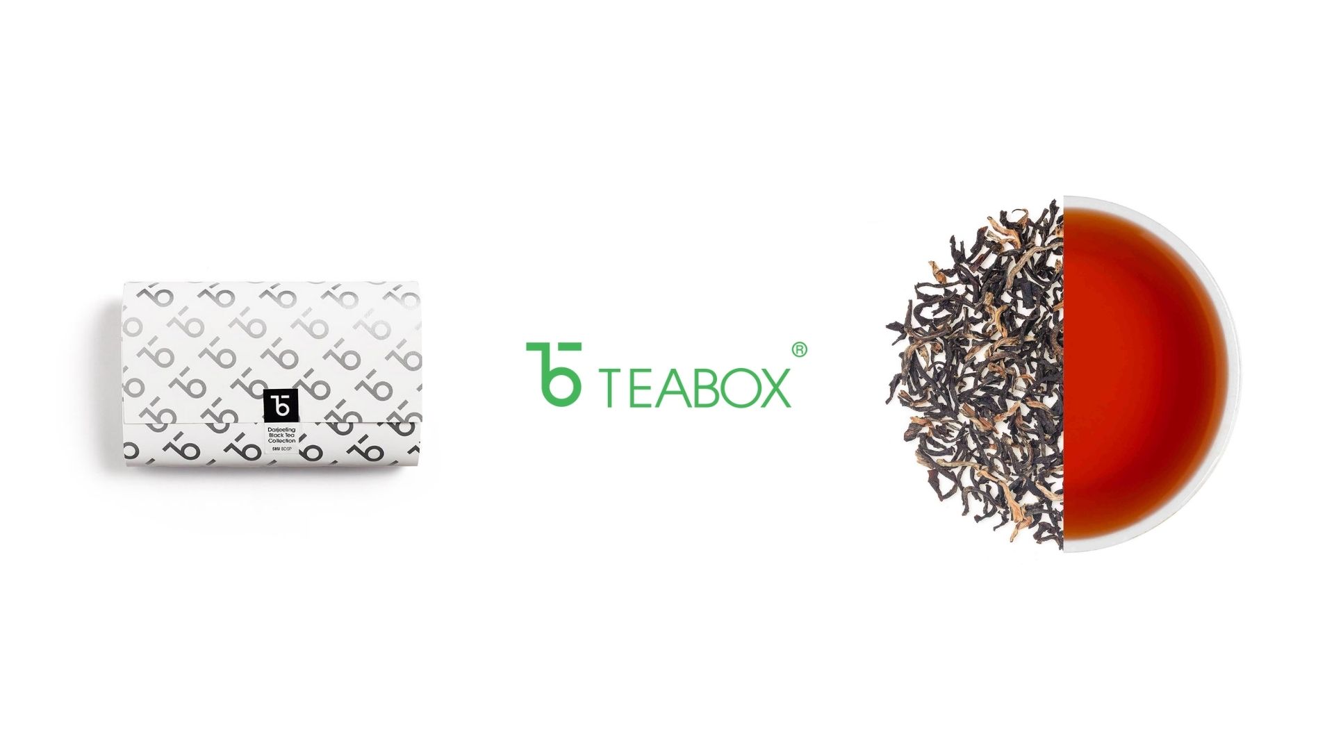 Teabox Logo and packaging design
The best identity and website design for tea brands consists of many different elements. Tea Box is a prime example of that. Simplicity is the core idea behind the tea packaging design and website. To make a strong visual impact, they used custom typeface, iconography, and monograms along with a multitude of color combinations and patterns. The brand tapped into the highly successful subscription business model with a clear yet eye-catching packaging design that includes the date, brewing instructions, and notes on the flavor profile.
As soon as you land on the website, you instantly get familiar with the brand’s values and quality of products. It’s authentic. The top menu is nicely organized. A full-width video introduces the top most important elements that make this tea brand stand out from the crowd. Upon scrolling, we quickly notice an easy-to-use structure that highlights their top-selling tea blends followed by their brand’s statement to “DISRUPTING A 200-YEAR-OLD TEA INDUSTRY”
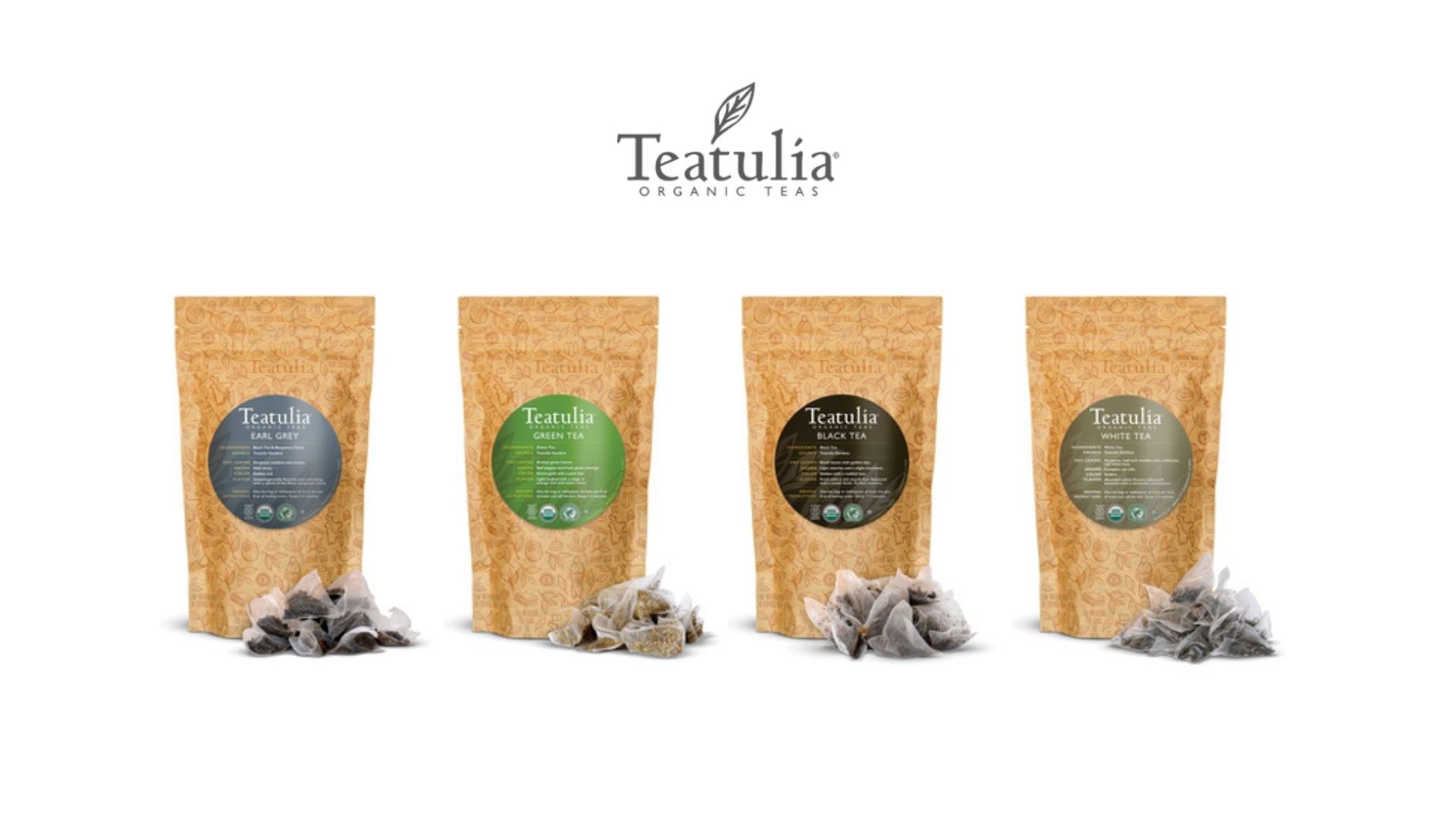 Teatulia Logo and packaging design
If you are looking for fun and pleasantly unique tea brand identity ideas, Teatulia will tick all your boxes. While the website's structure is pretty simplistic with a full-width slider at the top and clever use of call-to-action buttons, the tea brand certainly doesn't lack stunning visuals. Teatulia’s mission statement comes in the form of a beautifully-presented video that allows us to get a glimpse of the origins of their herbs.
Their new brick-and-mortar tea store in the UK boasts warm lighting and inviting texture perfectly combined with modern colors and shapes for a “sophisticated and refined tea drinking experience.”
The company’s tea branding and packaging are quite memorable thanks to their intricate logo design that adorns each pack along with single letters (the first letter from the name of each variety written in Bengali script). Their eye-catching graphic identity consists of vivid colors such as green, pink, orange, and blue that evoke higher arousal emotions that stimulate the mind and attract attention.
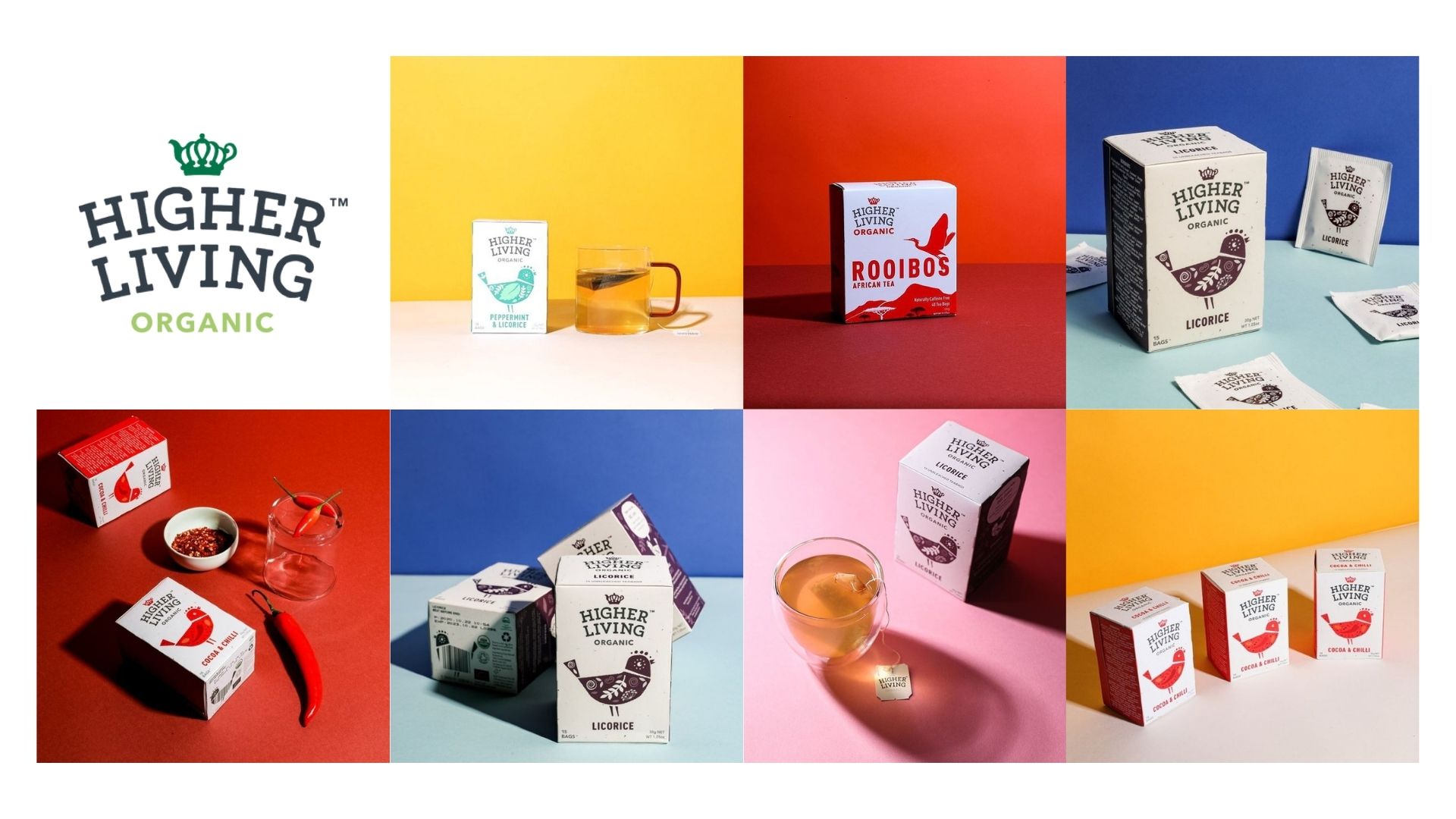 Higher Living organic tea logo, packaging and color palette
When it comes to unique tea brand identity ideas Higher Living Herbs is a great example. The brand heavily focuses on simpler forms, finer details that draw the eye to the beautifully made packaging illustration of a bird. They aim to silently communicate the uplifting experience their herbs guarantee to offer through the use of bright but natural colors emphasized by light backgrounds. With a clean and simple tea shop design concept, their website draws all its viewers’ attention to the products. Upon landing on the website, we are instantly informed of their aspiration to help environmental organizations with every product sale. They also highlight their awards (international trade 2019) with an eye-catching slider. Their typography is rather simple with strategic additions of bold fonts to draw attention to the most important information on their website.
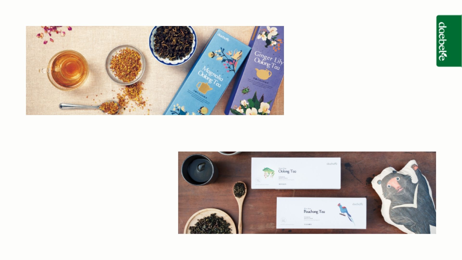 Daebeté organic tea logo, packaging and color palette
Daebeté’s Tea branding and packaging perfectly highlight all their unique aspects. The brand’s floral-infused tea, made with ancient baking methods, offers a refreshingly new experience with a subtle yet sweet flavor. Their tea packaging design showcases the natural beauty and ecology of the flower-growing regions of each floral-infused tea blend. Through beautiful hand-painted, watercolor illustrations, delicate typography, and the use of statement colors, the brand communicates its delicate flavor, fantastic quality, and ever-lasting tradition of tea preparation.
Yellow evokes feelings of freshness, happiness, positivity, clarity. Light blue hues are reminiscent of health, healing, tranquility while purple reminds us of nobility, luxury, power.
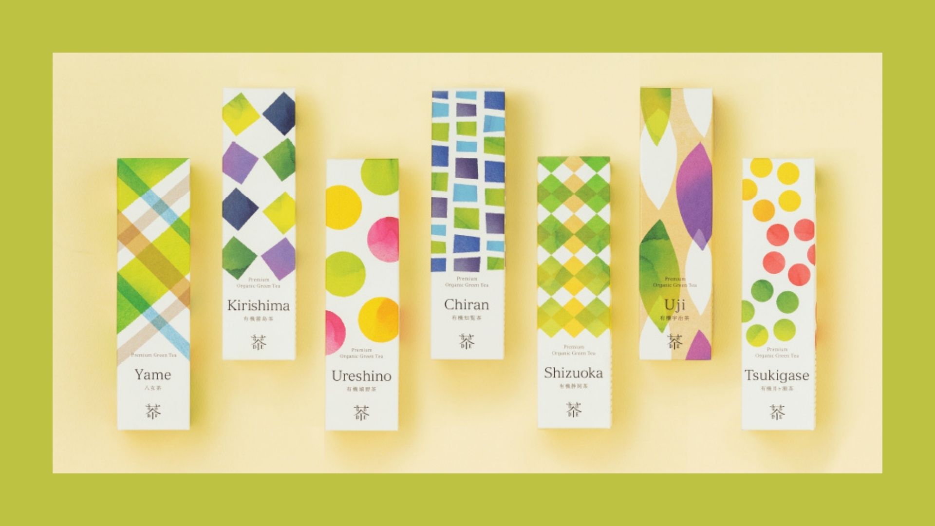 Saudade Japanese tea branding
Simple yet attention-grabbing watercolor illustrations, bright hues of yellow, purple, and green perfectly combined with slim, simplistic typography; Saudade’s tea branding and packaging is the perfect example of how to give a solid nod to your aesthetic and values without overdoing it.
The brand’s fresh and natural look goes hand in hand with its mission to promote organic cultivation and create a global “Green Tea Culture” where people won’t have to rely on chemical pesticides or fertilizers. Their color scheme relates to balance and harmony, hope, happiness with subtle hints of optimism and uplifting rejuvenation of the spirit.
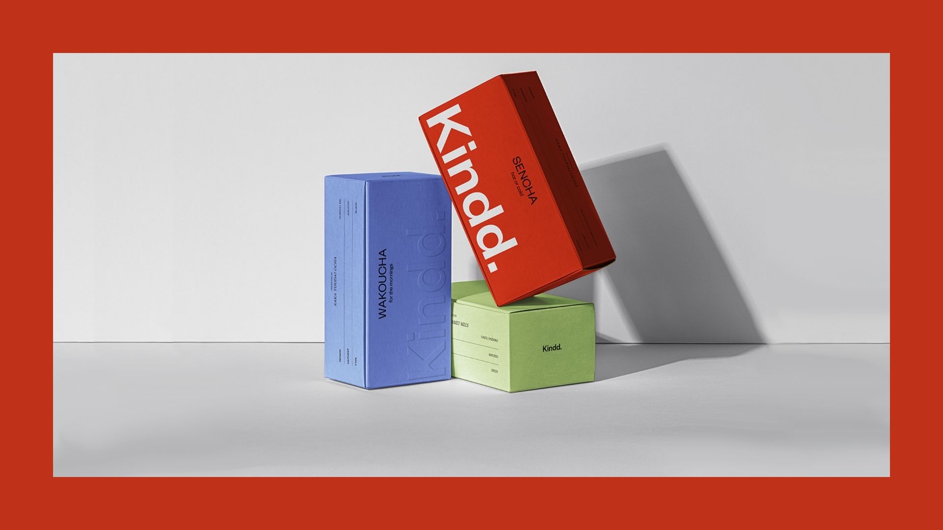 Kindd Japanese tea minimalistic packaging
As a new, promising startup, Kindd’s tea branding and packaging heavily focuses on providing showcasing their innovative approaches and aspiration to provide unique experiences. The use of bold colors and subtle text animations makes this tea shop design concept pretty eye-catching.
Developing a great brand strategy was their first and most important goal, then a functional tea website design was created which was optimized for a seamless user experience. For their subscription deliveries, the brand’s modern tea packaging design features red, the most intense color, accompanied by light green, pink and blue.
Time to develop the best tea brand identity for your own branding and packaging
Building the perfect tea eCommerce shop design concept along with memorable tea branding and packaging can be quite the challenge. Luckily, there are plenty of examples of tea brand identity ideas from successful brands that are nailing the game. So browse and take inspiration. With strong messaging, a consistent brand voice, and stunning visuals on your side, your herb business will definitely flourish (pun intended).