Top 10 Tea Website Design Inspirations in 2025
Looking for inspiration? Check our selection of 10 best examples of tea website designs with clean layouts that are simple, modern and functional.
Whether you are a tea connoisseur who decided to launch his own business or simply want to capitalize on the $200 billion global tea market, there is an array of tea website design examples to draw inspiration from. What are the 3 top things successful e-businesses have in common? A killer brand strategy, strong brand messaging that “sticks” and a beautiful design that enhances the user experience.
Luckily, there are more than a few clever strategies to take your visual presentation to new heights. From the best milk tea website design ideas to stellar herbal tea websites that captivate, we gathered the best examples of tea website designs below.
Types of Tea Website Designs: Informational vs eCommerce
Before we go into the best examples of tea website designs, let’s first share the two most prominent types: Informational and eCommerce. While both businesses offer coveted tea products, their brand strategy is a bit different. Take a look to better understand which of these types fit your brand vision the most.
Twinings
The UK-based online store Twinings is focused on offering delicious tea that runs the gamut from fruity and herbal to decaffeinated and superblends. It’s pretty evident that their website design is practically rows of virtual shelves that inspire the customer to start adding thighs to their cart ASAP. They are also known world wide for their teas in physical stores.
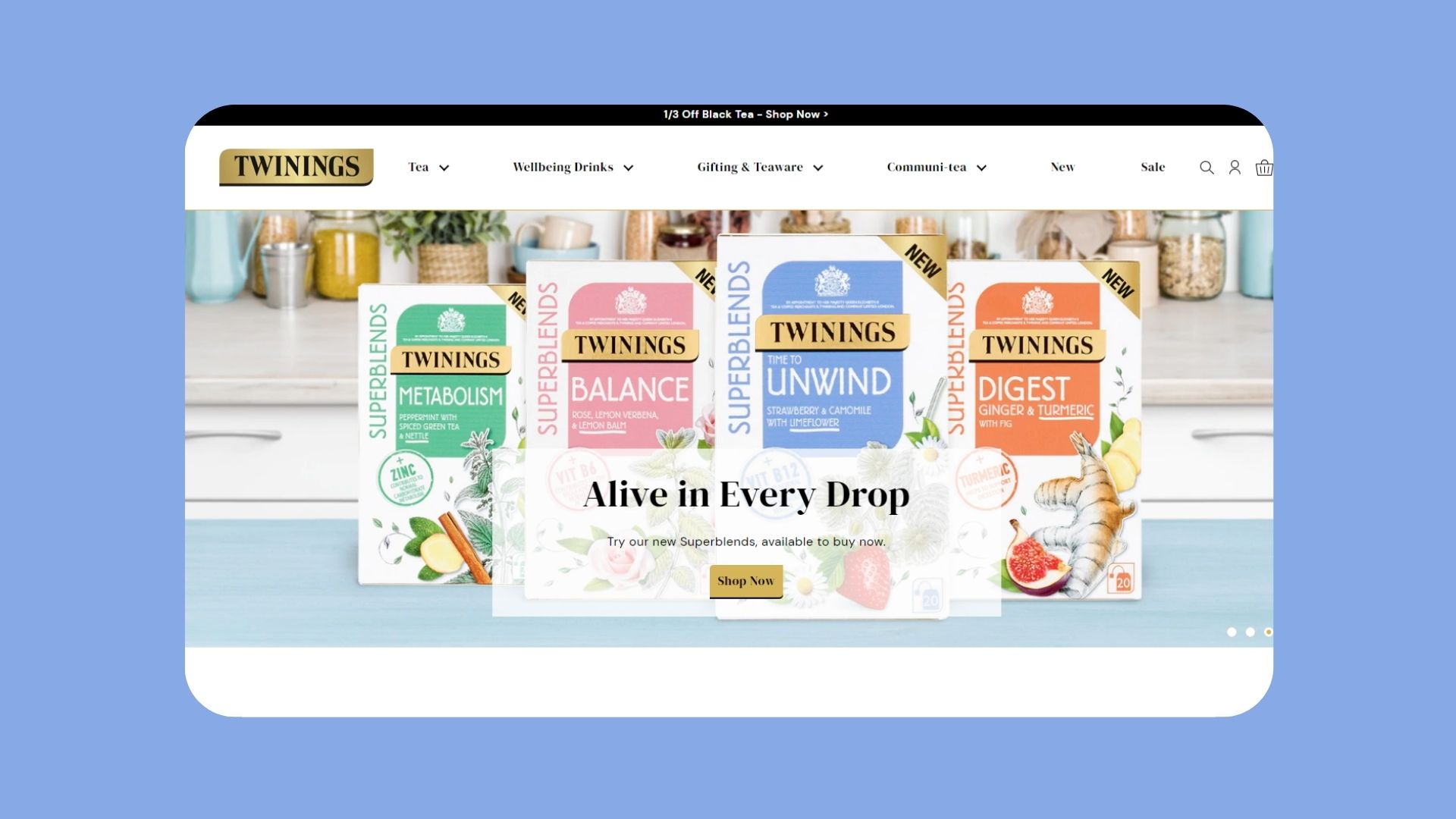 Twinings Tea Website Design
Yogi Tea
Yogi Tea, on the other hand, focuses more on education that will eventually lead to sales in physical stores. At first glance, we can’t even tell if it’s a Tea shop website design or a blog. This non-sales approach manages to capture and keep the attention of the readers. The end goal? To get familiar with the numerous benefits of tea and learn more about the company and values.
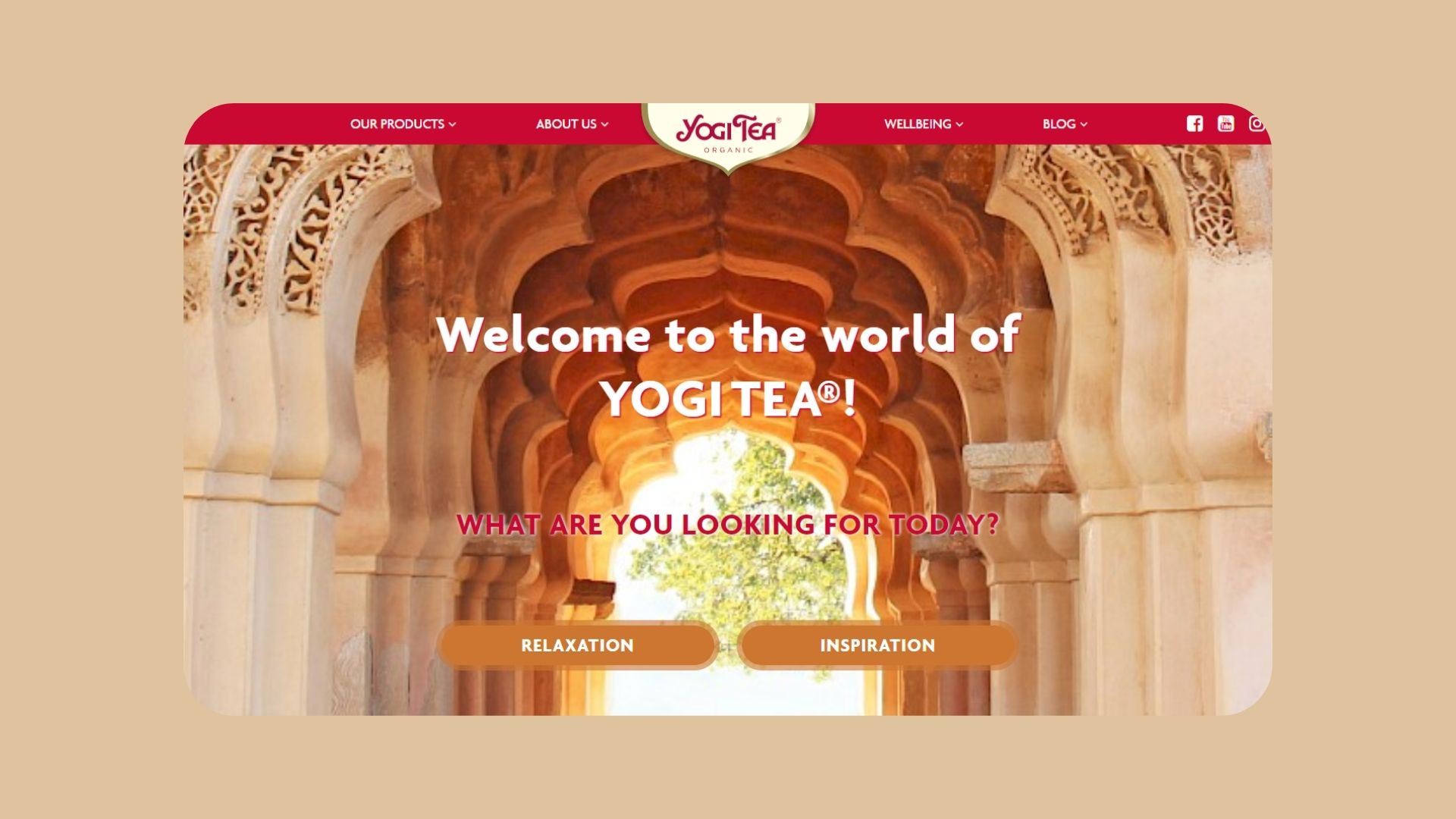 Yogi Tea Website Design
You probably pinpointed a few similarities between the two aforementioned examples of tea website designs. Both have a distinctive color palette, a user-friendly layout, and copywriting that inspires you to just keep scrolling. This is certainly a recurring theme.
So lets take a look at the best tea website designs below.
Best examples of tea website designs and layouts
Swallowtail Tea
As soon as we land on Swallowtail Tea’s website, we are presented with a full-screen slider of luscious greenery followed by a call-to-action to “bring swallowtail to our home”. The well-organized, minimal menu bar includes the 5 most important pages of the website (teas, merch, brews, about, and wholesale). Upon hovering over each category, we get a quick summary of what each important page is really about.
When we scroll past the slider, we can spot a neatly presented collection of the tea blends followed by three, simple yet statement-making blocks for quick access to different categories of the website.
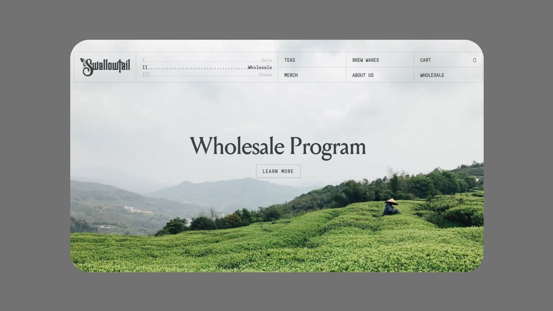 Swallowtail Tea Website Design
David’s Tea
David’s Tea uses strategically picked bold colors to its advantage. The homepage uses a carousel of images along with a call-to-action button to inspire customers to explore their new collections. The brand has one of the best examples of tea website designs that use colors to make a silent statement. The sky blue color of the images evokes feelings of trustworthiness and reliability while also promoting a sense of gentle tranquility. The menu on the top influences the customer to sign up and receive rewards. It also gives quick access to dozens of different pages and categories.
Across the website, there are many eye-catching animations and in the middle, there is a neatly-presented collection of different types of teas you can opt for.
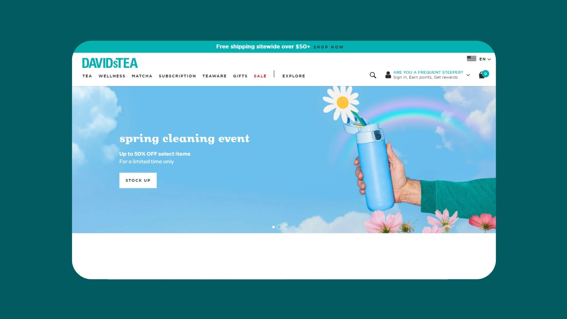 David’s Tea Website Design
Love Tea
Love Tea’s neutral color gives off a calm, almost bohemian vibe that suits the Australian brand. Black, white, gray, brown, and beige represent peace, wholesomeness, and reliability; values we see pretty frequently in many tea brand website design examples. The combination of subtractive images and emotive copywriting gives this simple tea shop design an elegant, clean look. Also, there’s a sticky menu bar chock full of useful links, pages, and categories that make navigation a breeze.
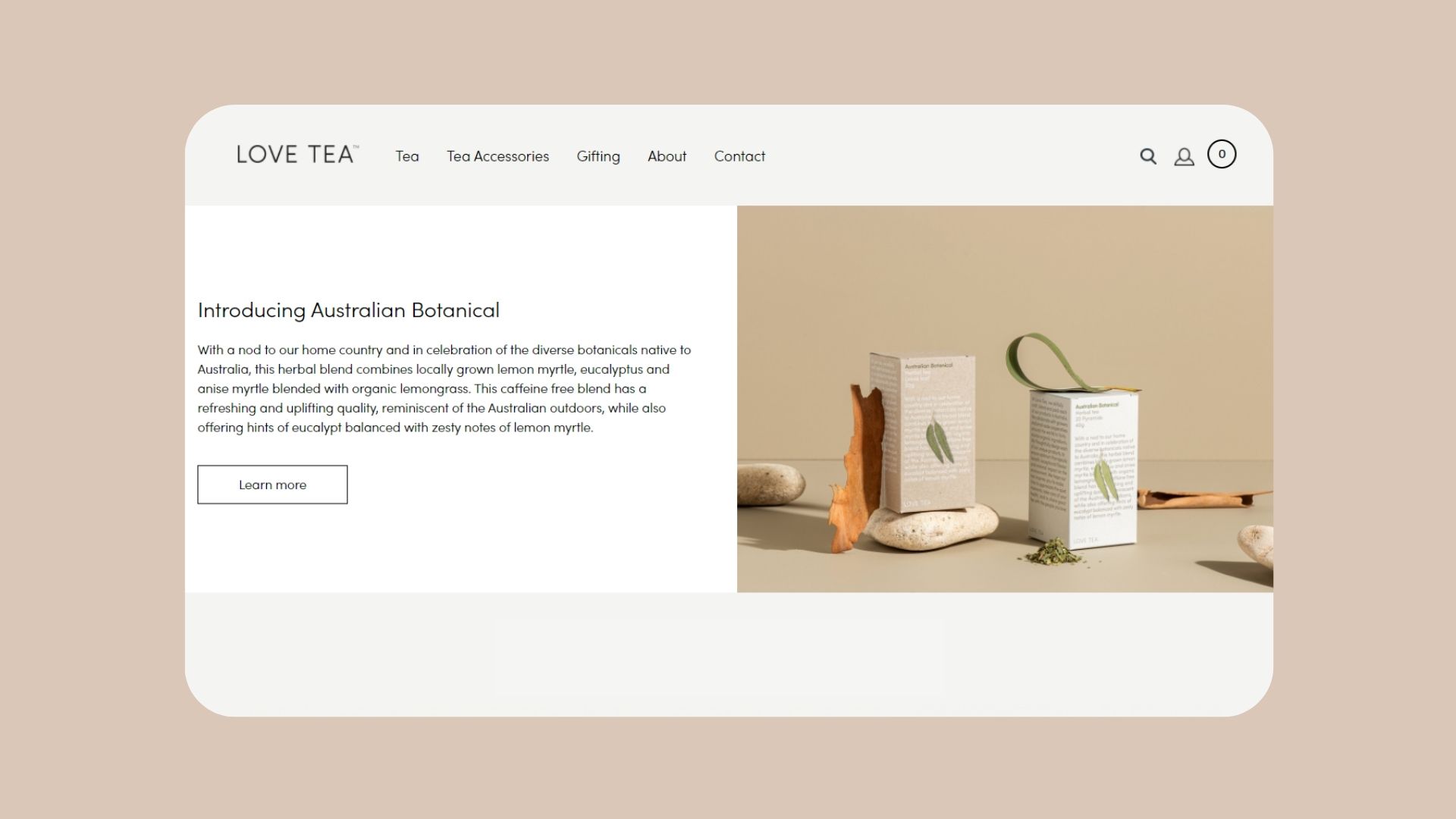 Love Tea Website Design
Kib Tea
Kib Tea channelled the power of animations combined with a colorful scheme to create one of the best examples of tea website designs that stands out from the crowd. The ample use of yellow, green, and purple reinforces their brand values: eco-friendly natural flavors, climate positivity and small farm sourcing. They showcase their herbs through the use of a product carousel and we can quickly spot the forest-like illustrations against the simple, all-white packaging with the brand’s signature circle motif. As for their menu, it’s simple and nicely organized in the top right corner. The intricate tea website design layout certainly captures the attention.
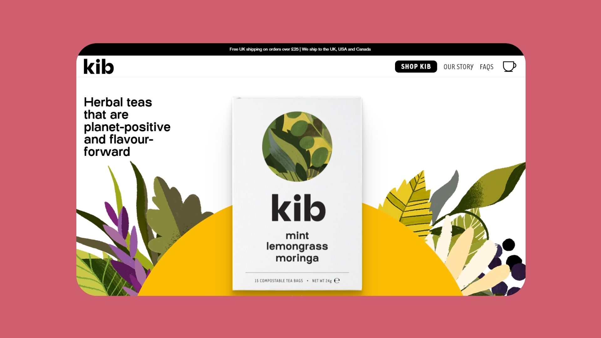 Kib Tea Website Design
Kindd Tea Farmers
Kindd tea is a Japanese brand that sources herbs from small farmers all across the island. Their identity is mix of vibrant and calm colors that leave an impression of doing things differently, but in a positive way. The navigation design of their website is fairly simple and you can find everything on the homepage. Top tea picks exactly in the beginning to ease returning and new customers, also categories for the rest of their offerings including subscription page and Japanese ceramics. Product page is highly focused just on ordering and giving important information about the tea without the typical scrolling and vast amount of imagery.
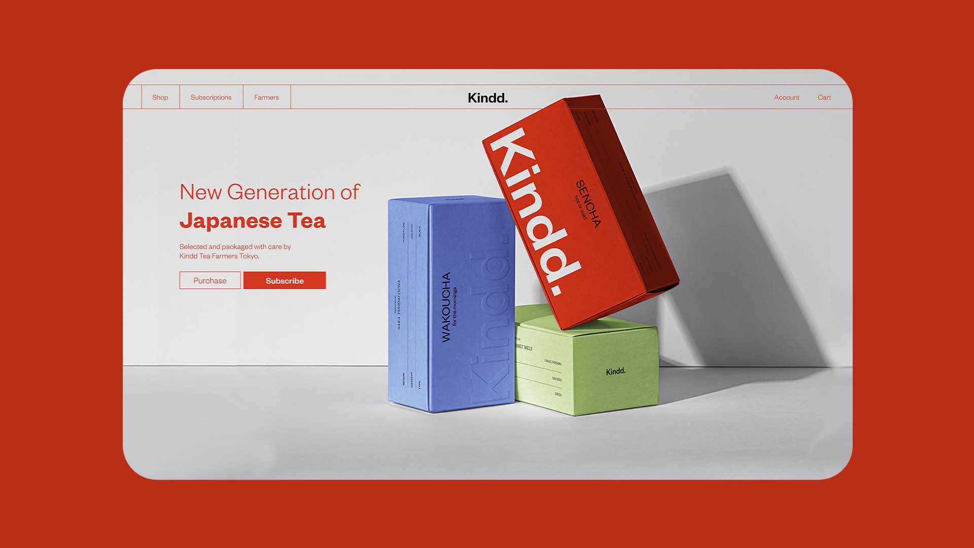 Kindd Tea Farmers Website Design
Off Blak
Off Blak is one of the best examples of tea website designs that cater to a mostly-female audience. As soon as you land on the website, you are welcomed by huge doses of millennial pink scattered across the main page. The strategic use of color gives off feelings of femininity, romance, sensitivity, and tenderness. This simple tea shop design has minimal text, well-organized to showcase their strongest points as well as their product collections and some testimonials from influencers.
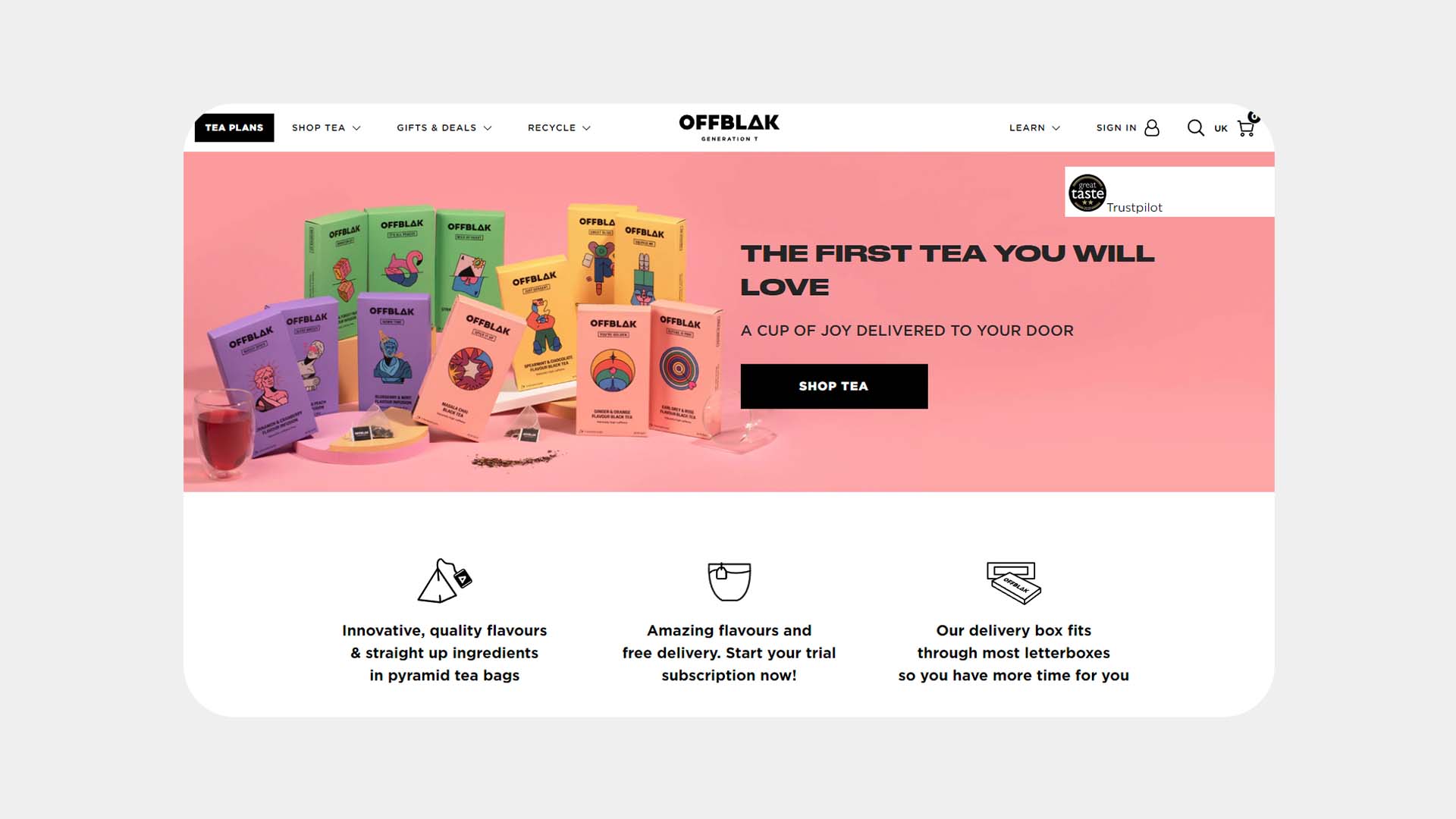 Off Blak Website Design
Mood Tea
Unlike the previous tea website designs, Mood Tea uses the power of art to its advantage. Through a series of uplifting, positive art pieces, Mood aims to show a dynamic and expressive visual identity. The blend of purple, green and yellow inspires us to connect the brand with wisdom, bravery, freshness, happiness, positivity, and spirituality. Right from the get-go, they make it clear that 100% of profits fund mental health projects. The navigation bar includes the 4 most important pages of the website (shop, mission, about, stories) following the same clean look that we see in many examples of tea website designs.
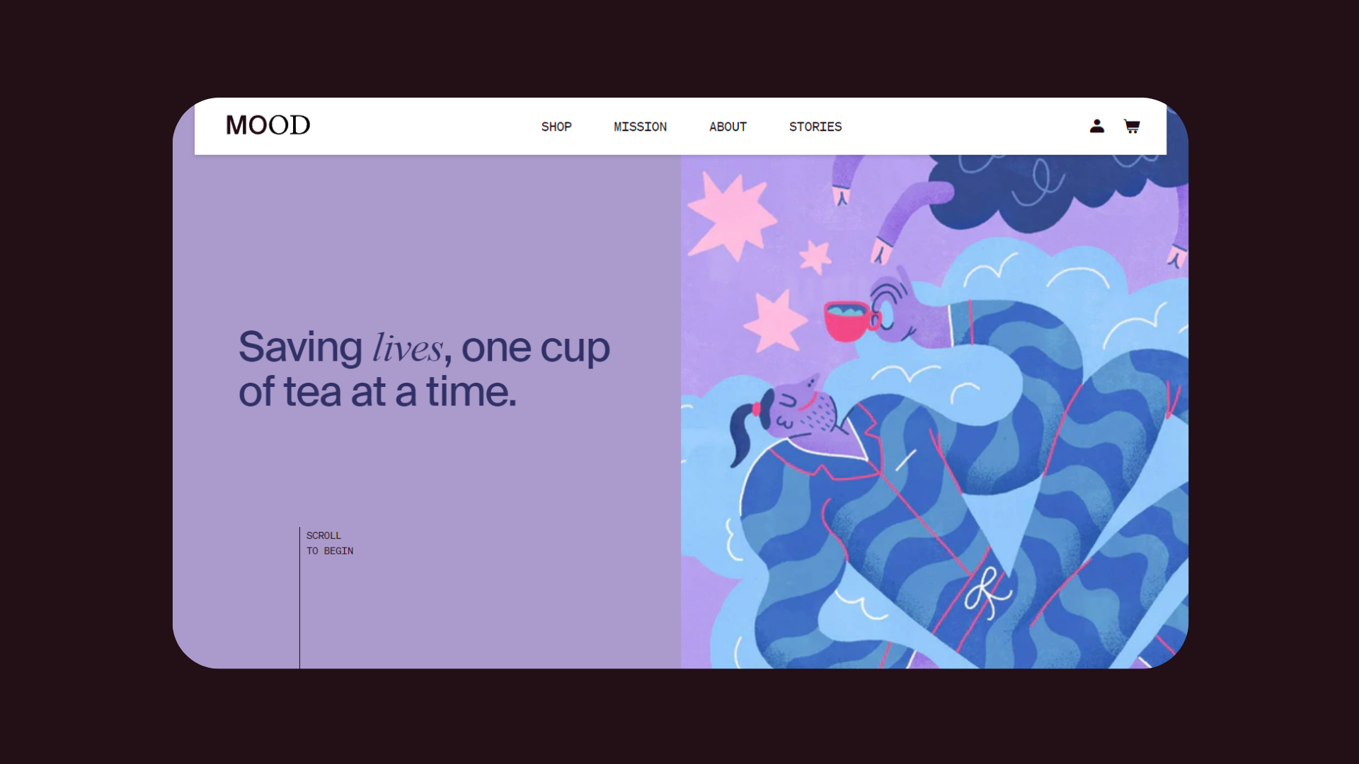 Mood Tea Website Design
Tea+
Tea+ uses many full-screen images and layout assets to shift the customer’s focus to the most important part of the website. Their playful look and feel cater to Gen Zs and Millennials who want to add powerfully nutritional vitamins, teas and herbs, and more to their daily rituals.
Clicking on the Get your free sample pack button gives us the opportunity to try all of their Vitamin & Mineral teas for free. On their homepage, we can also spot the many different bundles and programs they offer to meet every client’s specific health needs. On their tea website design layout, there is also a section dedicated for their expert guides where they share credible information for tea newbies who want to kick start their healthy journey.
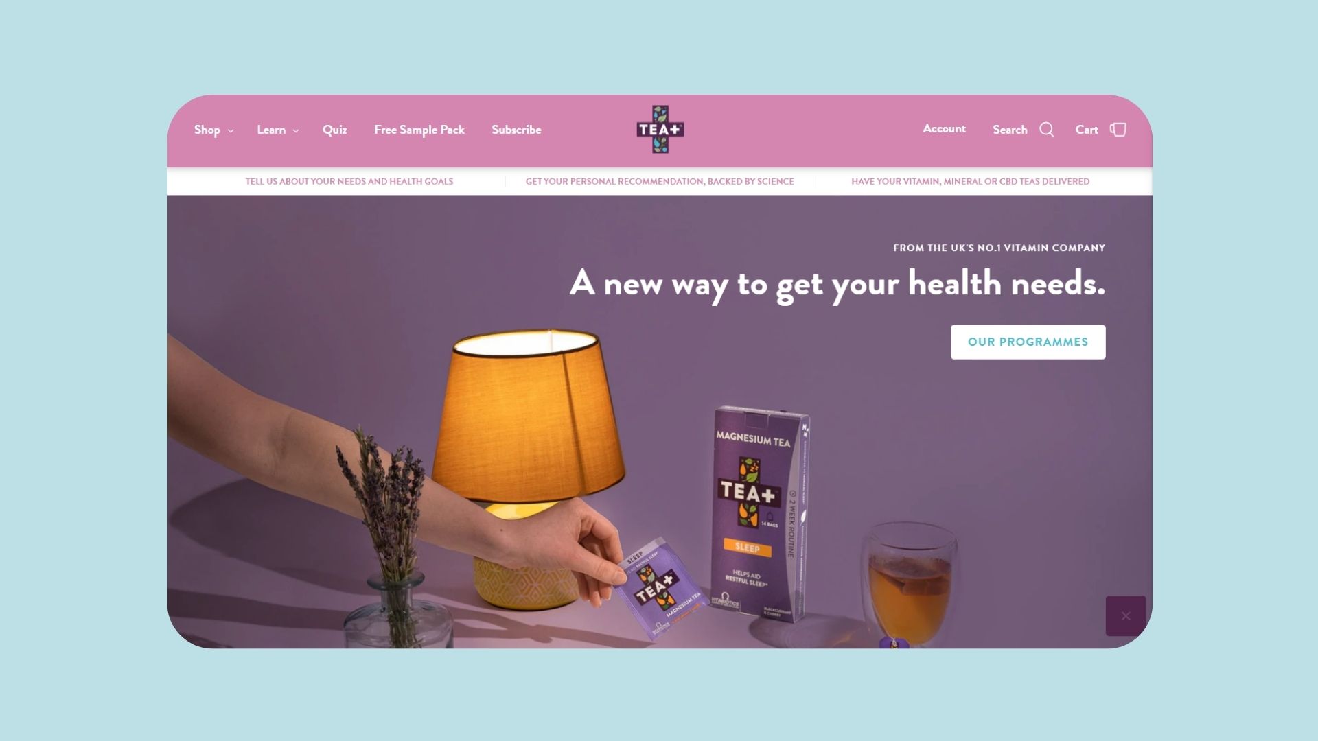 Tea+ Website Design
Use the best tea website design inspirations to make your brand stand out
When it comes to the best tea website designs, we can clearly see that individuality always pays off. However, there are many common design elements that guarantee to capture the customer’s attention and make them want to keep clicking. No matter if your goal is to have a simple tea shop design or a tea website design layout that’s strategically drenched in color, everything comes down to offering a truly exceptional user experience.