9 Professional Jewelry Website Design Examples 2025
Best jewelry website design examples & ideas to get inspiration for your own eCommerce store or portfolio website in 2025.
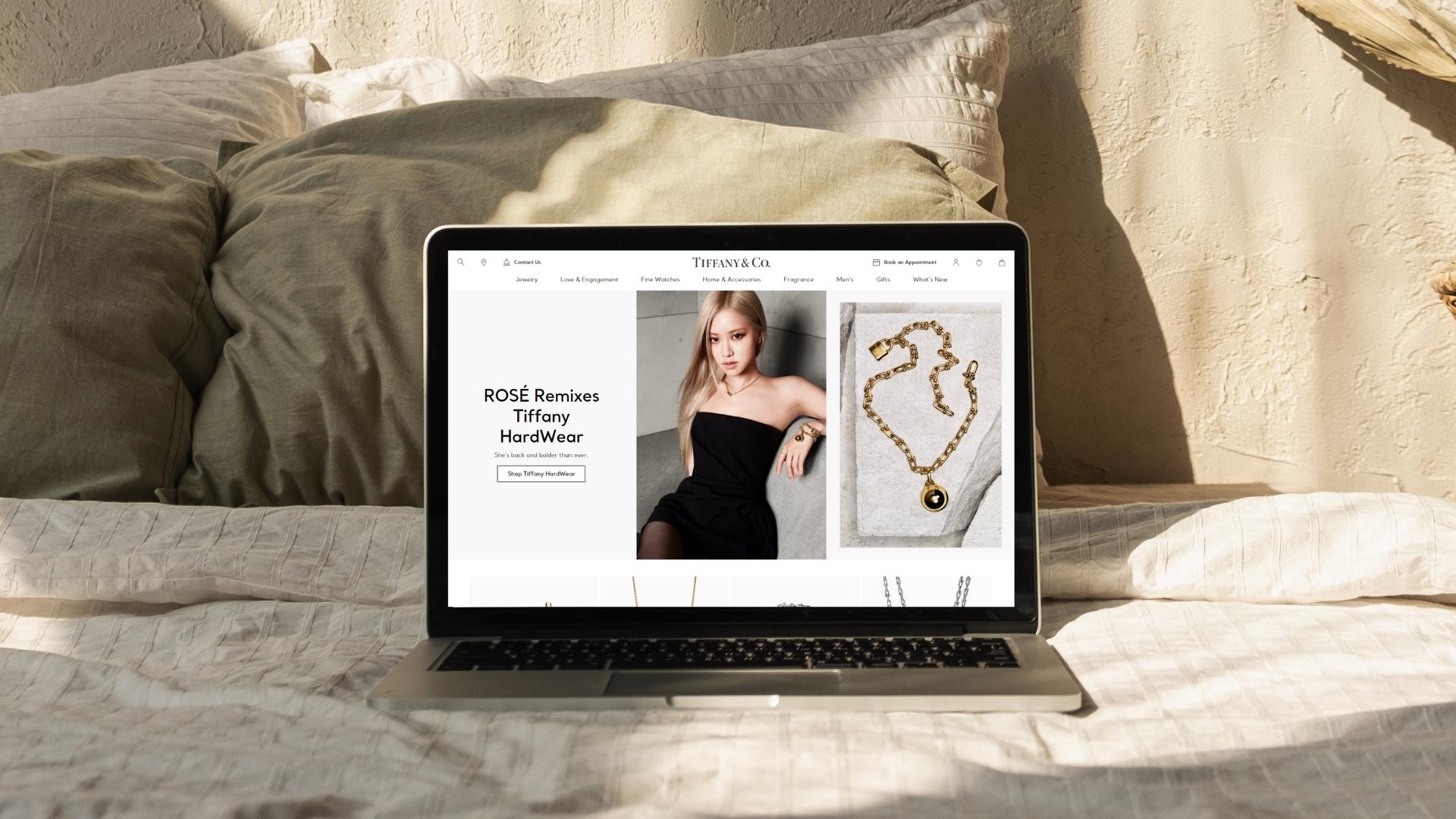
Are you a jewelry maker, a vendor, or a wholesaler? Then chances are that you’ve been looking everywhere for the best jewelry website examples to get some much-needed inspo for your online presence. Much like fashion and skincare, the 249.02 billion jewelry industry is amongst the top, most profitable niches you can capitalize on in . Luckily, there are plenty of jewelry website ideas to inspire you to give your pieces a professional digital home.
No matter if you are interested in creating a B2B Website, or looking for ways to Sell More with Your eCommerce Website, the jewelry website design inspiration below will help you do just that - and way more. We made a list of the most professional jewelry website design ideas for you to find the best eCommerce Website Structure for your e-business, generate more sales and get recognition.
While you can DIY your way to the top with these jewelry website design examples, you may want to considerhiring a professional web designer to work collaboratively on your project and take your brand to new digital heights.
What Type Of Jewelry Website Design Would You Need?
First and foremost, you need to determine the right jewelry website type for your own needs: Lookbook/Portfolio styled website, or eCommerce. The answer to this dilemma is pretty simple. If you want to showcase your work rather than generating direct online sales, you should probably seek jewelry website design inspiration for portfolios. If you are ready to attract customers and sell your inventory to customers or as a wholesaler, then it would be best to dive deep into the slew of eCommerce jewelry website ideas that are available today.
Here are two examples of the two aforementioned categories:
SASAI JEWELRY Lookbook styled website
Handcrafted in New York City. Saisai Jewelry are quiet and subtle yet modern and eyecatching. The Owner & Designer Akari Cassidy wanted to showcase their beautiful creations with a portfolio jewelry website design layout that represents their aim to create harmony in a complicated world.
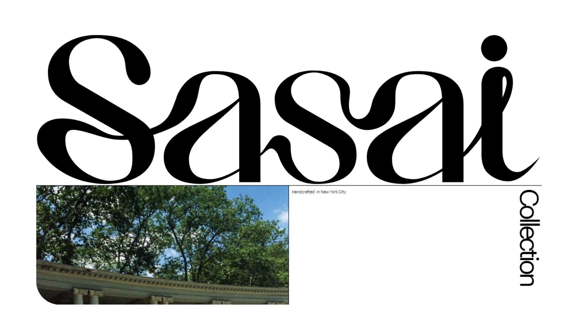
The entire website is focused on earthy, unfiltered imagery -sometimes animated- that perfectly matches Saisai’s brand identity. From the main menu, you can get direct access to the most important pages including their lookbook. The brand will also add a shop section very soon.
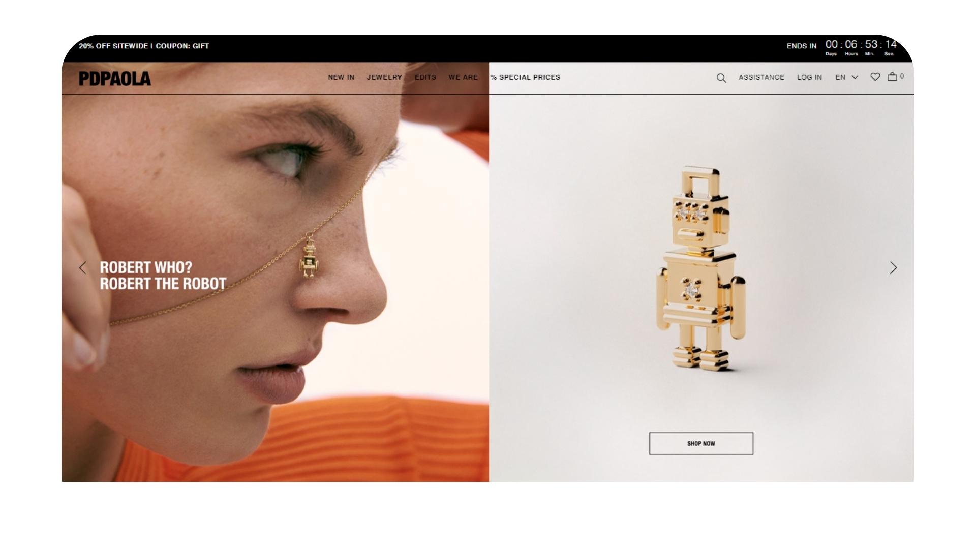
PDPAOLA eCommerce store
PDPAOLA jewelry evidently has a cult following. The brand’s clean and simplistic homepage offers the best jewelry website design inspiration to those who want to better understand the power of UX design. The unique and well-organized category collections on the homepage allow customers to get easy access to the most important product categories (rings, bracelets, jewelry boxes, etc.) The new collection is displayed with a banner video while customers can also get a glimpse of the newest arrivals.
Best Jewelry Website Design Examples to Get Inspiration From
If you are looking for jewelry website design ideas that are chic and elegant with a nature-inspired vibe, Bearfruit Jewelry is a great place to start. The earthy-toned imagery makes it look more endearing and effortlessly beautiful with subtle touches of romance.
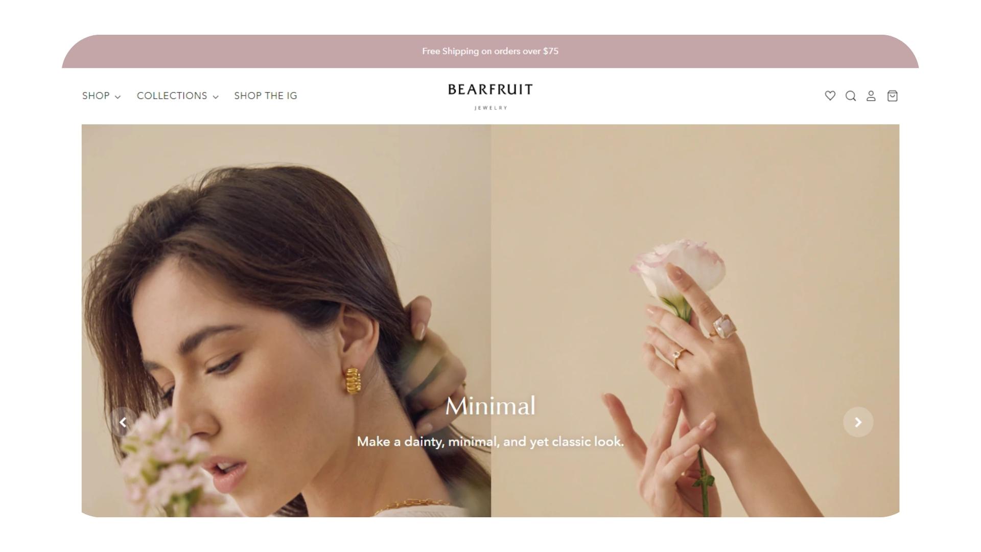
As soon as you land on the website, the new collection is presented through a full-width image carousel with their mission statement right under the first section. Then, customers can scroll through the best-selling products and shop by category or by Instagram post. Overall, it's one of the best jewelry website examples to get a better understanding of the way filterable categories can lead to easier conversion.
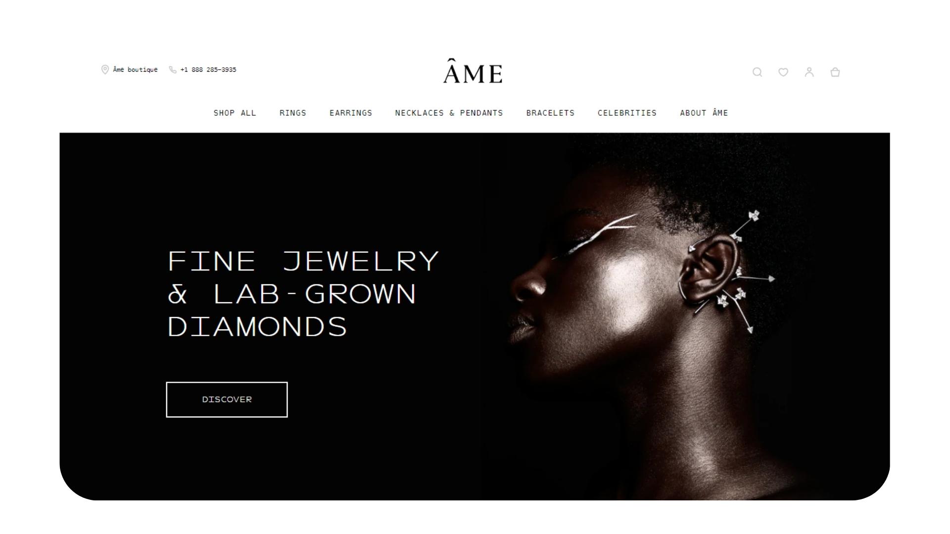
For jewelry website design examples that cater to luxury aficionados, look no further than AME jewelry. From the fonts to the muted color palette and elegantly displayed products, the brand gives off a timeless, classic, and sophisticated vibe that matches their brand personality and identity to a tee. Right under the header image, there is a section dedicated to their latest collections followed by a brief “about us”. The categories are also displayed at the top menu along with their celebrity endorsements.
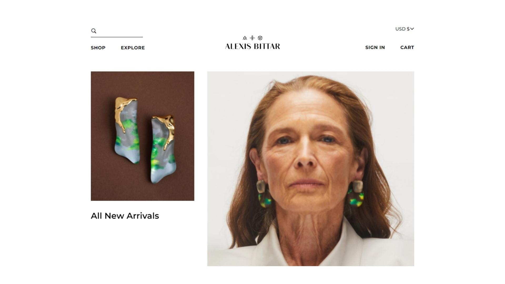
Alexis Bittar offers the perfect blend of art and fashion through luxury fine jewelry and handbags. If you are looking for jewelry website ideas that are modern and minimalistic, this one is a fantastic example. They make great use of the white space, to showcase the artful nature of their products in the right way. The website has great product pages with clean crisp imagery and videos that tap into the art of visual storytelling. From the main menu, customers can access an array of categories and subcategories - including filtering by style, best sellers, and selected for you. Also, the brand offers down payments with Afterpay.
When it comes to jewelry website design ideas that don’t shy away from color, Aurate reigns supreme. They present their mother’s day collection through a black-and-white video presentation of real-life mums to make it even more personal. The extensive use of burgundy perfectly portrays the brand’s rich, luxurious and elegant identity, letting the fine jewelry do all the talking for them. They educate potential customers on their values (quality, fair price, and longevity).
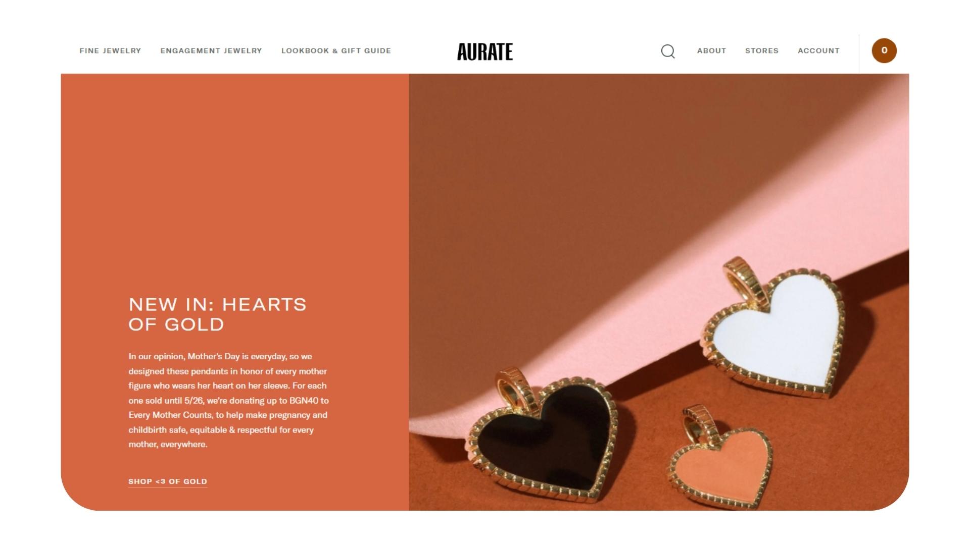
On top of that, they are a great jewelry website design inspiration for those who wonder how you can keep the attention of customers and make them want to scroll through every page to explore more. The top menu includes every product category along with sub-categories of specific styles. You can also find the most trending and newest additions, lookbooks, and gift guides.
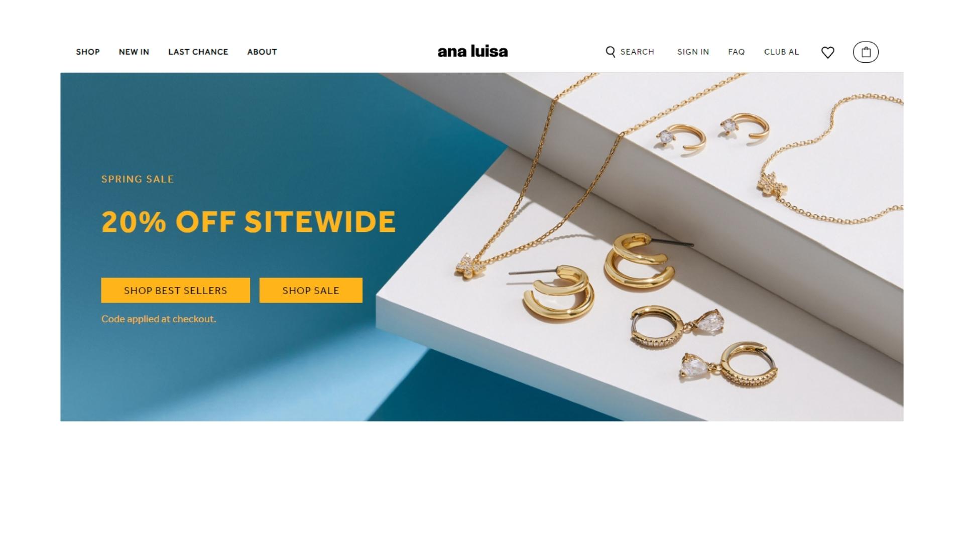
Ana Luisa is one of the best jewelry website design examples for sustainable brands. The extensive use of green evokes feelings of balance and harmony while also showing their commitment to earth and nature. The jewelry is displayed by categories as soon as you enter the website, followed by two sections: “last chance” and “essentials”. They dedicate an entire part to their climate-neutral certification while also including some of their 25,000+ five-star reviews to build trust and authority. Their jewelry website design layout is clearly product-based and the header and footer areas are simple and informative.
Aleyaole’s website is designed with simple white, gray, and blush colors to add a touch of femininity, luxury, and elegance. The brand uses crisp imagery to exhibit their latest collections - which is pretty common when it comes to jewelry website design inspiration. You can navigate their 6 different collections from the homepage and get notified of their current sales and deals. It also has a call to action sign-up form at the footer that offers a 10% discount. Plus, similarly to most jewelry website design ideas on our list, customers can easily change the language and currency settings from the main menu for convenience.
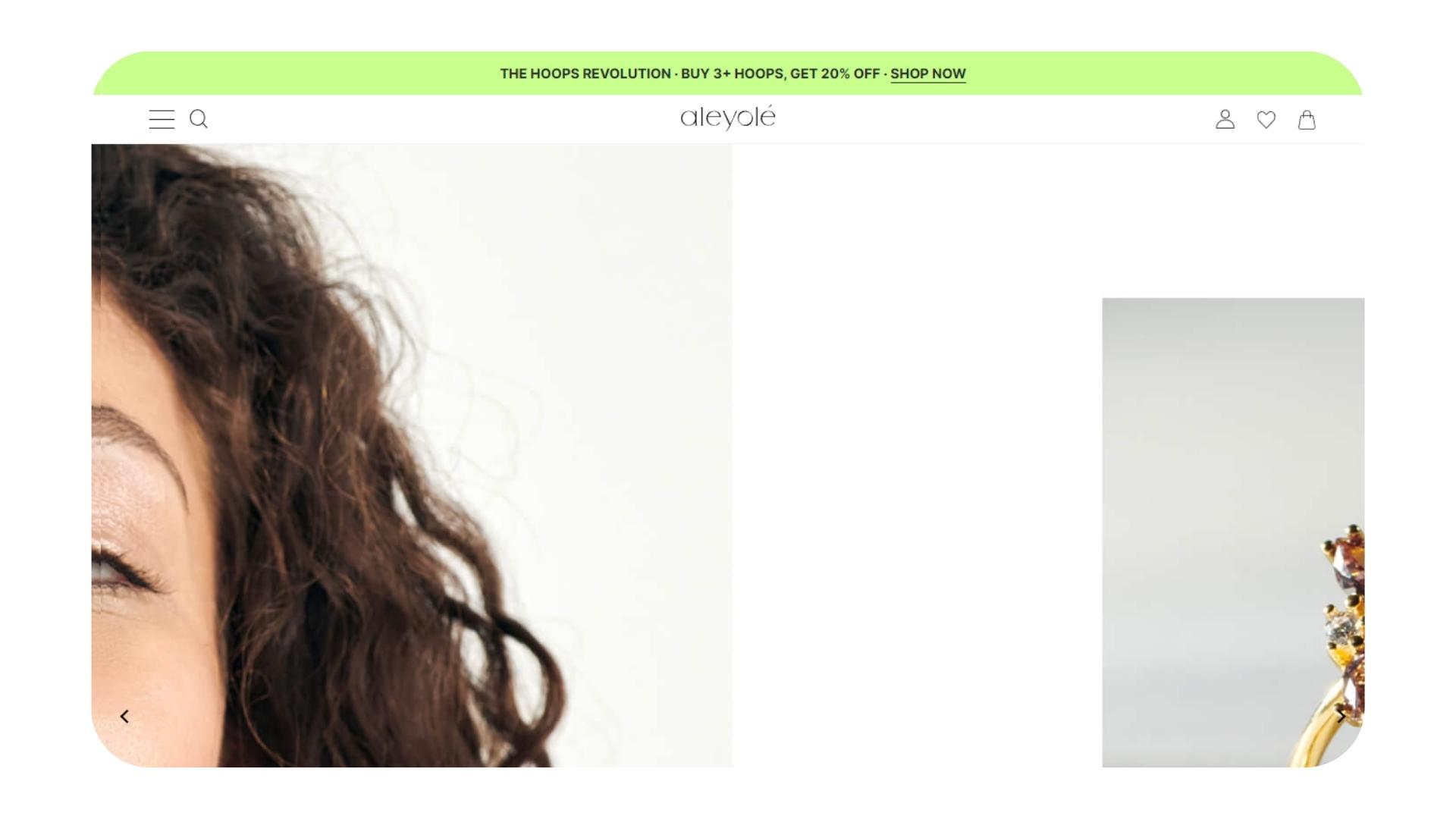
The fine jewelry website uses powerful animation and videos to showcase their striking collections and draw everyone’s attention to the quality of their pieces. Their newest releases are displayed right above the banner image in the form of a product carousel. The “most gifted” section is followed by a call-to-action to learn more about their laboratory-grown diamonds’ quality and development process.
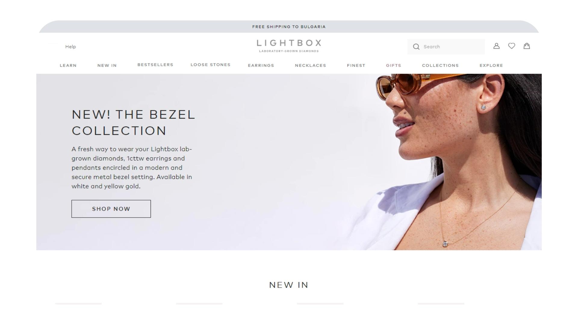
Reviews are also proudly displayed close to the footer along with quotes from magazines that have featured their jewelry. They also have a language and location option right at the top of the page. Bellow it, you can access their menu which includes 10 categories and dozens of subcategories.
Logan Hollowell is amongst the top jewelry website design examples for ethical, conflict-free fine jewelry with purpose. Handcrafted in Los Angeles using recycled gold, their collections are portrayed through artistic imagery that lets the jewelry sign through.
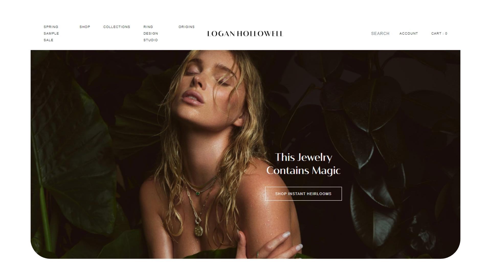
Right below their new collections, you can find a full-width section of products followed by a call-to-action to view all categories of products. The is a dedicated option on the menu to quickly access the ‘ring design studio’. Additionally, you can also access their newest sales, learn more about their origins and shop their collections.
Time To Use The Best Jewelry Website Design Inspiration & Examples To Your Advatage
While each brand is unique, the best jewelry website ideas will give you a glimpse of the different types of structures, fonts, and color combinations you can use to elevate your aesthetic. By now, you’ve certainly noticed some similarities amongst the top jewelry website design inspiration on the list above.
Most brands leverage the power of striking imagery accompanied by user-friendly categories that help customers find exactly what they are looking for within seconds. All the jewelry website examples on our list also focus on offering exclusive deals and discounts upon signing up for their newsletter. It’s evident that all the top jewelry website design examples have paid much attention to their UX and UI design - which is crucial for your eCommerce or portfolio website.