Which Font Should I Use For My Website Design?
Which font should I use for my website? How to choose the best wed design fonts and web fonts combinations for your e-shop, blog, or portfolio.
Website fonts; one of the most under-the-radar elements that require the same amount of attention as your beautifully-designed logo, content strategy, and product photography. Yes, the seemingly simple task of picking the best fonts for your specific website is crucial to your brand perception. But why web font combinations are so important? We hear you ask. Well, everything circles back to human behaviour.
Yes, much like color psychology marketing, the psychology behind typography is pretty fascinating. In reality, different typefaces communicate different values, and showcase a slew of different “personalities”. By choosing the best font for your website, you not only shape the way people perceive your brand but also make sure that your content is reader-friendly, user-friendly, and web-safe.
So which font should I use for my website? What is the most attractive font and which is the best font style for my specific niche? That depends on several contributing factors.
Tips On Choosing The Best Fonts For Websites
Your web design fonts should align with your brand identity
No matter if you want to redesign your website or build a brand new e-home from scratch, your brand identity is essentially what will determine which is the best font for your website. Remember that each font family has its own feel, look, and unique character, thus there are numerous web font combinations able to communicate your exact aesthetic and personality.
For example, clothing brands can be a bit more creative and artistic when choosing their website fonts, whereas a Newspaper company needs to be more formal.
According to psychological research, Serif fonts as perceived as elegant, classical, staid, and sleek. Narrow fonts, on the other hand, are viewed as modern and positive. Serif fonts are preferred by younger readers while Sans-Serif is popular amongst the older generations.
On another note, along with choosing the best wed design fonts, you also have to pay attention to the typographical emphasis. People are way more likely to remember text written in bold as opposed to normal or italic.
Larger fonts also help memory while the constant use of capitalized text is often perceived as negative. That’s yet another example of why you should pay attention to the choice of fonts for landing pages.
Keep your website fonts within the same family & be consistent
Consistency is the key! When you decide on the best font for your website, it’s advised to stick within the same family of fonts to avoid confusion amongst readers. Even the finest copywriting can become notoriously difficult to read when it’s written in different web font combinations.
If you do wish to use multiple fonts to communicate your strategic message, it’s recommended to leave that to professional designers. This way, you’ll ensure that your website looks coherent across all its different elements.
Choose the right website font for your audience
Certainly, with so many website fonts, you might find it hard to determine which web font combinations work best for your message. That’s exactly why you need to have a clear idea of your ideal customer/reader and their persona. How old are they? What is the main goal? Do you wish to give a striking first impression, or you are solely focusing on readability and information communication?
- For dyslexic people, readability improves when Helvetica, Courier, Arial, Verdana, and Computer Modern Unicode are used
- Dynamic display fonts are preferred by teens and young adults. The millennial demographic is more familiar with sans serif
- Women are more prone to reading text with Playfair Display
- According to The Next Web, Georgia and Helvetica are considered to be the most easy-to-read fonts for websites which makes them ideal for blogs and educational websites
Top 5 Most Used Website Fonts
While there are thousands of fonts available, some are more popular than others. So before you choose the best wed design fonts for your own shop, blog, or custom portfolio design, here are the 5 most used fonts for websites in 2022.
Helvetica
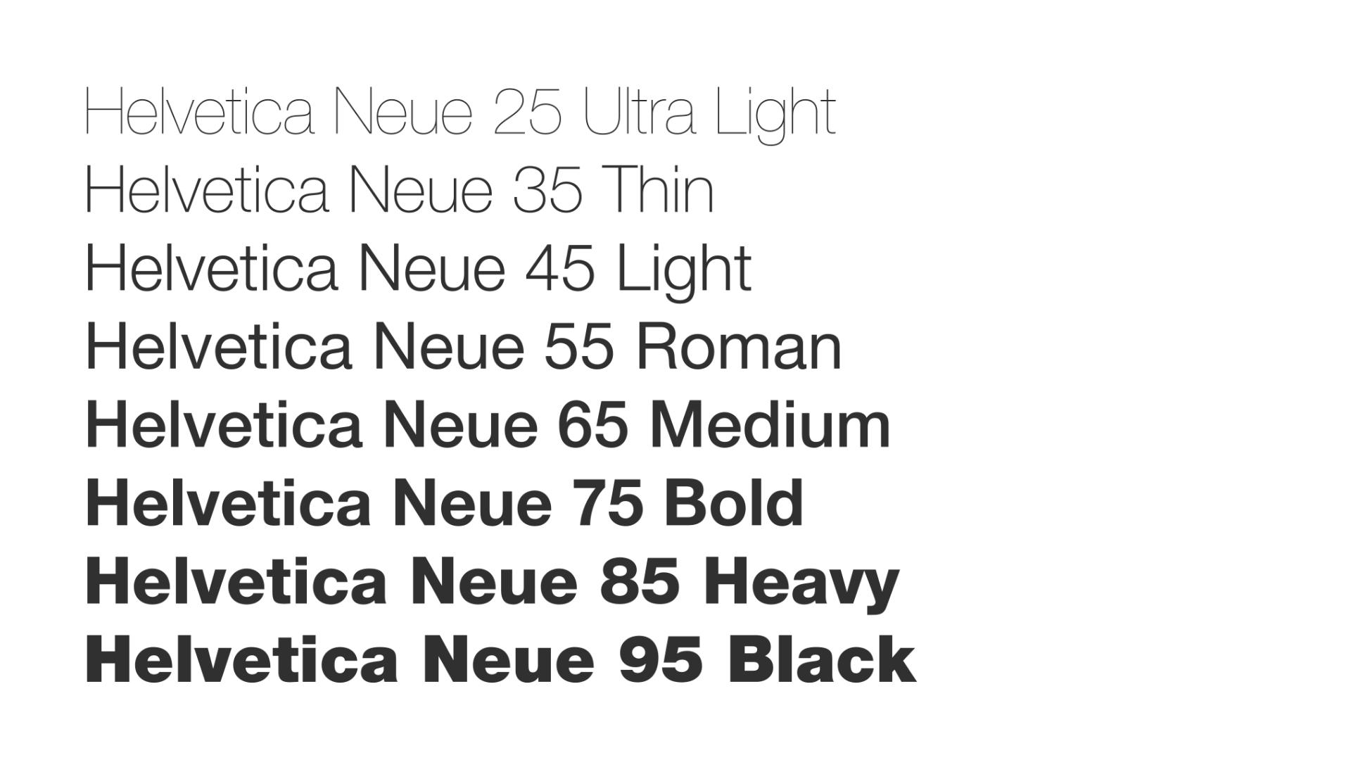
Helvetica is lauded as the world’s most popular font for a pretty good reason. While many can argue that it does lack character, it’s the number one choice for reader-friendliness as it’s widely used in documents such as business forms, fine prints, and invoices. In fact, it’s the most one of the most adaptable wed design fonts used by giant corporations including American Apparel and Target.
Calibri
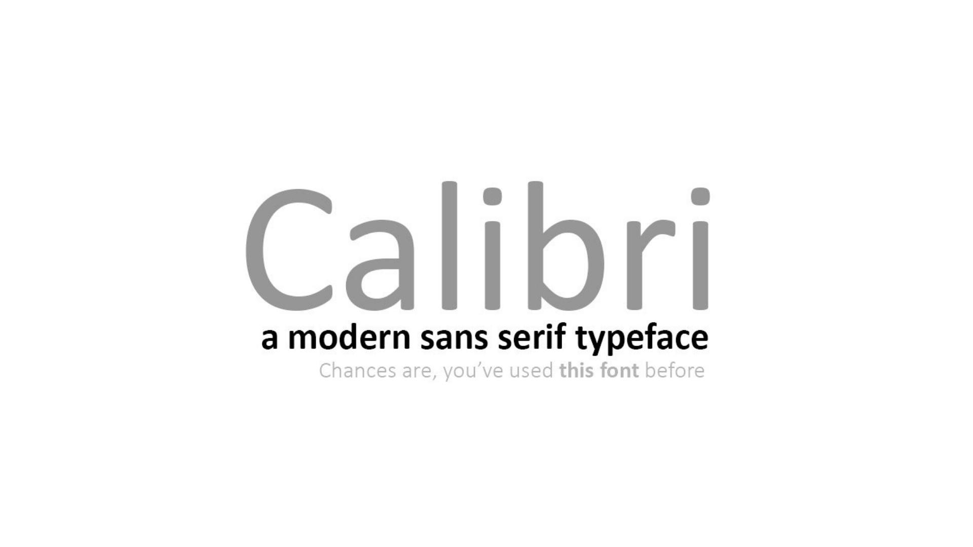
With a more creative and rounder letter shape, Calibri is yet another widely-used Sans Serif font. The business-casual font, designed by Microsoft is now the default choice in Microsoft Office. While Caibri is considered a universally readable professional font, the interesting designs makes it visually appealing to most web readers and is often compared to Roboto which is the number one ranked on Google fonts.
Montserrat
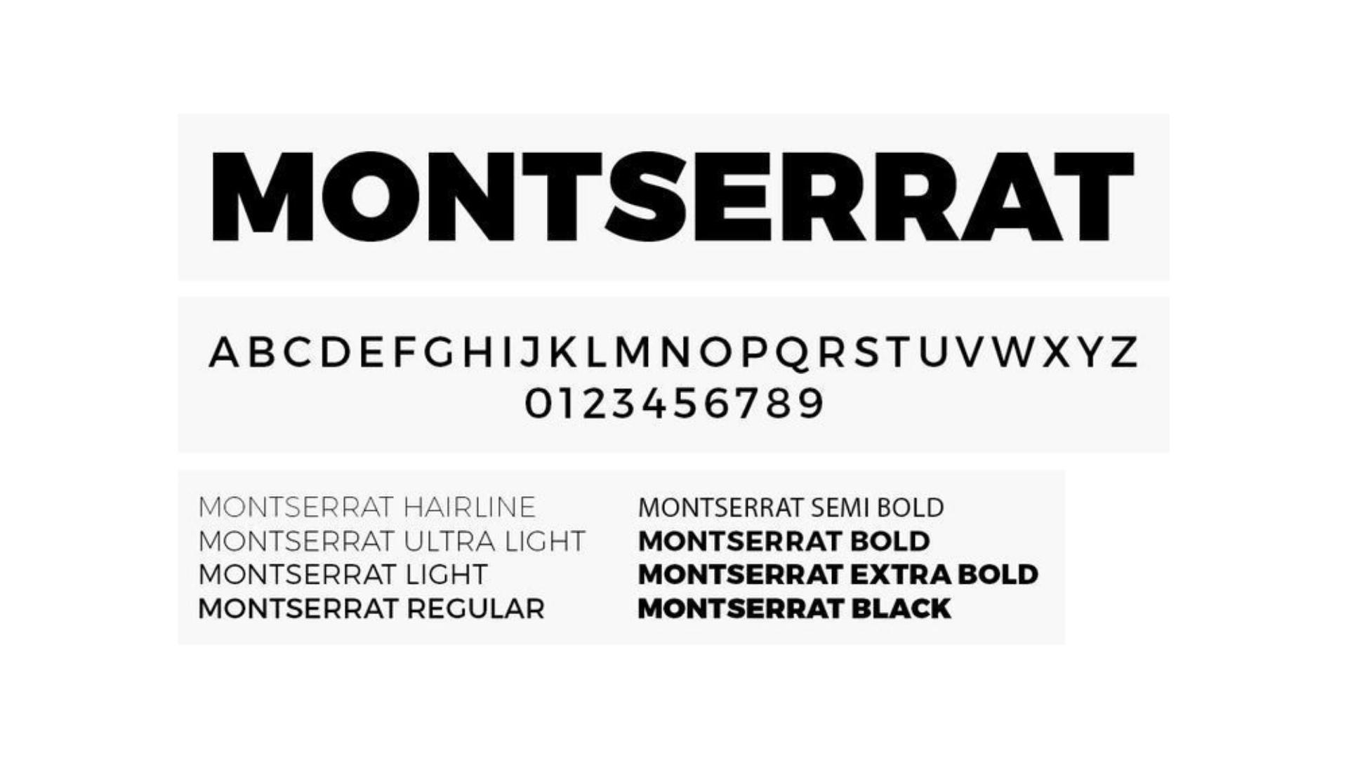
Montserrat’s geometric simplicity can be incorporated into every page of a website with ease. It’s considered a pretty youthful, easy-to-read font that also carries an elegant simplicity.
Garamond
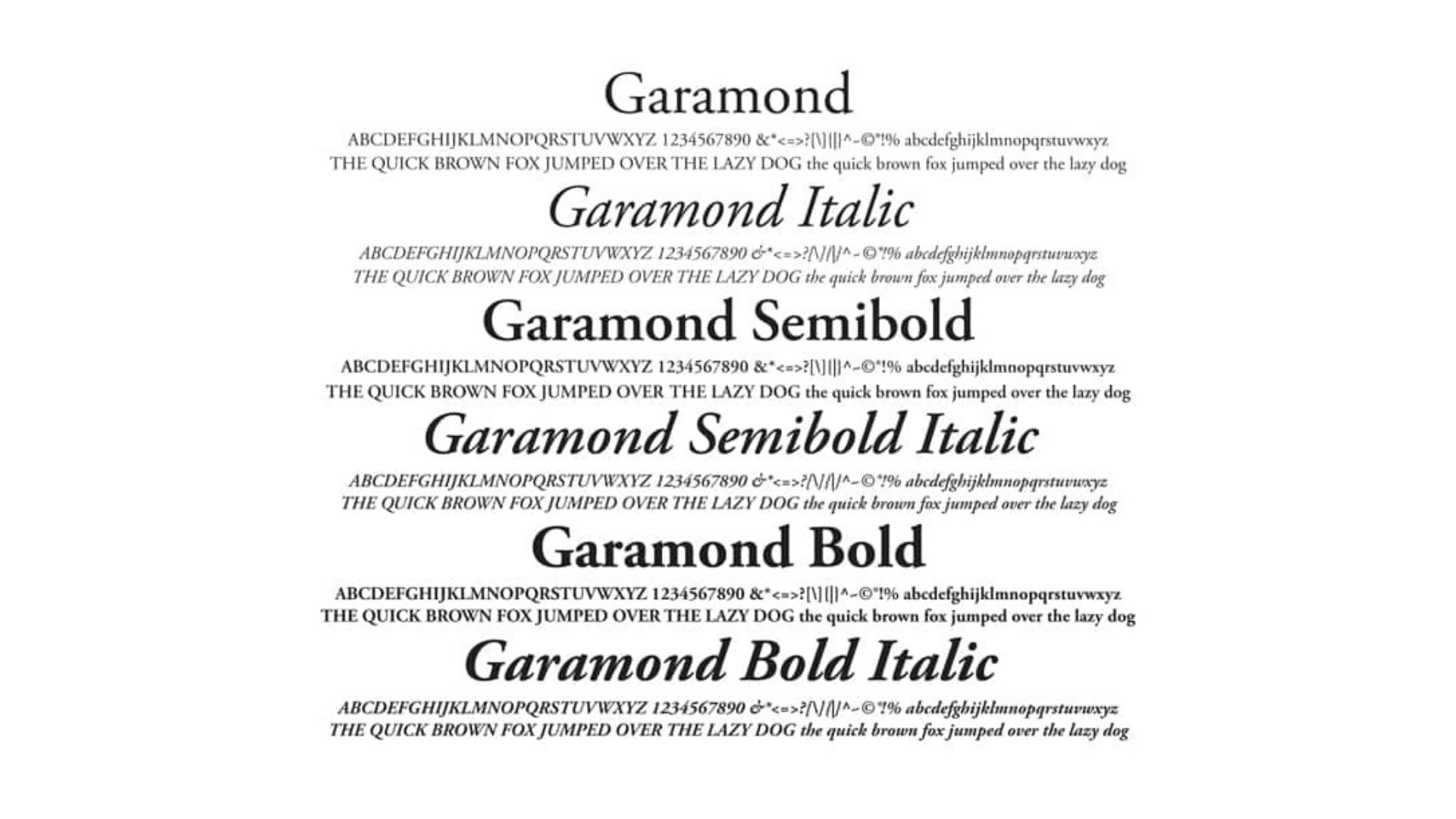
Garamond is loved by creatives for its classic, elegant look. In fact, this sleek font style goes back all the way to the 16th century. France, and it’s one of the most elegant fonts you can choose. It is considered one of the best fonts for websites, books, manuals, or any printed material that needs to convey a sense of classical taste.
Gotham
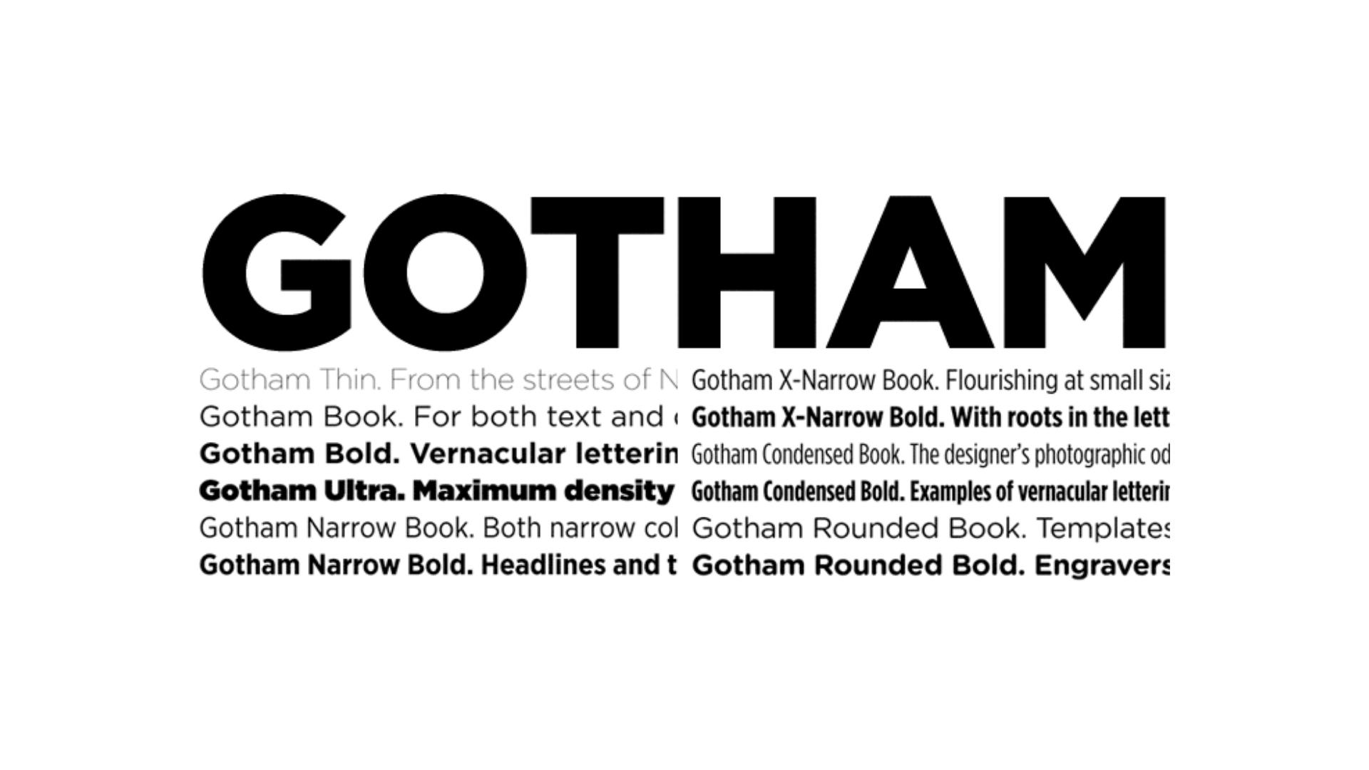
Firstly introduced in 2000, Gotham is hailed as one of the best wed design fonts for clean and modern looks. No wonder why it was used by Twitter, Spotify, Netflix, and across Obama’s promotional materials for the 2008 presidential elections. Currently, over 8000 of the top one million websites use the font, including upwork.com and QVC.com
Time To Pick The Right Font For Your Own Website
Now that you are aware of the psychology behind typography and understand the importance of choosing the best font for your website, it’s time to start brainstorming on wed design fonts that match your own aesthetic. But remember, your web font combinations should perfectly align with your brand identity and personality. Some fonts evoke reliability and trust while others communicate messages of modern creativity, playfulness, or elegance. So make sure to discuss your vision with a skilled website developer to identify the best font for your website.